

Tableauは2025年最新のTDS-C01サンプル問題は信頼され続けるTDS-C01テストエンジン
無料お試しTableau TDS-C01問題集PDFは必ずベストの問題集オプションを使おう
質問 # 47
What do the colours Blue and Green represent in Tableau?
- A. Continuous and Discrete
- B. Measures and Dimensions
- C. Dimensions and Measures
- D. Discrete and Continuous
正解:D
解説:
Important question! If you selected Dimension and Measure, don't worry! It is a very common mistake. But we're here to learn aren't we?
When you connect to a new data source, Tableau assigns each field in the data source as dimension or measure in the Data pane, depending on the type of data the field contains. You use these fields to build views of your data.


質問 # 48
When exporting a worksheet as an image in Tableau, which of the following file formats are available?
- A. Portable Network Graphic (.PNG)
- B. JPEG Image (.JPG, .JPEG)
- C. Windows Bitmap (.BMP)
- D. Tagged Image File Format (TIFF)
正解:A、B、C
解説:
The following options are available when an image is Exported:
NOTE: When we Copy an image rather than exporting it, then the image is copied to the clipboard in the TIFF file format! However, it is not available when EXPORTING an image.
質問 # 49
Which of the following are valid ways to show Mark Labels in the visualisation?
- A. Drag the measure to the Text label in the Marks Card
- B. Click on the Show mark labels icon in the Toolbar
- C. Click on Data in the Menu bar and Choose Show Mark Labels
- D. Click on Analysis in the Menu bar and choose Show Mark Labels
正解:A、B、D
解説:
The following showcase how you can show mark labels. Using the Sample Superstore dataset:
1) Let's create a Bar chart showing the sales for each sub-category:
2) Now you can show labels by:
2.1) Click on Show Mark Labels Icon in the Toolbar ( easiest )

2.2) Drag Sales to the Text icon in the Marks Card:
2.3) Click on Analysis -> Show mark labels from the Tableau menu bar:
質問 # 50
Is SUM a table calculation?
- A. No
- B. Yes
正解:A
解説:
SUM is an aggregate function, not a table calculation!
A table calculation is a transformation you apply to the values in a visualization. Table calculations are a special type of calculated field that computes on the local data in Tableau. They are calculated based on what is currently in the visualization and do not consider any measures or dimensions that are filtered out of the visualization.
The most common Table calculations are:
Running Total
Percent Difference
Difference
Percent of Total
Rank
Percentile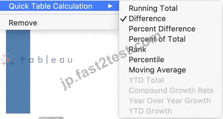

These can be calculated using : Table(across), Cell, or Specific dimensions!
質問 # 51
You can _______________ your data to combine two or more tables by appending values (rows) from one table to another
- A. union
- B. blend
- C. concatenate
- D. join
正解:A
解説:
Explanation
You can union your data to combine two or more tables by appending values (rows) from one table to another.
To union your data in Tableau data source, the tables must come from the same connection.
For example, suppose you have the following customer purchase information stored in three tables, separated by month. The table names are "May2016," "June2016," and "July2016."
A union of these tables creates the following single table that contains all rows from all tables.
質問 # 52
Broadly speaking, after an importing a dataset in Tableau Desktop, all fields in it are broken down into
_______________________
- A. Dimensions and Measures
- B. Labels and Values
- C. Rows and Columns
- D. Numbers and Headers
正解:A
解説:
When you connect to a new data source, Tableau assigns each field in the data source as dimension or measure in the Data pane, depending on the type of data the field contains. You use these fields to build views of your data.
Further,
質問 # 53
What is a story point in Tableau?
- A. A collection of both worksheets and dashboards
- B. A single worksheet or dashboard
- C. A collection of dashboards
- D. A collection of worksheets
正解:B
解説:
Explanation
In Tableau, a story is a sequence of visualizations that work together to convey information. You can create stories to tell a data narrative, provide context, demonstrate how decisions relate to outcomes, or to simply make a compelling case.
A story is a sheet, so the methods you use to create, name, and manage worksheets and dashboards also apply to stories (for more details, see Workbooks and Sheets). At the same time, a story is also a collection of sheets, arranged in a sequence. Each individual sheet (worksheet or dashboard) in a story is called a story point.
When you share a story -for example, by publishing a workbook to Tableau Public, Tableau Server, or Tableau Online-users can interact with the story to reveal new findings or ask new questions of the data.
質問 # 54
How does Tableau know at which level to aggregate values?
- A. Tableau doesn't aggregate values, we do!
- B. Aggregation is always done by using Tableau special formulas
- C. Values are always aggregated at the level of granularity of the worksheet.
- D. Values are always aggregated at the level of the Date Part
正解:C
解説:
Explanation
In Tableau, you can aggregate measures or dimensions, though it is more common to aggregate measures.
Whenever you add a measure to your view, an aggregation is applied to that measure by default. The type of aggregation applied varies depending on the context of the view.
When you add a measure to the view, Tableau automatically aggregates its values. Sum, average, and median are common aggregations; for a complete list, see List of Predefined Aggregations in Tableau.
The current aggregation appears as part of the measure's name in the view. For example, Sales becomes SUM(Sales). Every measure has a default aggregation which is set by Tableau when you connect to a data source. You can view or change the default aggregation for a measure-see Set the Default Aggregation for a Measure.
You can change the aggregation for a measure in the view from its context menu:
質問 # 55
Which two analytics options are available for a scatter plot view? Choose two.
- A. Forecast
- B. Reference lines
- C. Trend lines
- D. Totals IS
正解:B、C
解説:
For a scatter plot view in Tableau, you can add reference lines and trend lines as part of the analytics options.
Reference lines can be added to a visualization to mark certain values or to provide context, such as an average line across a scatter plot. Trend lines, on the other hand, are used to show the relationship between two variables in the view, indicating the general direction or pattern of the data points in a scatter plot.
質問 # 56
True or False: Context Filters are executed after Data Source filters
- A. True
- B. False
正解:A
解説:
THIS IS A VERY IMPORTANT QUESTION
To answer this question, you need to understand Tableau's Order of Operations. See below and remember this always:
質問 # 57
To use a quick table calculation, which of the following programming languages do you need to know?
- A. ython
- B. Javascript
- C. None of these
- D. Java
正解:C
解説:
You don't need to know ANY programming language to use quick table calculations!
Follow along with the steps below to learn how to apply a quick table calculation to a visualization:
1) Open Tableau Desktop and connect to the Sample-Superstore data source, which comes with Tableau.
2) Navigate to a new worksheet.
3) From the Data pane, under Dimensions, drag Order Date to the Columns shelf.
4) From the Data pane, under Dimensions, drag State to the Rows shelf.
5) From the Data pane, under Measures, drag Sales to Text on the Marks Card.
6) From the Data pane, under Measures, drag Profit to Color on the Marks Card.
7) On the Marks card, click the Mark Type drop-down and select Square.
The visualization updates to look like this:
Apply the quick table calculation
1) On the Marks card, right-click SUM(Profit) and select Quick Table Calculation > Moving Average.
Note: You can only perform quick table calculations on measures in the view.
A delta symbol appears on the field to indicate that a quick table calculation is being applied to the field. The colors in the visualization update to show the moving average of profit across the years.
質問 # 58
Which of the following are valid ways to copy a worksheet visualisation as an image?
- A. By clicking on Worksheet in the Tableau Main Menu above, and choosing Copy->Image
- B. By simply clicking Control + V on the keyboard
- C. Using the Marks shelf and choosing Copy->Image
- D. By right clicking on the worksheet visualisation and selecting Copy->Image
正解:A、D
解説:
The following are 2 correct ways to copy the worksheet visualisation as an image:
AND
質問 # 59
You create a visualization by first adding a measure to rows. Next, you add a dimension wilh 11 members to columns.
Assuming that all the dimensions have a non-zero value, how many marks are in the view before and after the dimension is added?
- A. 1 before and 2 after
- B. 1 before and 12 after
C 1 before and 11 after - C. 2 before and 11 after
正解:C
解説:
In Tableau, when you initially add a measure to the rows shelf, you create one mark in the view that represents the aggregate value of that measure. When you then add a dimension with 11 members to the columns shelf, the view is subdivided into 11 separate marks, each representing the measure for one of the dimension members. This results in a total of 11 marks in the view after the dimension is added, one for each member of the dimension.
質問 # 60
_______________ enables us to create workbooks and views, dashboards, and data sources in Tableau Desktop, and then publish this content to our own server.
- A. Tableau Prep
- B. Tableau myServer
- C. Tableau Public
- D. Tableau Server
正解:B
解説:
Tableau SERVER enables us to create workbooks and views, dashboards, and data sources in Tableau Desktop, and then publish this content to our own server.
Moreover, as a Tableau Server administrator you will control who has access to server content to help protect sensitive data. Administrators can set user permissions on projects, workbooks, views, and data sources.
質問 # 61
Dimensions containing ____________ and ____________ values cannot be continuous.
- A. Date
- B. Date and Time
- C. Boolean
- D. String
正解:C、D
解説:
According to Tableau's official documentation -
質問 # 62
What are two methods for renaming a field in a visualization? Choose two.
- A. From the Format menu, select Field Labels.
- B. From the Data pane, right-click the field and select Replace References.
- C. From the Data pane, use the field's drop-down menu and select Rename.
- D. From the Data pane, click and hold on the field until the name is editable.
正解:C、D
解説:
In Tableau, you can rename a field directly in the Data pane by clicking and holding on the field name until it becomes editable, allowing you to type a new name. Alternatively, you can use the drop-down menu associated with the field in the Data pane and select the "Rename" option. Both methods provide a quick and easy way to change the name of a field without affecting the underlying data structure. The "Format menu" and "Replace References" option do not apply to renaming fields.
質問 # 63
Which of the following are the options to export the data used to build the view / visualisations?
- A. CSV file
- B. JSON format
- C. MS Access Database
- D. PDF File
正解:C
解説:
You can export the data in a Tableau data source, including all or part of the records from your original data. Alternatively, you can export only the portion of data used to generate the view.
Since the question mentions the data used to build the view, we'll focus on that :
*Export data in the view to Microsoft Access or .csv*
Export the data that is used to generate the view as an Access database (Windows only) or .csv file (Mac only).
1) In Tableau Desktop, select Worksheet > Export > Data.
2) Select a location and type a name for your Access database or .csv file.
3) Click Save.
4) If you're on Windows, the Export Data to Access dialog box displays to give you the option to immediately use the new Access database and continue working in Access without interrupting your work flow.
質問 # 64
Which of the following describes the best way to change the formatting at a workbook level?
- A. Click on Text in the Marks card, choose format, and then specify the formatting in the new Format workbook pane.
- B. It is only possible to specify formatting at a worksheet level, not at the workbook level.
- C. Choose Format from the menu on top and then specify the formatting in the new Format workbook pane.
- D. Right click anywhere in the view, choose format, and then specify the formatting in the new Format workbook pane.
正解:C
解説:
It is very much possible to specify the formatting at a WORKBOOK level (all sheets) instead of a single worksheet level.
You can quickly change how fonts, titles, and lines look in every view in a workbook by specifying format settings at the workbook level, instead of the worksheet level.
For example, you might want to use a specific font, size, and color so that all views adhere to your company's brand. You might also want to remove grid lines from your views-or make them more noticeable by increasing their pixel size or color.
You can also change the theme used by your workbook. Themes control items like the default font, colors, and line thickness. When you create a new workbook, it automatically uses the Default theme, which uses visual best practices.
Change fonts in your workbook:
You can change all fonts in your workbook or you can change fonts for only certain areas, such as just worksheet titles.
1) On the Format menu, select Workbook.
2) The Format Workbook pane replaces the Data pane on the left and provides a series of drop-down lists where you can change all font settings in a workbook, as well as the font settings for titles of worksheets, stories, and dashboards.
Note: If you have made font changes at the worksheet level, such as on a filter card or a worksheet title, changing the font at the WORKBOOK level will overwrite those changes.
Reset a workbook to its default settings
When you make changes to your workbook's font settings, a gray dot appears next to the setting in the Format Workbook pane. You can quickly switch back to default settings using the Reset to Defaults button.
1) On the Format menu, select Workbook.
2) In the Format Workbook pane, click Reset to Defaults.
Graphical user interface, application Description automatically generated
質問 # 65
Dates in Tableau are typically treated as ______________
- A. Measures
- B. Dimensions
正解:B
解説:
For relational data sources, dates and times are automatically placed in the Dimensions area of the Data pane and are identified by the date or date-time icon. For example, the Order Date and Ship Date dimensions from an Excel data source are shown below:
When you place a relational date on a shelf, the field name is automatically modified to reflect the default date level. Tableau defines the default date level to be the level at which there are multiple instances. For example, if the date field includes multiple years, the default level is year. However, if the date field contains data for just one year but includes multiple months, then the default level is month.
質問 # 66
To use a quick table calculation, which of the following programming languages do you need to know?
- A. ython
- B. Javascript
- C. None of these
- D. Java
正解:C
解説:
You don't need to know ANY programming language to use quick table calculations!
Follow along with the steps below to learn how to apply a quick table calculation to a visualization:
1) Open Tableau Desktop and connect to the Sample-Superstore data source, which comes with Tableau.
2) Navigate to a new worksheet.
3) From the Data pane, under Dimensions, drag Order Date to the Columns shelf.
4) From the Data pane, under Dimensions, drag State to the Rows shelf.
5) From the Data pane, under Measures, drag Sales to Text on the Marks Card.
6) From the Data pane, under Measures, drag Profit to Color on the Marks Card.
7) On the Marks card, click the Mark Type drop-down and select Square.
The visualization updates to look like this:
Apply the quick table calculation
1) On the Marks card, right-click SUM(Profit) and select Quick Table Calculation > Moving Average.
Note: You can only perform quick table calculations on measures in the view.
A delta symbol appears on the field to indicate that a quick table calculation is being applied to the field. The colors in the visualization update to show the moving average of profit across the years.
質問 # 67
Larger image
What is this view referred to as in Tableau?
- A. Analytics Pane
- B. Data Pane
- C. Window Pane
- D. Dimensions & Measures
正解:B
解説:
Tableau displays data source connections and data fields for the workbook in the Data pane on the left side of the workspace.
The Data pane includes:
Dimension fields - Fields that contain qualitative values (such as names, dates, or geographical data). You can use dimensions to categorize, segment, and reveal the details in your data. Dimensions affect the level of detail in the view. Examples of dimensions include dates, customer names, and customer segments.
Measure fields - Fields that contain numeric, quantitative values can be measured. You can apply calculations to them and aggregate them. When you drag a measure into the view, Tableau applies an aggregation to that measure (by default). Examples of measures: sales, profit, number of employees, temperature, frequency.
For more information on what dimensions and measures are, see Dimensions and Measures, Blue and Green.
Calculated fields - If your underlying data doesn't include all of the fields you need to answer your questions, you can create new fields in Tableau using calculations and then save them as part of your data source. These fields are called calculated fields.
For more information on calculated fields, see Create Custom Fields with Calculations.
Sets - Subsets of data that you define. Sets are custom fields based on existing dimensions and criteria that you specify. For more information, see Create Sets.
Named sets from an MS Analysis Services server or from a Teradata OLAP connector also appear in Tableau in this area of the Data pane. You can interact with these named sets in the same way you interact with other custom sets in Tableau.
Parameters - Values that can be used as placeholders in formulas, or replace constant values in calculated fields and filters. For more information, see Create Parameters.
質問 # 68
True or False: A reference line cannot be added from the Analytics Pane
- A. False
- B. True
正解:A
解説:
You can add a reference line to any continuous axis in the view.
To add a reference line:
Drag Reference Line from the Analytics pane into the view. Tableau shows the possible destinations. The range of choices varies depending on the type of item and the current view.
In a simple case, the drop target area offers three options:
質問 # 69
......
有効な問題最新版を試そうTDS-C01テスト解釈TDS-C01有効な試験ガイド:https://jp.fast2test.com/TDS-C01-premium-file.html
TDS-C01試験資料Tableau学習ガイド:https://drive.google.com/open?id=1EZEKGuVrzRmNL5nxXJ1rS_iizgJkTwYK