

[2023年12月11日] TDS-C01のPDF問題集にはあなたに不可欠なTDS-C01試験解答を合格に繋ぐ!
TDS-C01のPDF解答で完璧な予見TDS-C01練習試験問題
Tableau TDS-C01 は、Tableau Desktop Specialist になりたい個人を対象とした試験です。この試験は、Tableau Desktop を使用してデータを接続、準備、分析、視覚化するための個人の知識とスキルをテストすることを意図しています。Tableau TDS-C01 試験は、個人が Tableau Desktop での熟練度を示し、自分のスキルに対する認識を得るための素晴らしい方法です。
質問 # 33
When you want to first apply a filter and THEN show the Top N or Bottom N elements, which of the following filters would you use?
- A. Extract Filter
- B. None of the these
- C. Data source Filter
- D. Context Filter
正解:D
解説:
IMPORTANT QUESTION, PAY ATTENTION
By default, all filters that you set in Tableau are computed independently. That is, each filter accesses all rows in your data source without regard to other filters. However, you can set one or more categorical filters as context filters for the view. You can think of a context filter as being an independent filter. Any other filters that you set are defined as dependent filters because they process only the data that passes through the context filter.
You may create a context filter to:
1) Improve performance - If you set a lot of filters or have a large data source, the queries can be slow. You can set one or more context filters to improve performance.
2) Create a dependent numerical or top N filter - You can set a context filter to include only the data of interest, and then set a numerical or a top N filter.
質問 # 34
DOWNLOAD THE DATASET FROM:
https://drive.google.com/drive/folders/1WXzqsrNmXVdmQ-574wld4InEplyKT8RP?usp=sharing (if you haven't already) Using the cwurData table, plot a Map to see which country had the Second highest number of patents in the Year 2013?
- A. United Kingdom
- B. United States
- C. France
- D. Canada
正解:C
解説:
Explanation
Follow along to get the correct answer:
* Drag Country to the view, and then Patents to the Size Mark on the Marks shelf as follows :
2) But, this isn't all right? We need to focus on the year 2013. This can be done by using the year column as it is (continuous) in the filter shelf, or by converting it to discrete first and then using it:
2.1 As it is (continuous)
2.2 Converting to discrete first & then using it
and then :
3) We can now see that France, with 485 has the 2nd most number of patents for the year 2013
質問 # 35
Which of the following are valid ways to italicize Tooltip content in Tableau?
- A. Click on Worksheet in the Menu bar, select Tooltip, and then use
the italics option - B. Click on Tooltip in the Marks card, select the text, and then use the Italics option
- C. Click on Format in the Menu bar, choose Font, and then edit the
Tooltip options to italicize the font - D. Click on Dashboard in the Menu bar, select Tooltip, and then use the italics option
正解:A、B、C
解説:
The only incorrect option is - Click on Dashboard in the Menu bar, select Tooltip, and then use the italics option.
This option doesn't exist. See below:
The rest of the options do exist, and therefore are correct:


質問 # 36
Which of the following calculations DO NOT need a quick table calculation?
- A. Standard Deviation
- B. Variance
- C. Rank
- D. Moving Average
正解:B
解説:
For Standard Deviation and Variance, we don't need to use quick table calculations, since they are available by default. See below:
However, as seen in the types of quick table calculations available in Tableau, Rank and Moving Average belong to only this category.
質問 # 37
For a relative date filter, the default anchor is _________________
- A. The date we specify
- B. The current time
- C. Today's date
- D. The target date
正解:D
解説:
Explanation
Relative date filters dynamically update to show a time period relative to when you open the view, such as the current week, the year to date, or the past 10 days. Relative date filters make it easy to create views that always show the most recent data.
Step 1: Drag a date field to the filter shelf
Right-click (control-click on Mac) and drag a date field from the Data window to the Filters shelf. In the Filter Field dialog box, click Relative Date, and then click Next.
Step 2: Select a time unit
In the Filter dialog box, click Relative dates, and then select the unit of time for the filter. For example, to show only the three most recent weeks, select Weeks.
Here, you can clearly see that the default date is TODAY
質問 # 38
What term is used to describe the following picture?
- A. Set
- B. Hierarchy
- C. Parameter
- D. Larger image
- E. Group
正解:A
解説:
When you connect to a data source, Tableau automatically separates date fields into hierarchies so you can easily break down the viz. You can also create your own custom hierarchies. For example, if you have a set of fields named Region, State, and County, you can create a hierarchy from these fields so that you can quickly drill down between levels in the viz.
質問 # 39
We can join a maximum of ______ tables in Tableau
- A. 0
- B. 1
- C. 2
- D. 3
正解:C
解説:
Explanation
It is possible to join a maximum of 32 tables in Tableau!
質問 # 40
What does the following icon do in Tableau?
Larger image
- A. Create a Story
- B. Create a Story and Dashboard both
- C. Create a Dashboard
- D. Create a Worksheet
正解:C
解説:
Explanation
The icon shown is used to add a new Dashboard! From the official documentation:
質問 # 41
In which situation should you save a workbook as a PDF document?
- A. You want document users to be able to filter and sort the views.
- B. Your users have Tableau Desktop but not Tableau Reader.
- C. Your analysis does not require a live connection to a data source.
- D. You need paper copies of the workbook.
正解:D
解説:
You should save a workbook as a PDF document if you need paper copies of the workbook. A PDF document preserves the layout and formatting of the workbook, and can be easily printed or shared. Saving a workbook as a PDF document is not necessary or useful in the other situations1
質問 # 42
Which of the following is a good reason for using a bullet graph?
- A. Forecasting future sales
- B. Displaying the year-on-year growth in sales
- C. Comparing the actual sales against the target sales
- D. Analysing the trend over a given time period
正解:C
解説:
A bullet graph is a variation of a bar graph developed to replace dashboard gauges and meters. A bullet graph is useful for comparing the performance of a primary measure to one or more other measures. Below is a single bullet graph showing how actual sales compared to estimated sales.
質問 # 43
Which of the following are valid ways to Bold the Tooltip content in Tableau?
- A. Click on Worksheet in the Menu bar, followed by Tooltip and select the bold option
- B. Right click, click format and then under the default worksheet formatting, choose Tooltip and make it bold.
- C. Click on Tooltip in the Marks card, and select bold.
- D. Click on Analysis, Tooltip options, and select bold.
正解:A、B、C
解説:
Lot of students have been seeing this question in the exam lately, and wanted me to include this question so here it is. Follow along -
1) Click on Worksheet in the Menu bar, followed by Tooltip and select the bold option
2) Click on Tooltip in the Marks card, and select bold.

3) Right click, click format and then under the default worksheet formatting, choose Tooltip and make it bold.
There exists no option to Bold the tooltip contents by clicking Analysis. Hence, it is an incorrect choice.
質問 # 44
You can _______________ your data to combine two or more tables by appending values (rows) from one table to another
- A. join
- B. concatenate
- C. union
- D. blend
正解:C
解説:
You can union your data to combine two or more tables by appending values (rows) from one table to another. To union your data in Tableau data source, the tables must come from the same connection.
For example, suppose you have the following customer purchase information stored in three tables, separated by month. The table names are "May2016," "June2016," and "July2016."
A union of these tables creates the following single table that contains all rows from all tables.
質問 # 45
When you connect to a new data source, all worksheets that previously referred to the original data source now refer to the new data source. If the new data source does not have the same field names as the original workbook, the fields are marked with an exclamation point
. Which feature helps us fix this issue?
- A. Fix Metadata
- B. Replace Reference
- C. Aliases
- D. Renaming
正解:B
解説:
Replace Reference:
For example, say you have a workbook connected to a data source that contains a Customer Name field. Then you edit the data source to point to a new data source that has all the same data but instead of Customer Name, the field name has been changed to Name. The Customer Name field remains in the Data pane but is marked as invalid. To make the field valid, you can replace the references, which means you can map the invalid field to a valid field in the new data source (for example, Customer Name corresponds to Name).
Read more at : https://help.tableau.com/current/pro/desktop/en-us/howto_connect.htm
質問 # 46
True or False: A sheet cannot be used within a story directly. Either sheets should be used within a dashboard, or a dashboard should be used within a story.
- A. rue
- B. False
正解:B
解説:
It is possible in Tableau to use a sheet within a story directly.
Moreover, in Tableau, a story is a sequence of visualizations that work together to convey information. You can create stories to tell a data narrative, provide context, demonstrate how decisions relate to outcomes, or to simply make a compelling case.
At the same time, a story is also a collection of sheets, arranged in a sequence. Each individual sheet in a story is called a story point.
質問 # 47
Which of the following represent a valid method to create a Bullet Graph with the LEAST number of fields possible?
- A. using 2 dimensions and 3 measures
- B. using 1 measure
- C. using 2 measures
- D. using 2 dimensions
正解:C
解説:
A bullet graph is a variation of a bar graph developed to replace dashboard gauges and meters. A bullet graph is useful for comparing the performance of a primary measure to one or more other measures. Below is a single bullet graph showing how actual sales compared to estimated sales.
We can create a Bullet graph with just 2 measures! This method requires the LEAST number of fields possible to create this type of chart.
The best way to tackle such questions in the exam is to click the "SHOW ME" button on top right, and hover over the chart we want to create.
In our case, it is a Bullet graph.

Therefore, we need 2 measures at least to create this chart, and 0 or more dimensions.
質問 # 48
Using the Geo Data table, create a Bar chart showing the In-Stock percentage for each Color. What is the Average In-Stock percentage for the Color Red? Present your answer correctly upto 2 decimal places.
- A. 95.12%
- B. 96.46%
- C. 97.12%
- D. 99.46%
正解:C
解説:
Explanation
Not too tough. Follow along the steps:
* Drag Color to Filter and choose Red:
* 3) Now to display the percentage correctly, lets format it. Click on the In Stock % pill in the Row shelf, and select format:
* And your final view will look like :
質問 # 49
Which of the following fields would be best used as Dimensions?
- A. Categories
- B. Sales
- C. Names
- D. Profit
正解:A、C
解説:
Names and Categories would be mostly used as dimensions (categorical data).
Profit and measures contain quantitative data and would be more suitable for Measures!
質問 # 50
Using the dataset, plot a Map showing all the countries, filtered by Market to only include LATAM. Which country in the LATAM Market has the highest shipping delay (sum of total number of days between the order date and the ship date)?
- A. Brazil
- B. Peru
- C. Argentina
- D. Mexico
正解:D
解説:
VERY IMPORTANT QUESTION FOR THE EXAM, PAY ATTENTION
1) To find the number of days between order date and shipping date, we will make use of a calculated field:
In the data pane, click on the dropdown arrow, and choose create calculated field.
Let's name this calculated field "ShippingDelay" (you can name it anything you want :) )
2) Use the DATEDIFF() function, and pass it the arguments as follows:
'day' depicts that we want to calculate the number of DAYS between the two dates. The first argument is 'start_date' which is the ORDER_DATE (day the order was placed), the second argument is 'end_date', which is the SHIP_DATE (date the order was shipped). So by subtracting as follows: SHIP_DATE - ORDER_DATE, we can find the delay in shipping.
Click OK.
3) You should now have a new measure as follows:
4) Phew! The hard part is done! Now let's filter by Market to include only LATAM: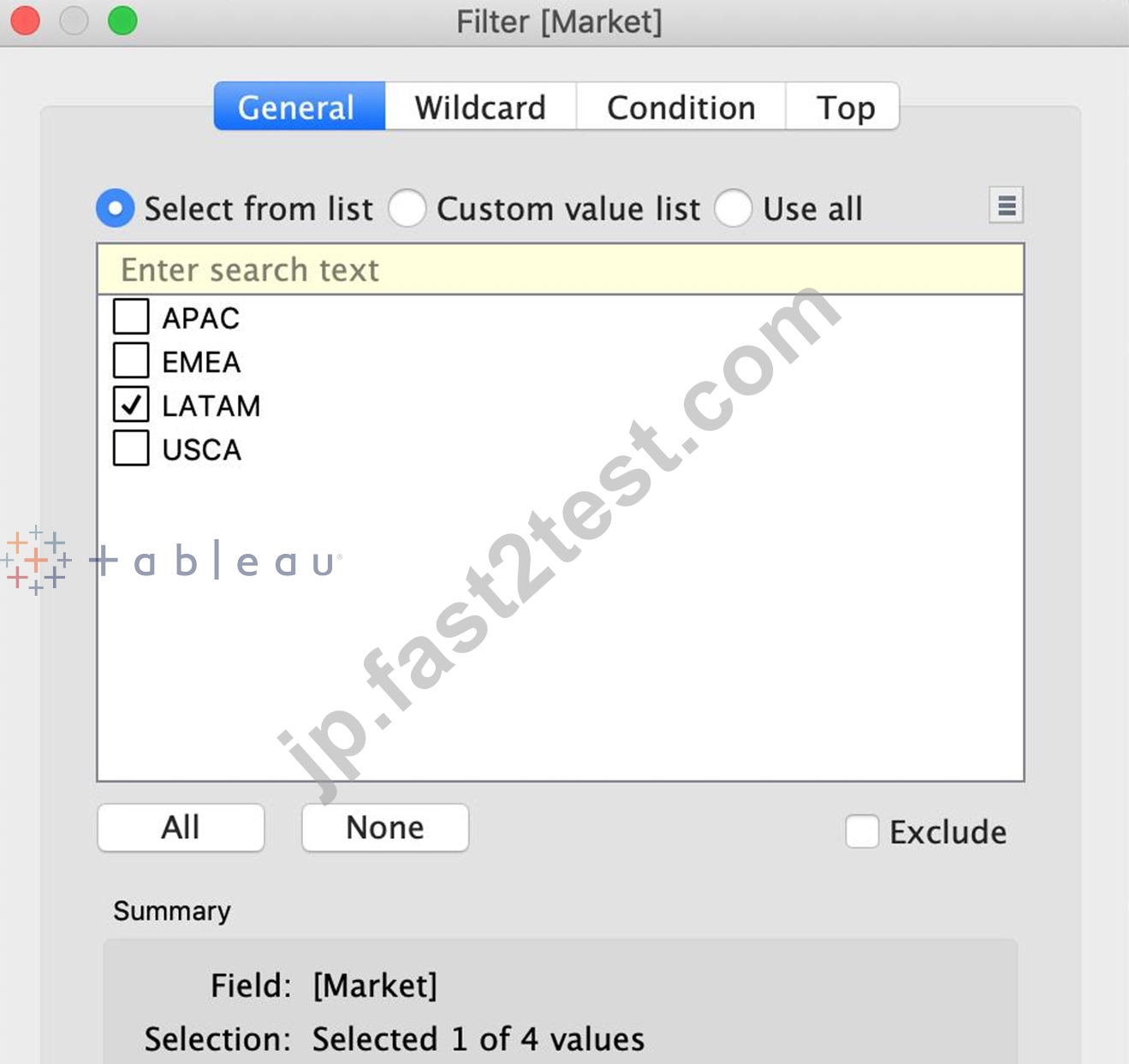
5) Drag Country to the view, and the new calculated field 'ShippingDelay' to SIZE on the Marks Shelf as follows:
*You can also click on Show Text Labels to be sure that you're choosing the Largest value*
Clearly, Mexico has the highest Shipping Delay!
質問 # 51
What is the one most important thing you should do after creating a Dual-axis chart?
- A. Synchronise the axis
- B. Hide the axis
- C. Change the colours
- D. Edit the labels
正解:A
解説:
After creating a dual axis chart, make sure to synchronise their axis since they both might not be having the same y-axis.
To align the two axes in a dual axes chart to use the same scale, right-click (control-click on Mac) the secondary axis, and select Synchronize Axis. This aligns the scale of the secondary axis to the scale of the primary axis.
In this example, the Sales axis is the secondary axis and the Profit axis is the primary axis.
If you would like to change which axis is the primary, and which axis is the secondary, select the field on the Columns or Rows shelf that is the secondary, and drag it in front of the primary field on the shelf until you see an orange triangle appear.
In this example, you can select the SUM(Sales) field on the Rows shelf, and drag it in front of the SUM(Profit) field. The Sales axis is now the primary and the Profit axis is the secondary.
質問 # 52
Which of the following are stored in a .tds file? Choose 3.
- A. Calculated Fields
- B. Data Extracts
- C. Visualizations
- D. Data Connection information
- E. Metadata edits
正解:A、D、E
解説:
If you've created a data connection that you might want to use with other workbooks or share with colleagues, you can export (save) the data source to a file. You might want to do this also if you've added joined tables, default properties, or custom fields-such as groups, sets, calculated fields, and binned fields-to the Data pane.
Visualisations and Data extracts are NOT saved in a .tds file!
質問 # 53
Using the cwurData table, create a cross-tab showing the number of Publications per Country broken down by Institution, and filtered by Country to only show United Kingdown (UK). For the University of Manchester, what percent of the total publications were contributed in 2014?
- A. 22.404%
- B. 25.683%
- C. 23.497%
- D. 28.415%
正解:A
解説:
Explanation
Phew! Tricky one for sure. This question tests multiple concepts and will help you revise them. We'll be using filters, as well as quick table calculations (percent of total) for this one.
1) Firstly, let's drag Country and to the Rows shelf, and year (discrete) to the Columns shelf.
Then, drag Publications to the Text Icon in the Marks Shelf. The following is our view:
質問 # 54
......
TDS-C01リアル試験問題と正確なTableau Desktop SpecialistのPDF解答:https://jp.fast2test.com/TDS-C01-premium-file.html
リアルTableau試験の素晴らしい練習問題集でTDS-C01試験:https://drive.google.com/open?id=1EZEKGuVrzRmNL5nxXJ1rS_iizgJkTwYK