

最新 [2025年04月26日] Tableau TDS-C01リアル試験問題集PDF
TDS-C01練習テスト問題は更新された318問題あります
質問 # 28
Suppose I have the following view. What will be the total number of marks if I drag a new measure to the row shelf vs the column shelf?
- A. If dragged to row shelf : 14 marks ; If dragged to column shelf : 7
marks - B. If dragged to row shelf : 14 marks ; If dragged to column shelf : 14 marks
- C. If dragged to row shelf : 7 marks ; If dragged to column shelf : 14 marks
- D. If dragged to row shelf : 7 marks ; If dragged to column shelf : 7 marks
正解:A
解説:
This is a tricky question often asked in the exam.
If we drag a new measure to the row shelf, the following happens:
We now have 2 rows, and the same 7 columns for both these rows. Therefore, 2x7 = 14 marks!
But if we drag the same measure to the column shelf, we have just 1 row and a chart created for each of the columns. So (1x7) = 7 marks!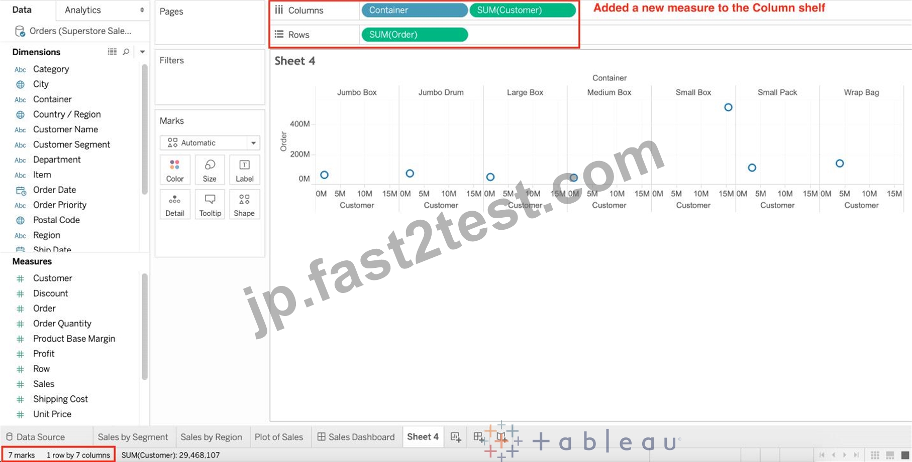
Reference and notes: https://medium.com/@justindixon91/tableau-specialist-exam-notes-part-4-understanding-tableau-concepts-f78de83fdd35
質問 # 29
Which of the following are valid Dashboard size options?
- A. Fixed Size
- B. Scaled
- C. Range
- D. Automatic
正解:A、C、D
解説:
Scaled is NOT a valid size options when creating Dashboards in Tableau!
After you create a dashboard, you might need to resize and reorganize it to work better for your users.


質問 # 30
What does the following marker/icon do in Tableau?
- A. Edit the Colors
- B. Toggle the highlighting on/off.
- C. Highlight the largest value
- D. Format the Legends
正解:B
解説:
Top of Form
The correct answer is Toggle the highlighting ON/OFF. If selected, whichever value you choose from this legend will be highlighted in the view. However, if it is deselected, then even if you choose a value in the Legend, it will NOT be highlighted.
See below:

Bottom of Form
質問 # 31
You may create a context filter to:
- A. Improve performance
- B. To replace a data source filter
- C. Create a dependent numerical or top N filter
- D. To create a dependent filter
正解:A、C
解説:
Important question! You cannot use a context filter to replace a data source filter since each filter type has its own use case. Also, a content filter is an Independent filter and all other filters are called dependent since they only process the data that passes through a context filter.
According to the official documentation :


質問 # 32
Which of the following returns the Absolute Value of a given number?
- A. ABS(Number)
- B. FLOOR(Number)
- C. ZN(Number)
- D. CEILING(Number)
正解:A
解説:
From the official Tableau website:


質問 # 33
Question 30: Skipped
Using the CoffeeChain table, create a scatter plot of Profit (x-axis) vs Sales (y-axis) broken down by State. Add a Linear trend line to the view. What is its R-squared value?
- A. 0.783262
- B. 0.759329
- C. 0.748472
- D. 0.739284
正解:A
解説:
Trend lines have become popular questions in recent Tableau examinations. Follow along:
1) First drag Sales to the Rows shelf and Profit to the Columns shelf:
You will only see a single mark since the view is aggregated.
2) Now, break down this view by state. Drag State into Detail on the Marks shelf ( or directly to the view):
3) Finally, move to the Analytics pane, and drag Trend line to the view. When you drag it, select the Linear option!:

4) The following is our view. Hover over the trend line to see the R-squared value:
質問 # 34
Which of the following are valid ways of Grouping Data?
- A. Using Marks in the view
- B. From the Analytics Pane
- C. Using Labels in the View
- D. From the Dimensions Shelf
正解:A、C、D
解説:
**IMPORTANT QUESTION AND EXPLANATION, PLEASE READ**
3 ways to group data -
1) Marks
2) Labels
3) Dimensions shelf.
*IMPORTANT*
If we Group the data by selecting the marks, then they remain separate marks in the view and then have the same colour. Also, a new group is created in the Dimensions shelf. Example - Using the sample superstore dataset, first plot a bar chart showing sales for each sub-category:
Here, if we Select Phones, Chairs and Storage by selecting the MARKS (Bars), and then group them:
They remain seperate marks (BARS) but are grouped by the same colour.
Now, if we didn't do this, and rather grouped by selecting their Labels (Names):
Then they no longer remain separate Marks (bars) but are rather consolidated into a single Bar:
Finally, we can group directly from the Dimensions shelf as follows:
Now choose Phones, Chairs and Storage and Click Group:
You will now automatically have a new Dimension as follows:
質問 # 35
Using the dataset, plot a Map showing all the countries, filtered by Market to only include LATAM. Which country in the LATAM Market has the highest shipping delay (sum of total number of days between the order date and the ship date)?
- A. Peru
- B. Brazil
- C. Argentina
- D. Mexico
正解:D
解説:
VERY IMPORTANT QUESTION FOR THE EXAM, PAY ATTENTION
1) To find the number of days between order date and shipping date, we will make use of a calculated field:
In the data pane, click on the dropdown arrow, and choose create calculated field.
Let's name this calculated field "ShippingDelay" (you can name it anything you want :) )
2) Use the DATEDIFF() function, and pass it the arguments as follows:
'day' depicts that we want to calculate the number of DAYS between the two dates. The first argument is 'start_date' which is the ORDER_DATE (day the order was placed), the second argument is 'end_date', which is the SHIP_DATE (date the order was shipped). So by subtracting as follows: SHIP_DATE - ORDER_DATE, we can find the delay in shipping.
Click OK.
3) You should now have a new measure as follows:
4) Phew! The hard part is done! Now let's filter by Market to include only LATAM: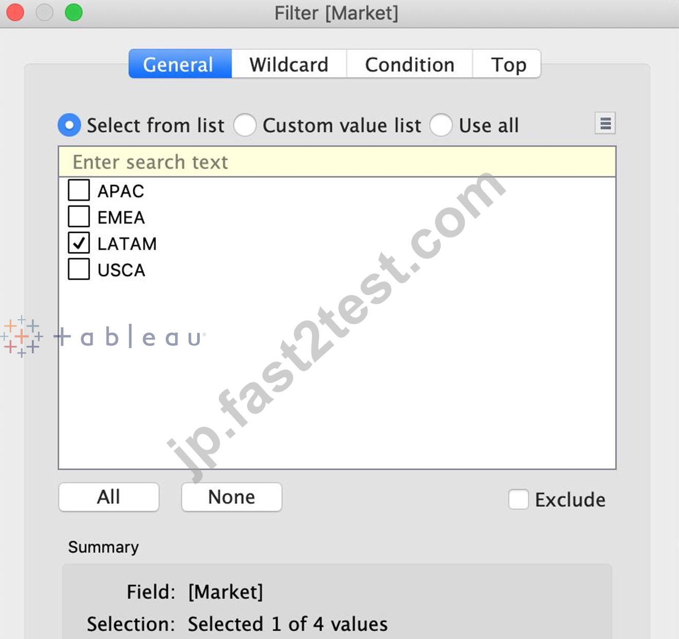
5) Drag Country to the view, and the new calculated field 'ShippingDelay' to SIZE on the Marks Shelf as follows:
*You can also click on Show Text Labels to be sure that you're choosing the Largest value*
Clearly, Mexico has the highest Shipping Delay!
質問 # 36
Which of the following sets would you use to compare the members?
- A. Combined Sets
- B. Static Sets
- C. None of these
- D. Dynamic Sets
正解:A
解説:
You can combine two sets to compare the members. When you combine sets you create a new set containing either the combination of all members, just the members that exist in both, or members that exist in one set but not the other.
Combining sets allows you to answer complex questions and compare cohorts of your data. For example, to determine the percentage of customers who purchased both last year and this year, you can combine two sets containing the customers from each year and return only the customers that exist in both sets.
To combine two sets, they must be based on the same dimensions. That is, you can combine a set containing the top customers with another set containing the customers that purchased last year. However, you cannot combine the top customers set with a top products set.


質問 # 37
You have a workbook that contains one data source and you need to combine data from another database. What should you do first?
- A. Edit the existing connection.
- B. Add a new connection.
- C. Create an extract.
- D. Add a new data source from the data source canvas.
正解:B
解説:
To combine data from another database with an existing data source in Tableau, the first step is to add a new connection. This will allow you to access the additional database and either blend or join the data from the two sources depending on your analysis needs.
質問 # 38
Are animations enabled by default in Tableau?
- A. No
- B. Yes
正解:A
解説:
No, by default, animations are not enabled in Tableau.
We can animate visualizations to better highlight changing patterns in your data, reveal spikes and outliers, and see how data points cluster and separate.
Animations visually transition between filter, sort, and zoom settings, different pages, and changes to filter, parameter, and set actions. As visualizations animate in response to these changes, viewers can more clearly see how data differs, helping them make better informed decisions.
When you author animations, you can choose between two different styles: simultaneous or sequential. Here are examples of each type.
1) Simultaneous animations
The default simultaneous animations are faster and work well when showing value changes in simpler charts and dashboards.
2) Sequential animations
Sequential animations take more time but make complex changes clearer by presenting them step-by-step.
To Animate visualizations in a workbook:
1) Choose Format > Animations.
2) If you want to animate every sheet, under Workbook Default, click On. Then do the following:
For Duration, choose a preset, or specify a custom duration of up to 10 seconds.
For Style, choose Simultaneous to play all animations at once or Sequential to fade out marks, move and sort them, and then fade them in.
3) To override workbook defaults for a particular sheet, change the settings under Selected Sheet.
質問 # 39
If you see a Blue field, generally it will add _____________ to the view
- A. none
- B. both
- C. headers
- D. axis
正解:C
解説:
Important question!
質問 # 40
Which of the following options best describe measures?
- A. They are numerical, quantitative
- B. They are numerical, qualitative
- C. They are categorical, quantitative
- D. They are categorical, qualitative
正解:A
解説:
Data fields are made from the columns in your data source. Each field is automatically assigned a data type (such as integer, string, date), and a role: Discrete Dimension or Continuous Measure (more common), or Continuous Dimension or Discrete Measure (less common).
Dimensions contain qualitative values (such as names, dates, or geographical data). You can use dimensions to categorize, segment, and reveal the details in your data. Dimensions affect the level of detail in the view.
Measures contain numeric, quantitative values that you can measure. Measures can be aggregated. When you drag a measure into the view, Tableau applies an aggregation to that measure (by default).
質問 # 41
For creating variable sized bins we use __________________
- A. Table Calculations
- B. Calculated Fields
- C. Sets
- D. Groups
正解:B
解説:
One way to view a measure in Tableau Desktop is to split it into bins. You can think of bins as buckets based on a range of values. For example, say you have a measure that represents age. Instead of aggregating the measure to calculate the average age, you can bin the measure to define age groups: 0-5, 6-10, 11-15, and so on. Then you can count the number of people in each age group.
Create a calculated field for variable bin size
Step 1
Select Analysis > Create Calculated Field.
Step 2
In the Calculated Field dialog box, complete the following steps:
質問 # 42
If you see the following Filter, then you're working with _______________________ Larger image
- A. Date Parts
- B. Date Values
- C. Grouped Dates
- D. Date Functions
正解:B
解説:
Explanation
Dates in Tableau will behave differently depending on whether they are a Datepart (blue) or a Datevalue (green). This affects how the axes display/behave and also how visualisations such as line charts will display.
The difference essentially boils down to Dateparts behaving like a dimension as opposed to a measure which is how Datevalues behave. This means that Dateparts behave like discrete categories on the view whereas Datevalues are more like continuous numeric values.
Dateparts are discrete and they behave the same as dimension filters. If all dates are used on the filter then each individual date will be a datepart that can be selected/excluded. This is the same for each level of date, if datepart months is placed on filters January to December will be tick-able options in the filter. This also means that conditions and top/bottom filters can be applied to datepart filters like any other dimension filter.
Datevalues placed on filters behave like measure filters. A min and a max date can be set and there is a relative dates option which allows you to choose things like only show the previous 3 months or years etc.
質問 # 43
Tableau auto-generates ____________ dimension(s) and _____________ measure(s) for us
- A. 2 , 3
- B. 2 , 2
- C. 1 , 4
- D. 1 , 2
正解:C
解説:
Explanation
Tableau auto-generates :
1 Dimension - Measure Names
4 Measures - Latitude, Longitude, Number of records, Measure Values
Starting with Tableau 2020.2, every table in a data source has a Count field, in the form of NameofTable(Count). The table count field is an automatically generated, calculated field. (THIS IS NOT PRESENT IN VERSION 2020.1 ON WHICH THE EXAM IS CURRENTLY BASED)
質問 # 44
Which two elements can have their values changed by using a dashboard action? Choose two.
- A. Parameters
- B. Sets
- C. Groups
- D. Bins
正解:A、B
解説:
In Tableau, the two elements that can have their values changed by using a dashboard action are Sets and Parameters. Dashboard actions can be configured to modify the values within a set or a parameter, allowing for interactive and dynamic changes in the visualization based on user interactions. For example, selecting a specific data point in a dashboard can trigger an action that updates a set or changes the value of a parameter, which in turn can alter the displayed data or the appearance of visualizations within the dashboard.
質問 # 45
......
Tableau TDS-C01問題集で一発合格できる問題を試そう!:https://jp.fast2test.com/TDS-C01-premium-file.html
TDS-C01問題集を掴み取れ![最新2025]Tableau試験問題を提供しています:https://drive.google.com/open?id=1EZEKGuVrzRmNL5nxXJ1rS_iizgJkTwYK