

TDS-C01練習Tableau高合格率回答あなたを試験は高確率で合格させます![2025]
最高の方法からパスTableau Desktop SpecialistのTDS-C01試験合格させます
質問 # 19
Which of the following are valid options to define the scope of a reference line? Choose 3.
- A. Window
- B. cell
- C. Pane
- D. Section
- E. Axis
- F. Table
正解:B、C、F
解説:
When we create a reference line, we get the following 3 options for the scope:
質問 # 20
You have the following visualization.
Which set type is created when you select the Create Set option?
- A. A combined set
- B. A Top N set
- C. A dynamic set
- D. A fixed set
正解:C
解説:
When you use the 'Create Set' option in Tableau, it creates a dynamic set if the conditions for inclusion in the set are based on a calculation or an aggregation that may change as the data is updated or as filters are applied.
Fixed sets are static and do not change with data refreshes, while dynamic sets can update to reflect the current state of the data.
質問 # 21
Using the cwurData table, create a cross-tab showing the number of Publications per Country broken down by Institution, and filtered by Country to only show United Kingdown (UK). For the University of Manchester, what percent of the total publications were contributed in 2014?
- A. 22.404%
- B. 25.683%
- C. 28.415%
- D. 23.497%
正解:A
解説:
Phew! Tricky one for sure. This question tests multiple concepts and will help you revise them. We'll be using filters, as well as quick table calculations (percent of total) for this one.
1) Firstly, let's drag Country and Institution to the Rows shelf, and year (discrete) to the Columns shelf.
Then, drag Publications to the Text Icon in the Marks Shelf. The following is our view: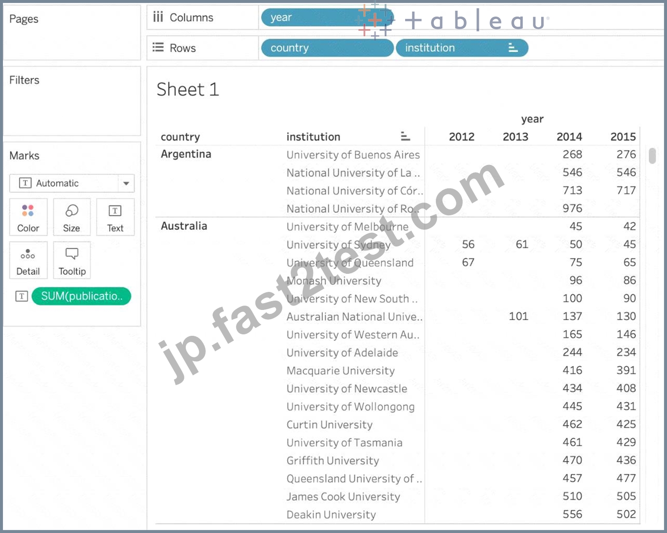
質問 # 22
True or False: A LEFT JOIN or INNER JOIN creates a row each time the join criteria is satisfied, which can result in duplicate rows. One way to avoid this is to use data blending instead.
- A. True
- B. False
正解:A
解説:
Joins combine tables by adding more columns of data across similar row structures. This can cause data loss or duplication if tables are at different levels of detail, and joined data sources must be fixed before analysis can begin.
Inner join
Left Join
Blends, unlike relationships or joins, never truly combine the data. Instead, blends query each data source independently, the results are aggregated to the appropriate level, then the results are presented visually together in the view.
質問 # 23
When working with Excel, text file data, JSON file, .pdf file data, you can use _________________ to union files across folders, and worksheets across workbooks. Search is scoped to the selected connection.
- A. Union Search
- B. Regex Search
- C. Wildcard Search
- D. Pattern Search
正解:C
解説:
You can use Wildcard Search to set up search criteria to automatically include tables in your union. Use the wildcard character, which is an asterisk (*), to match a sequence or pattern of characters in the Excel workbook and worksheet names, Google Sheets workbook and worksheet names, text file names, JSON file names, .pdf file names, and database table names.
When working with Excel, text file data, JSON file, .pdf file data, you can also use this method to union files across folders, and worksheets across workbooks. Search is scoped to the selected connection. The connection and the tables available in a connection are shown on the left pane of the Data source page.

質問 # 24
How can you MANUALLY assign geographic roles to a dimension from the data pane?
- A. Right click it -> Geographic role -> and then assign the appropriate geographic role
- B. Edit the config file in My Documents -> MyTableauRepository for a quick fix
- C. Edit the data source manually for a quick resolution
- D. Right click it -> Edit Default properties -> Assign geographic roles
正解:A
解説:
Explanation
From the data pane, simply right click on the dimension, choose geographic role, and then select the appropriate role as follows:
質問 # 25
_________________ is useful when you need to change how the data source is configured on a sheet-by-sheet basis, and when you want to combine databases that don't allow relationships or joins
- A. Union
- B. Data segregation
- C. Data Joining
- D. Data Blending
正解:D
解説:
Data blending is performed on a sheet-by-sheet basis and is established when a field from a second data source is used in the view. To create a blend in a workbook already connected to at least two data sources, bring a field from one data source to the sheet-it becomes the primary data source.
Switch to the other data source and use a field on the same sheet-it becomes a secondary data source. An orange linking icon will appear in the data pane, indicating which field(s) are being used to blend the data sources.
According to the official Tableau Documentation:
To read more about Data Blending, click on THIS link.
質問 # 26
______________ refers to the level of detail for a piece of data, wherever you are looking.
- A. Data connectivity
- B. Data granularity
- C. Data LOD
- D. Data Cleanliness
正解:B
解説:
Data is generated and analyzed at many different levels of granularity. Granularity is the level of detail of the data. For example, when looking at graduation data, granularity would describe whether a row in the data set represents a single person or the graduating class of a university.
質問 # 27
Using the CoffeeChain table, create a Dual Axis chart showing the Sales (Bar chart) and Profit (Line Chart) for each Product type. What was the Profit for the Herbal Tea product type in 2013?
- A. 74,683
- B. 46,493
- C. 68,620
- D. 37,455
正解:D
解説:
Explanation
If you answered this question quickly and correctly, you're well prepared for the exam! Most students stumble while creating a Dual axis chart, so go ahead and give yourself a pat on the back!
To create a dual axis chart for the problem mentioned:
1) Drag Product Type to the column shelf, and Sales and Profit to the Row shelf:
2) Now, to focus on 2013, drag Date to the filter shelf and select only 2013:

3) Now, click on the Profit pill in the Rows Shelf, and select dual axis:
4) Now, in the marks shelf, choose Sales, and change the chart type to bar. Similarly, for Profit, change the chart type to Line.
Now the chart looks like this:
Now we change the Profit chart type to line:

5) Finally, we synchronise the axis as follows: Right click on the axis, and choose 'Synchronise axis'
And, our final view and answer is:
質問 # 28
True or False: LEFT JOIN returns all rows from the left table, with the matching rows in the right table
- A. True
- B. False
正解:A
解説:
Explanation
This is true, indeed!
The LEFT JOIN keyword returns all records from the left table (table1), and the matched records from the right table (table2). The result is NULL from the right side, if there is no match.
質問 # 29
Suppose you have a bar chart. When we group by labels in a view, which of the following happens?
- A. The colours of the members selected are now the same, and different for the rest of the members.
- B. A new mark (bar) is created, which consolidates all members of the group.
- C. Trick question! It is not possible to group by labels.
- D. Nothing changes in the view, but a group is created in the Dimensions shelf.
正解:B
解説:
*Very important question*
If we select the labels in the view and then group, a new consolidated mark is created - in our case bar since we are talking about a bar chart in the question. See below:
Then on grouping, a new bar is created, and the colour of all bars remain the same.
Had we grouped by choosing the marks instead of the labels, the following would be the result:
質問 # 30
True or False: LEFT JOIN returns all rows from the left table, with the matching rows in the right table
- A. True
- B. False
正解:A
解説:
This is true, indeed!
The LEFT JOIN keyword returns all records from the left table (table1), and the matched records from the right table (table2). The result is NULL from the right side, if there is no match.
質問 # 31
Which of the following sets would you use to compare the members?
- A. Dynamic Sets
- B. Static Sets
- C. None of these
- D. Combined Sets
正解:D
解説:
You can combine two sets to compare the members. When you combine sets you create a new set containing either the combination of all members, just the members that exist in both, or members that exist in one set but not the other.
Combining sets allows you to answer complex questions and compare cohorts of your data. For example, to determine the percentage of customers who purchased both last year and this year, you can combine two sets containing the customers from each year and return only the customers that exist in both sets.
To combine two sets, they must be based on the same dimensions. That is, you can combine a set containing the top customers with another set containing the customers that purchased last year. However, you cannot combine the top customers set with a top products set.


質問 # 32
When using a Blend, what is the color of tick-mark on the primary and secondary data sources respectively?
- A. Orange, Blue
- B. Red, Blue
- C. Blue, Red
- D. Blue, Orange
正解:D
解説:
Explanation
When using a Blend, the primary data source appears with a BLUE tick-mark and the secondary data source appears with a ORANGE tick-mark.
See below:
質問 # 33
Which of the following is NOT a new feature introduced in Tableau 2020.1?
- A. Dynamic Paramaters
- B. Set Control
- C. Viz Animations
- D. Buffer Calculations
正解:B
解説:
Your Tableau Desktop Specialist exam will be based on the 2020.1 version.
Set controls are a new feature introduced in the 2020.2 version, and hence is the correct answer - it is not a part of 2020.1 For the 2020.1 version the new features were:
1) Viz animations:
Viz animations help you see and understand your changing data. It's easy to track the logical steps behind data's evolution and tell powerful data stories. Sorting, filtering, adding fields, and other actions will now smoothly animate your visualizations. Choose whether to turn Viz Animations on or off, and decide how you'd best like to apply animations to your new workbooks.
2) Dynamic Parameters:
Say goodbye to republishing workbooks with parameters every time the underlying data changes. Set your parameter once, and Tableau will automatically update the parameter's list of values every time someone opens the workbook.
3) Buffer Calculations:
Buffer calculations allow you to visualize the distance around point locations. Give Tableau three parameters-location, distance, and a unit of measure-and a buffer, or boundary is instantly created. Answering complex spatial questions becomes easier than ever before-visualize what properties are within 200 meters of a proposed transit site, or how many competitors' stores are within 1 mile of their store, and more.
質問 # 34
Which of the following points are True about Viz Animations?
- A. Animations work well with maps, polygons, and density marks in web
browsers - B. Sequential animations take more time but make complex changes
clearer by presenting them step-by-step - C. They can be turned on for certain worksheets only
- D. It is possible to turn them on for the entire workbook at once
正解:B、C、D
解説:
All of the given options are true except - Animations work well with maps, polygons, and density marks in web browsers.
From the official documentation:

As seen above, we can either turn the animations for the entire workbook (upper red box), or only for the current sheet ( lower red box )
1) Simultaneous animations
The default simultaneous animations are faster and work well when showing value changes in simpler charts and dashboards.
2) Sequential animations
Sequential animations take more time but make complex changes clearer by presenting them step-by-step.
質問 # 35
When there are both negative and positive values for a field, the default range of values will use two color ranges. This is known as a ______________ palette.
- A. reversed
- B. stepped
- C. converging
- D. diverging
正解:D
解説:
質問 # 36
When you want to first apply a filter and THEN show the Top N or Bottom N elements, which of the following filters would you use?
- A. Context Filter
- B. Data source Filter
- C. Extract Filter
- D. None of the these
正解:A
解説:
IMPORTANT QUESTION, PAY ATTENTION
By default, all filters that you set in Tableau are computed independently. That is, each filter accesses all rows in your data source without regard to other filters. However, you can set one or more categorical filters as context filters for the view. You can think of a context filter as being an independent filter. Any other filters that you set are defined as dependent filters because they process only the data that passes through the context filter.
You may create a context filter to:
1) Improve performance - If you set a lot of filters or have a large data source, the queries can be slow. You can set one or more context filters to improve performance.
2) Create a dependent numerical or top N filter - You can set a context filter to include only the data of interest, and then set a numerical or a top N filter.
質問 # 37
Is it possible to make a Measure discrete?
- A. Yes
- B. No
正解:A
解説:
Of course! Follow along:
Right click on any measure, and choose Discrete as shown:
Once you do this, the green pill becomes blue in colour, indicating that it is now Discrete!
質問 # 38
Which of the following are True for Measure Names?
- A. When working with a text table showing Profit for each Category,
when you add Sales to the text table (by dragging it and dropping it in the view), the measure names field is automatically dragged to the row and filter shelves. - B. When you add it to a view, all of the measure names appear as row or column headers in the view.
- C. It contains all the measures in your data, collected into a single field with continuous values.
- D. It contains the names of all measures in your data, collected into a single field with discrete values.
正解:A、B、D
解説:
It contains all the measures in your data, collected into a single field with continuous values - This is the definition for 'Measure Values'.
All others are True w.r.t. Measure Names!
The Measure Names field contains the names of all measures in your data, collected into a single field with discrete values.
Graphical user interface, text, application, email Description automatically generated
Documentation
1: https://help.tableau.com/current/pro/desktop/en-us/datafields_understanddatawindow_meavalues.htm
質問 # 39
Broadly speaking, after an importing a dataset in Tableau Desktop, all fields in it are broken down into
_______________________
- A. Rows and Columns
- B. Dimensions and Measures
- C. Labels and Values
- D. Numbers and Headers
正解:B
解説:
Explanation
When you connect to a new data source, Tableau assigns each field in the data source as dimension or measure in the Data pane, depending on the type of data the field contains. You use these fields to build views of your data.
Further,
質問 # 40
What is the default behavior of Tableau when you add a measure to the view?
- A. An aggregation is applied that varies depending on the context of the view.
- B. An aggregation is applied that is independent of the context of the view.
- C. You are prompted to add an aggregation.
- D. The measure is added disaggregated.
正解:A
解説:
The default behavior of Tableau when you add a measure to the view is to automatically apply an aggregation to that measure. The type of aggregation applied can vary depending on the context of the view. For example, if no other measures or dimensions affect the measure, Tableau might default to SUM. However, if there are other dimensions in the view that define the level of detail, the aggregation might be different to reflect the context.
質問 # 41
You can create _______________ for members in a dimension so that their labels appear differently in the view.
- A. copies
- B. duplicates
- C. parameters
- D. aliases
正解:D
解説:
You can create aliases (alternate names) for members in a dimension so that their labels appear differently in the view.
Aliases can be created for the members of discrete dimensions only. They cannot be created for continuous dimensions, dates, or measures.
To create an alias:
1) In the Data pane, right-click a dimension and select Aliases.
2) In the Edit Aliases dialog box, under Value (Alias), select a member and enter a new name.
* To submit your changes: In Tableau Desktop, click OK.
On Tableau Server or Tableau Online, click the X icon in the top-right corner of the dialog box.
When you add the field to the view, the alias names appear as labels in the view. For example:
質問 # 42
You have the following visualization.
Where should you place a field named Region to show multiple distinct lines on the same axis?
- A. The Columns shelf
- B. The Rows shelf
- C. Color on the Marks card
- D. Path on the Marks card
正解:C
解説:
To display multiple distinct lines on the same axis based on a field, you should place the field on the Color shelf in the Marks card. This will encode each distinct value in the Region field with a different color, resulting in separate lines for each region on the same axis.
質問 # 43
Which of the following is not a Trend Line Model?
- A. Logarithmic Trend Line
- B. Linear Trend Line
- C. Exponential Trend Line
- D. binomial Trend Line
正解:D
解説:
According to the official Tableau documentation, there are 5 types of trend lines which we can work with in Tableau :
1) Linear Trend Line
2) Logarithmic Trend Line
3) Exponential Trend Line
4) Polynomial Trend Line
5) Power Model
Hence, the correct answer is BINOMIAL trend line which is not present in Tableau.
See the following image:
For more information, refer to: https://help.tableau.com/current/pro/desktop/en-us/trendlines_add.htm
質問 # 44
......
この試験は36問の選択式問題からなり、試験時間は2時間です。合格するには最低70%の点数を取る必要があります。試験は、データ接続、データソース、データブレンディング、計算、可視化などの様々なトピックをカバーしています。
Tableau TDS-C01事前に試験練習テストFast2test: :https://jp.fast2test.com/TDS-C01-premium-file.html
TDS-C01練習テスト問題回答解釈::https://drive.google.com/open?id=1EZEKGuVrzRmNL5nxXJ1rS_iizgJkTwYK