

試験準備には欠かさない!TDS-C01問題解答でTDS-C01試験問題集
リアルTableau TDS-C01試験問題 [更新されたのは2024年]
Tableau TDS-C01試験の準備をするために、候補者はTableau Webサイトで利用可能なさまざまなリソースを活用できます。 Tableauは、候補者が試験の準備を支援するために、無料のトレーニングビデオ、練習試験、および学習資料を提供しています。候補者は、Tableauトレーニングコースに参加したり、認定されたTableauの専門家からガイダンスを求めて知識とスキルを向上させることもできます。適切な準備をすれば、候補者はTableau TDS-C01試験に合格し、Tableau Desktopスペシャリスト認定を獲得できます。これにより、キャリアを進めて専門的な目標を達成できます。
Tableau TDS-C01 認定試験の出題範囲:
| トピック | 出題範囲 |
|---|---|
| トピック 1 |
|
| トピック 2 |
|
| トピック 3 |
|
| トピック 4 |
|
| トピック 5 |
|
| トピック 6 |
|
| トピック 7 |
|
| トピック 8 |
|
| トピック 9 |
|
| トピック 10 |
|
質問 # 40
What are two examples of a date value?
Choose two.
- A. January 1.1995
- B. Wednesday
- C. December
- D. 2020-05-01
正解:A、D
解説:
Date values in Tableau represent specific points in time and are typically formatted in a standard date format.
Option A, "2020-05-01", is a standard date format representing the 1st of May, 2020.
Option D, "January 1, 1995", is another example of a date value, representing the 1st of January, 1995. Options B ("December") and C ("Wednesday") represent a month and a day of the week, respectively, but do not specify a particular date.
質問 # 41
For a relative date filter, the default anchor is _________________
- A. The target date
- B. Today's date
- C. The current time
- D. The date we specify
正解:A
解説:
Relative date filters dynamically update to show a time period relative to when you open the view, such as the current week, the year to date, or the past 10 days. Relative date filters make it easy to create views that always show the most recent data.
Step 1: Drag a date field to the filter shelf
Right-click (control-click on Mac) and drag a date field from the Data window to the Filters shelf. In the Filter Field dialog box, click Relative Date, and then click Next.
Step 2: Select a time unit
In the Filter dialog box, click Relative dates, and then select the unit of time for the filter. For example, to show only the three most recent weeks, select Weeks.
Here, you can clearly see that the default date is TODAY
質問 # 42
When you want to first apply a filter and THEN show the Top N or Bottom N elements, which of the following filters would you use?
- A. Context Filter
- B. Extract Filter
- C. None of the these
- D. Data source Filter
正解:A
解説:
Explanation
IMPORTANT QUESTION, PAY ATTENTION
By default, all filters that you set in Tableau are computed independently. That is, each filter accesses all rows in your data source without regard to other filters. However, you can set one or more categorical filters as context filters for the view. You can think of a context filter as being an independent filter. Any other filters that you set are defined as dependent filters because they process only the data that passes through the context filter.
You may create a context filter to:
1) Improve performance - If you set a lot of filters or have a large data source, the queries can be slow. You can set one or more context filters to improve performance.
2) Create a dependent numerical or top N filter - You can set a context filter to include only the data of interest, and then set a numerical or a top N filter.
質問 # 43
You have the following visualization.
Where should you place a field named Region to show multiple distinct lines on the same axis?
- A. The Columns shelf
- B. Path on the Marks card
- C. The Rows shelf
- D. Color on the Marks card
正解:D
解説:
To display multiple distinct lines on the same axis based on a field, you should place the field on the Color shelf in the Marks card. This will encode each distinct value in the Region field with a different color, resulting in separate lines for each region on the same axis.
質問 # 44
To display data that has both negative and positive quantitative values, Tableau Desktop will display marks by using__________________as the default.
- A. the full color range
- B. a sequential palette
- C. a diverging palette
- D. a categorical palette
正解:C
解説:
Tableau Desktop will display marks by using a diverging palette as the default to display data that has both negative and positive quantitative values. A diverging palette is a type of color palette that uses two different color ranges to show positive and negative values. For example, a red-green diverging palette uses shades of red for negative values and shades of green for positive values. A diverging palette is automatically applied when there are both negative and positive values for a measure that is placed on Color on the Marks card5 The other options are not correct types of color palettes that Tableau Desktop uses as the default for data with both negative and positive values. A full color range is not a valid term for a color palette in Tableau. A sequential palette is a type of color palette that uses different shades of one color to show variations in a single measure. A sequential palette is usually applied when there are only positive values for a measure that is placed on Color on the Marks card5 A categorical palette is a type of color palette that uses different colors to show discrete values or categories. A categorical palette is usually applied when there is a dimension that is placed on Color on the Marks card5
質問 # 45
Larger image
What is this view referred to as in Tableau?
- A. Window Pane
- B. Dimensions & Measures
- C. Data Pane
- D. Analytics Pane
正解:C
解説:
Explanation
Tableau displays data source connections and data fields for the workbook in the Data pane on the left side of the workspace.
The Data pane includes:
Dimension fields - Fields that contain qualitative values (such as names, dates, or geographical data). You can use dimensions to categorize, segment, and reveal the details in your data. Dimensions affect the level of detail in the view. Examples of dimensions include dates, customer names, and customer segments.
Measure fields - Fields that contain numeric, quantitative values can be measured. You can apply calculations to them and aggregate them. When you drag a measure into the view, Tableau applies an aggregation to that measure (by default). Examples of measures: sales, profit, number of employees, temperature, frequency.
For more information on what dimensions and measures are, see Dimensions and Measures, Blue and Green.
Calculated fields - If your underlying data doesn't include all of the fields you need to answer your questions, you can create new fields in Tableau using calculations and then save them as part of your data source. These fields are called calculated fields.
For more information on calculated fields, see Create Custom Fields with Calculations.
Sets - Subsets of data that you define. Sets are custom fields based on existing dimensions and criteria that you specify. For more information, see Create Sets.
Named sets from an MS Analysis Services server or from a Teradata OLAP connector also appear in Tableau in this area of the Data pane. You can interact with these named sets in the same way you interact with other custom sets in Tableau.
Parameters - Values that can be used as placeholders in formulas, or replace constant values in calculated fields and filters. For more information, see Create Parameters.
質問 # 46
_________________ are a local copy of a subset or entire data set that you can use to share data with others, when you need to work offline, and improve performance.
- A. .twb files
- B. .tde files
- C. .twbx files
- D. .tbm files
正解:B
解説:
Explanation
According to the official Tableau documentation:
Depending on the version the extract was created in, Tableau extract files can have either the .hyper or .tde file extension. Extract files are a local copy of a subset or entire data set that you can use to share data with others, when you need to work offline, and improve performance. For more information, see Extract Your Data.
質問 # 47
DOWNLOAD THE DATASET FROM:
https://drive.google.com/drive/folders/1WXzqsrNmXVdmQ-574wld4InEplyKT8RP?usp=sharing (if you haven't already) Using the cwurData table, plot a Map to see which country had the Second highest number of patents in the Year 2013?
- A. France
- B. United Kingdom
- C. United States
- D. Canada
正解:A
解説:
Follow along to get the correct answer:
* Drag Country to the view, and then Patents to the Size Mark on the Marks shelf as follows :
2) But, this isn't all right? We need to focus on the year 2013. This can be done by using the year column as it is (continuous) in the filter shelf, or by converting it to discrete first and then using it:
2.1 As it is (continuous)
2.2 Converting to discrete first & then using it
and then :
3) We can now see that France, with 485 has the 2nd most number of patents for the year 2013
質問 # 48
What does it imply if a field has a blue background?
- A. It is discrete
- B. It is a dimension
- C. It is continuous
- D. It is a measure
正解:A
解説:
When you connect to a new data source, Tableau assigns each field in the data source as dimension or measure in the Data pane, depending on the type of data the field contains. You use these fields to build views of your data.
質問 # 49
Are animations enabled by default in Tableau?
- A. Yes
- B. No
正解:B
解説:
No, by default, animations are not enabled in Tableau.
We can animate visualizations to better highlight changing patterns in your data, reveal spikes and outliers, and see how data points cluster and separate.
Animations visually transition between filter, sort, and zoom settings, different pages, and changes to filter, parameter, and set actions. As visualizations animate in response to these changes, viewers can more clearly see how data differs, helping them make better informed decisions.
When you author animations, you can choose between two different styles: simultaneous or sequential. Here are examples of each type.
1) Simultaneous animations
The default simultaneous animations are faster and work well when showing value changes in simpler charts and dashboards.
2) Sequential animations
Sequential animations take more time but make complex changes clearer by presenting them step-by-step.
To Animate visualizations in a workbook:
1) Choose Format > Animations.
2) If you want to animate every sheet, under Workbook Default, click On. Then do the following:
For Duration, choose a preset, or specify a custom duration of up to 10 seconds.
For Style, choose Simultaneous to play all animations at once or Sequential to fade out marks, move and sort them, and then fade them in.
3) To override workbook defaults for a particular sheet, change the settings under Selected Sheet.
質問 # 50
Which statement accurately describes an extract when the Physical Tables option is selected?
- A. An individual table is created for each physical table in the extract.
- B. Data is limited to only the Top N of data for the connection.
- C. Data shown in the Data pane is separated based on the table type.
- D. All the data is tolled up to the current visible fields.
正解:A
解説:
When the Physical Tables option is selected for an extract in Tableau, an individual table is created for each physical table in the extract. This means that the extract will include a separate table for each underlying table in your database, maintaining the database's structure within the extract. This can be useful when you need to preserve the original granularity of the data or when working with certain database optimizations.
質問 # 51
When field names in the Union do not match, then:
- A. Both field names are present in the Union, but contain several null values
- B. Only one field name is present in the Union with null values
- C. Only one field name is present in the Union with correct values since Tableau automatically corrects field name mismatch
- D. An error is raised and both fields are dropped from the resulting Union
正解:A
解説:
By default, both field names are present in the Union, but contain several null values!
When field names in the union do not match, fields in the union contain null values. You can merge the non-matching fields into a single field using the merge option to remove the null values. When you use the merge option, the original fields are replaced by a new field that displays the first non-null value for each row in the non-matching fields.
You can also create your own calculation or, if possible, modify the underlying data to combine the non-matching fields.
For example, suppose you have the following customer purchase information stored in three tables, separated by month. The table names are "May2016," "June2016," and "July2016." Table Description automatically generated
A union of these tables creates the following single table that contains all rows from all tables.
Table Description automatically generated
Now suppose a fourth table, "August2016", is added to the underlying data. Instead of the standard
"Customer" field name, it contains an abbreviated version called "Cust." Table Description automatically generated
Table Description automatically generated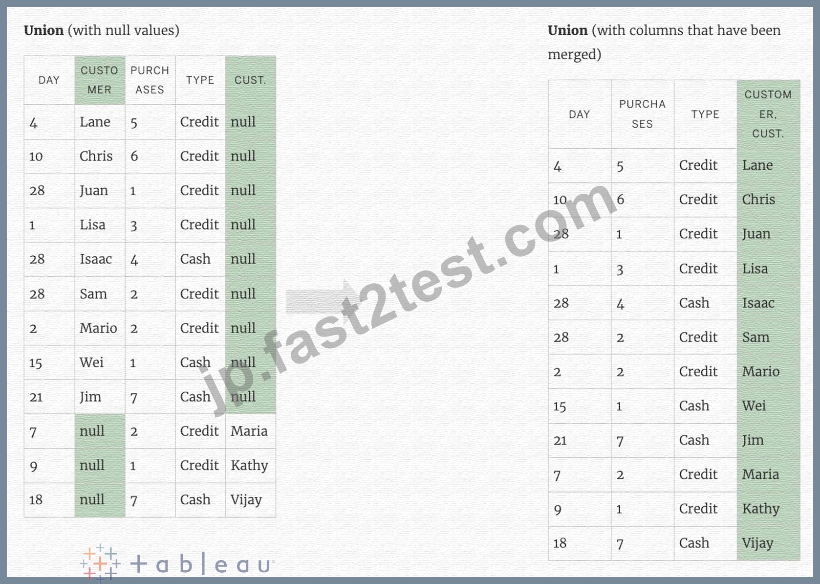
質問 # 52
How can you MANUALLY assign geographic roles to a dimension from the data pane?
- A. Edit the config file in My Documents -> MyTableauRepository for a quick fix
- B. Edit the data source manually for a quick resolution
- C. Right click it -> Geographic role -> and then assign the appropriate geographic role
- D. Right click it -> Edit Default properties -> Assign geographic roles
正解:C
解説:
From the data pane, simply right click on the dimension, choose geographic role, and then select the appropriate role as follows:
質問 # 53
Using the Time Series Table, create a Line chart showing the Monthly Year over Year Growth for the Sales, broken down by Assortment. For the Electronics assortment, which Month had the most NEGATIVE value of Year over Year Growth?
- A. July
- B. June
- C. October
- D. September
正解:C
解説:
Follow along:
1) Drag Assortment and Year ID (choose Discrete Month) to Columns shelf, and Sales to the Columns Shelf.
For sales, click on the pill -> choose Quick Table calculation -> Year over Year growth.
The view should now look like:
質問 # 54
You are creating a combined axis chart.
Where should you drag the second measure after dragging the first measure to the Rows shelf?
- A. The Filter card
- B. The vertical axis in the view
- C. The Marks card
- D. The horizontal axis in the view
正解:D
解説:
In Tableau, when creating a combined axis chart, after dragging the first measure to the Rows shelf, you should drag the second measure directly onto the existing axis in the view. This will combine both measures on the same axis, allowing them to share a scale and an axis, which is the essence of a combined axis chart.
質問 # 55
Which of the following are valid ways to export a dashboard with multiple visualisations as an image?
- A. Right click on the dashboard, and choose Copy, then image.
- B. using the floating export worksheet option on the Dashboard
- C. Click on Dashboard in the Menu bar followed by Copy Image
- D. Click on Worksheet in the Menu bar followed by Export, then choose Image
正解:C
解説:
Only 1 option is correct -
Click on Dashboard in the Menu bar followed by Copy Image
Right click on the dashboard, and choose Copy, then image - Try doing this, you will end up copying just one of the worksheets not the entire dashboard Click on Worksheet in the Menu bar followed by Export, then choose Image - Again, try doing this. You will end up copying just one of the worksheets not the entire dashboard Using the floating export worksheet option on the Dashboard - No such option exists
質問 # 56
Which of the following are stored in a .tds file? Choose 3.
- A. Visualizations
- B. Calculated Fields
- C. Data Extracts
- D. Data Connection information
- E. Metadata edits
正解:B、D、E
解説:
If you've created a data connection that you might want to use with other workbooks or share with colleagues, you can export (save) the data source to a file. You might want to do this also if you've added joined tables, default properties, or custom fields-such as groups, sets, calculated fields, and binned fields-to the Data pane.
Visualisations and Data extracts are NOT saved in a .tds file!
質問 # 57
Dates in Tableau are typically treated as ______________
- A. Dimensions
- B. Measures
正解:A
解説:
For relational data sources, dates and times are automatically placed in the Dimensions area of the Data pane and are identified by the date or date-time icon. For example, the Order Date and Ship Date dimensions from an Excel data source are shown below:
When you place a relational date on a shelf, the field name is automatically modified to reflect the default date level. Tableau defines the default date level to be the level at which there are multiple instances. For example, if the date field includes multiple years, the default level is year. However, if the date field contains data for just one year but includes multiple months, then the default level is month.
質問 # 58
What are three benefits of using an extract as compared to a live connection to a data source? Choose three.
- A. An extract reduces the amount of data stored on a client computer as compared to a live data connection.
- B. Calculated fields perform better in workbooks connected to extracts than in workbooks with live connections to a data source.
- C. Extracts are stored in memory (RAM), resulting in faster query performance as compared with live data connections.
- D. A live connection to a data source can be slow due to network and user traffic, whereas a connection to an extract improves performance.
- E. A live connection to a data source provides the best performance for data connections.
正解:B、C、D
解説:
There are three benefits of using an extract as compared to a live connection to a data source:
* A live connection to a data source can be slow due to network and user traffic, whereas a connection to an extract improves performance. An extract is a snapshot of data that is stored locally on your computer or on Tableau Server. An extract can reduce the load on the data source and speed up queries.
* Extracts are stored in memory (RAM), resulting in faster query performance as compared with live data connections. When you use an extract, Tableau loads the data into memory and optimizes it for analysis.
This allows Tableau to perform calculations and aggregations faster than with live connections.
* Calculated fields perform better in workbooks connected to extracts than in workbooks with live connections to a data source. Calculated fields are customfields that you create using formulas or expressions. When you use an extract, Tableau can process calculated fields more efficiently than with live connections.
質問 # 59
When you drop a continuous field on Color, Tableau displays a quantitative legend with a ___________ range of colors.
- A. Mixed
- B. Continuous
- C. Fading
- D. Discrete
正解:B
解説:
When you drop a discrete field on Color in the Marks card, Tableau displays a categorical palette and assigns a color to each value of the field.
When you drop a continuous field on Color, Tableau displays a quantitative legend with a continuous range of colors.
Web version:
Desktop Version:
For more information about color palettes, see Color Palettes and Effects.
質問 # 60
......
Tableau TDS-C01(Tableau Desktop Specialist)認定試験は、Tableau Desktopスキルを向上させたい専門家向けの優れたプログラムです。認定プログラムは、個人にTableau Desktopの包括的な理解を提供し、認定試験に準備させます。認定を取得することで、個人はキャリアの見通しを向上させ、組織は従業員がTableau Desktopを効果的に使用していることを確認できます。
TDS-C01合格させる試験問題集には更新されたのは2024年:https://jp.fast2test.com/TDS-C01-premium-file.html
無料TDS-C01試験問題集でお手軽に試験合格させる:https://drive.google.com/open?id=1EZEKGuVrzRmNL5nxXJ1rS_iizgJkTwYK