

[2023年04月]更新のTDS-C01認定実際の問題を提供します
更新されたのはTDS-C01問題集PDFでTDS-C01リアル有効なブレーン問題集には225問があります!
質問 88
True or False: A LEFT JOIN or INNER JOIN creates a row each time the join criteria is satisfied, which can result in duplicate rows. One way to avoid this is to use data blending instead.
- A. True
- B. False
正解: A
解説:
Explanation
Joins combine tables by adding more columns of data across similar row structures. This can cause data loss or duplication if tables are at different levels of detail, and joined data sources must be fixed before analysis can begin.
Inner join
Left Join
Blends, unlike relationships or joins, never truly combine the data. Instead, blends query each data source independently, the results are aggregated to the appropriate level, then the results are presented visually together in the view.
質問 89
Which of the following 2 columns CANNOT be deleted in Tableau?
- A. Calculated Fields
- B. Number of Records
- C. Measure Names
- D. Measure Values
正解: C,D
解説:
Explanation
Measure names and values CANNOT be deleted in Tableau like other columns can. These are auto-generated.
Calculated Fields, and Number of records can both be deleted.
質問 90
True or False: A LEFT JOIN or INNER JOIN creates a row each time the join criteria is satisfied, which can result in duplicate rows. One way to avoid this is to use data blending instead.
- A. True
- B. False
正解: A
解説:
Joins combine tables by adding more columns of data across similar row structures. This can cause data loss or duplication if tables are at different levels of detail, and joined data sources must be fixed before analysis can begin.
Inner join
Left Join
Blends, unlike relationships or joins, never truly combine the data. Instead, blends query each data source independently, the results are aggregated to the appropriate level, then the results are presented visually together in the view.
質問 91
Which of the following are True for Measure Names?
- A. When you add it to a view, all of the measure names appear as row or column headers in the view.
- B. It contains the names of all measures in your data, collected into a single field with discrete values.
- C. When working with a text table showing Profit for each Category,
when you add Sales to the text table (by dragging it and dropping it in the view), the measure names field is automatically dragged to the row and filter shelves. - D. It contains all the measures in your data, collected into a single field with continuous values.
正解: A,B,C
解説:
It contains all the measures in your data, collected into a single field with continuous values - This is the definition for 'Measure Values'.
All others are True w.r.t. Measure Names!
The Measure Names field contains the names of all measures in your data, collected into a single field with discrete values.
Documentation : https://help.tableau.com/current/pro/desktop/en-us/datafields_understanddatawindow_meavalues.htm
質問 92
Using the dataset, create a bar chart showing the average Quantity broken down by Region, and filtered by Country to only show Japan. What was the average Quantity in the State of Tokyo?
- A. 3.704
- B. 3.500
- C. 3.840
- D. 3.000
正解: A
解説:
Explanation
Since we need to focus on 1 country -> Japan, let's filter on it first as follows:
1) Drag Country to the filter shelf, and choose only Japan. Click OK.
2) Read the Question Carefully, we need to break down the visualisation by Region, then by Country, and then by State. So let's do that:
Drag Region to the column shelf, followed by Country. Drill down into Country to include states as well.
Then drag Quantity to the Row Shelf, and change the Aggregation to AVERAGE.
The following is our visualisation:
Now that you think of it, EVEN IF YOU REMOVE THE REGION, THE ANSWER REMAINS THE SAME.
Such elements will be present in the actual exam too, just to make the question sound a little difficult, but actually it is pretty straightforward :)
質問 93
True or False: The Highlighting action can be disabled for the entire workbook.
- A. True
- B. False
正解: A
解説:
Explanation
Yes, it is possible to disable highlighting for the entire workbook.
For more information : https://help.tableau.com/current/pro/desktop/en-gb/actions_highlight.htm
質問 94
Is it possible to deploy a URL action on a dashboard object to open a Web Page within a dashboard rather than opening the system's web browser?
- A. YES, we can do this with the help of Tableau Public
- B. YES, we can do this with the help of a plugin
- C. YES, we can do this with the help of a Web-Page object
- D. NO, this is not currently possible in Tableau
正解: C
解説:
To interactively display information from the web INSIDE a dashboard, you can use a URL action with a web page object.
For example, you might have a dashboard that shows profits by country. In addition to showing the profit data in your dashboard, you also want to display supplemental information about the countries from a web site.


質問 95
What term is used to describe the following picture?
- A. Set
- B. Larger image
- C. Parameter
- D. Hierarchy
- E. Group
正解: A
解説:
When you connect to a data source, Tableau automatically separates date fields into hierarchies so you can easily break down the viz. You can also create your own custom hierarchies. For example, if you have a set of fields named Region, State, and County, you can create a hierarchy from these fields so that you can quickly drill down between levels in the viz.
質問 96
Is it possible to use measures in the same view multiple times (e.g. SUM of the measure and AVG of the measure)?
- A. No
- B. Yes
正解: B
解説:
Explanation
Yes, it is very much possible to use measures in the same view multiple times. For example, refer to the image below: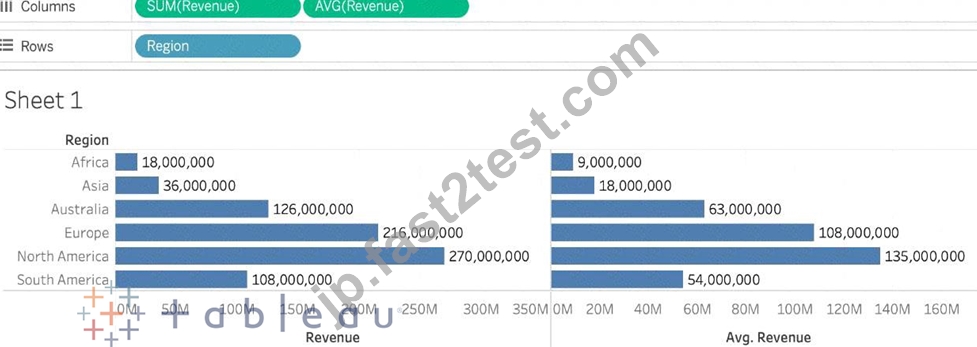
We are using BOTH the Sum of the revenue and the AVG of the revenue in the same view!
質問 97
The row and column shelves contain ___________________
- A. Grand Totals
- B. Parameters
- C. Filters
- D. Pills
正解: D
解説:
Explanation
We can drag fields from the Data pane to create the structure for your visualizations.
The Columns shelf creates the columns of a table, while the Rows shelf creates the rows of a table. You can place any number of fields on these shelves.
These FIELDS are also referred to as PILLS. See below:
質問 98
You want to add Custom shapes to your visualisation. Where can you add these new shapes?
- A. In Downloads -> My Tableau Repository -> Shapes
- B. In My Computer -> C: -> Tableau -> Shapes
- C. In My Documents -> My Tableau Repository -> Shapes
- D. In Program Files -> Tableau -> Shapes
正解: C
解説:
Here's how to add image files to your repository:
1) Find image file on the internet. I try to find consistent image formats if I plan to use a set of shapes such as logos or flags.
2) Download the image to your computer.
3) Drag images into your My Documents -> My Tableau repository -> Shapes folder.
4) Open Tableau and your new shapes will automatically be included in your "edit shapes" menu.
質問 99
We can join a maximum of ______ tables in Tableau
- A. 0
- B. 1
- C. 2
- D. 3
正解: C
解説:
It is possible to join a maximum of 32 tables in Tableau!
質問 100
Using the CoffeeChain table, create a Dual Axis chart showing the Sales (Bar chart) and Profit (Line Chart) for each Product type. What was the Profit for the Herbal Tea product type in 2013?
- A. 37,455
- B. 68,620
- C. 74,683
- D. 46,493
正解: A
解説:
Explanation
If you answered this question quickly and correctly, you're well prepared for the exam! Most students stumble while creating a Dual axis chart, so go ahead and give yourself a pat on the back!
To create a dual axis chart for the problem mentioned:
1) Drag Product Type to the column shelf, and Sales and Profit to the Row shelf:
2) Now, to focus on 2013, drag Date to the filter shelf and select only 2013:

3) Now, click on the Profit pill in the Rows Shelf, and select dual axis:
4) Now, in the marks shelf, choose Sales, and change the chart type to bar. Similarly, for Profit, change the chart type to Line.
Now the chart looks like this:
Now we change the Profit chart type to line:

5) Finally, we synchronise the axis as follows: Right click on the axis, and choose 'Synchronise axis'
And, our final view and answer is:
質問 101
What is a story point in Tableau?
- A. A collection of both worksheets and dashboards
- B. A collection of worksheets
- C. A single worksheet or dashboard
- D. A collection of dashboards
正解: C
解説:
In Tableau, a story is a sequence of visualizations that work together to convey information. You can create stories to tell a data narrative, provide context, demonstrate how decisions relate to outcomes, or to simply make a compelling case.
A story is a sheet, so the methods you use to create, name, and manage worksheets and dashboards also apply to stories (for more details, see Workbooks and Sheets). At the same time, a story is also a collection of sheets, arranged in a sequence. Each individual sheet (worksheet or dashboard) in a story is called a story point.
When you share a story -for example, by publishing a workbook to Tableau Public, Tableau Server, or Tableau Online-users can interact with the story to reveal new findings or ask new questions of the data.
質問 102
True or False: Sets can be created on Measures
- A. False
- B. True
正解: A
解説:
Sets are custom fields that are created within Tableau Desktop based on dimensions from your data source. They are subsets of your data, which can be created manually or computed. Either dimensions or measures can be used to determine what is included or excluded from a set using conditional logic, but to CREATE a set we use dimensions.

質問 103
What is the minimum amount of RAM recommended for any production use of Tableau Server?
- A. 16GB
- B. 64GB
- C. 32GB
- D. 8GB
正解: C
解説:
The computer on which you are installing or upgrading Tableau Server must meet the minimum hardware requirements. If the Setup program determines that your computer does not meet the following requirements, you will not be able to install Tableau Server.
These minimum requirements are appropriate for a computer that you use for prototyping and testing of Tableau Server. They apply to single-node installations and to each computer in a distributed installation.
質問 104
True or False: Context Filters are executed after Data Source filters
- A. True
- B. False
正解: A
解説:
Explanation
THIS IS A VERY IMPORTANT QUESTION
To answer this question, you need to understand Tableau's Order of Operations. See below and remember this always: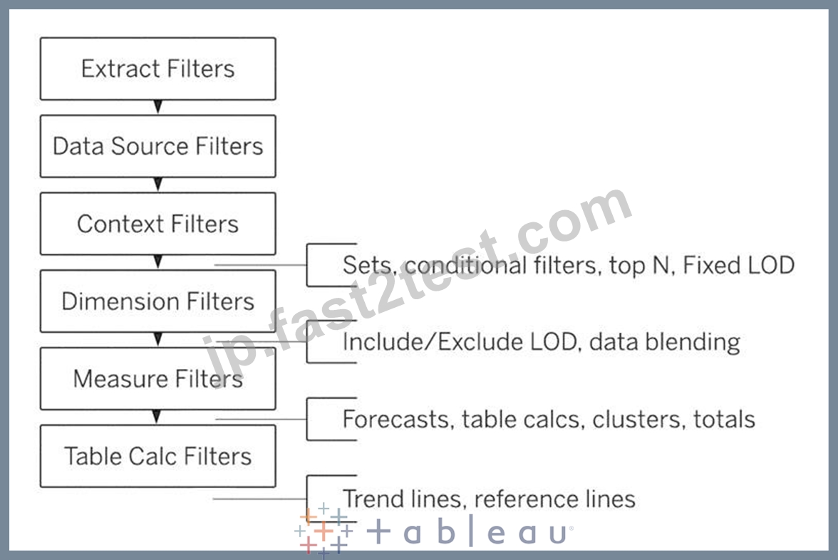
質問 105
The icon associated with the field that has been grouped is a ______________
- A. =#
- B. Paper Clip
- C. Globe
- D. Intersection
正解: B
解説:
You can create a group to combine related members in a field. The icon associated with a group is a paper clip!
質問 106
Using the Time-series table, create a cross tab showing the Sales for each Item Number-ID, broken down by Assortments, then add Grand totals to the view. Which Item Number ID made the maximum sales across all assortments?
- A. 0
- B. Correct)
- C. 1
- D. 2
- E. 3
正解: D
解説:
Explanation
Follow along the steps below:
* Drag Assortment and Year ID to the column shelf, and Item Number ID to the row shelf. Next, drag
* Sales to the Text label to create a cross-tab as below:
質問 107
How can you change the default Tableau repository location?
- A. By clicking on Window -> Repository Location
- B. By Moving the repository location manually to wherever we want
- C. By clicking on File -> Repository Location and choosing a new location
- D. By clicking on Help -> Change Repository Location
正解: B
解説:
Explanation
According to the official Tableau documentation:
質問 108
True or False: It is possible to change the Geographic Role of a dimension
- A. True
- B. False
正解: A
解説:
Explanation
A geographic role associates each value in a field with a latitude and longitude value.
Assigning a geographic role based on the type of location (such as state versus postcode) helps ensure that your data is plotted correctly on your map view. For example, you can assign the City geographic role to a field that contains a list of city names.
To assign a geographic role to a field:
In the Data pane, click the data type icon next to the field, select Geographic Role, and then select the geographic role you want to assign to the field.
When you assign a geographic role to a field, Tableau adds two fields to the Measures area of the Data pane:
Latitude (generated) and Longitude (generated).
These fields contain latitude and longitude values and are assigned the Latitude and Longitude geographic roles. If you double-click each of these fields, Tableau adds them to the Columns and Rows shelves and creates a map view using the Tableau background map.
質問 109
Which of the following are valid way(s) to make either of Rows or Columns Bold without affecting the other?
- A. Choose Format from the Menu bar, select Row or Column, and then select Bold under the header option
- B. Select Text Label on the Marks Card, choose Rows or Columns, and then select Bold.
- C. Choose Format then Font from the Menu bar, and select Bold under the Header option
- D. Right click on Rows or Columns, and choose format. In the Font option click on Bold.
正解: A,D
解説:
1) Right click on Rows or Columns, and choose format. In the Font option click on Bold. (CORRECT) - this will modify only the selected axis (row or column)

2) Choose Format then Font from the Menu bar, and select Bold under the Header option (INCORRECT) - this modifies both rows and columns at the same time
3) Choose Format from the Menu bar, select Row or Column, and then select Bold under the header option (CORRECT) - this will modify only the selected axis (row or column)

4) Select Text Label on the Marks Card, choose Rows or Columns, and then select Bold. (INCORRECT) - no such option exists
質問 110
_________________ is useful when you need to change how the data source is configured on a sheet-by-sheet basis, and when you want to combine databases that don't allow relationships or joins
- A. Union
- B. Data Blending
- C. Data Joining
- D. Data segregation
正解: B
解説:
Explanation
Data blending is performed on a sheet-by-sheet basis and is established when a field from a second data source is used in the view. To create a blend in a workbook already connected to at least two data sources, bring a field from one data source to the sheet-it becomes the primary data source.
Switch to the other data source and use a field on the same sheet-it becomes a secondary data source. An orange linking icon will appear in the data pane, indicating which field(s) are being used to blend the data sources.
According to the official Tableau Documentation:
To read more about Data Blending, click on THIS link.
質問 111
......
あなたをお手軽にTDS-C01試験合格させるし100%試験合格保証:https://jp.fast2test.com/TDS-C01-premium-file.html
100%無料TDS-C01試験問題集実際問題を使おうTableau Desktop Specialist問題集:https://drive.google.com/open?id=1EZEKGuVrzRmNL5nxXJ1rS_iizgJkTwYK