

Web-Development-Applications練習試験と学習ガイドは厳密検証されたFast2test最新な69問題
2025年最新のな厳密検証された合格させるWeb-Development-Applications学習ガイドベズトお試しセット
質問 # 20
Which technique should a developer use for text-based hyperlink on mobile web page?
- A. Keeping links uniform
- B. Deploying graphical links
- C. Padding the clickable area around the link
- D. Using dynamic page elements neat the link
正解:C
解説:
When designing text-based hyperlinks for mobile web pages, it is essential to ensure that the links are easily tappable. Adding padding around the clickable area increases the touch target size, making it easier for users to interact with the link on a mobile device.
* Techniques for Mobile-Friendly Links:
* Padding the Clickable Area: By adding padding, you increase the touchable area around the link, which helps prevent user frustration due to missed taps.
* CSS Example:
a {
padding: 10px;
display: inline-block;
}
* Other Options:
* B. Keeping links uniform: This refers to making all links look the same, which is good for consistency but doesn't specifically address the issue of touch targets.
* C. Deploying graphical links: While graphical links can be effective, they do not necessarily improve touch target size for text-based hyperlinks.
* D. Using dynamic page elements near the link: This can lead to a cluttered interface and does not address the touch target issue directly.
* References:
* MDN Web Docs - Touch targets
* Google Developers - Mobile Web Development
質問 # 21
Given the following code:
What does the console display as output?
- A. 0
- B. 1
- C. 2
正解:B
解説:
Given the code segment:
var a = "8";
var b = "6";
var c = a + b;
console.log(c);
This code concatenates two strings.
* Explanation:
* var a = "8";: Variable a is assigned the string "8".
* var b = "6";: Variable b is assigned the string "6".
* var c = a + b;: The + operator concatenates the two strings, resulting in "86".
* console.log(c);: Outputs the value of c to the console.
* Output:
* The console displays "86" because it concatenates the two string values.
* References:
* MDN Web Docs - String
* W3Schools - JavaScript String
質問 # 22
Which History API object is called when a browser window's document history changes?
- A. Window, open
- B. Window, location
- C. Window, onpopstate
- D. Window, name
正解:C
解説:
The onpopstate event is triggered in the window object when the active history entry changes, such as when the user navigates to a different page using the back or forward buttons in the browser.
* History API and onpopstate:
* Event: window.onpopstate
* Description: This event is fired when the user navigates to a session history entry, i.e., when moving backwards or forwards in the browser history.
* Example:
window.onpopstate = function(event) {
console.log("location: " + document.location + ", state: " + JSON.stringify(event.state));
};
* Other Options:
* A. Window, location: location is an object containing information about the current URL.
* C. Window, name: name is a property to set or get the name of a window.
* D. Window, open: open is a method to open a new browser window or tab.
* References:
* MDN Web Docs - window.onpopstate
* W3Schools - JavaScript History API
質問 # 23
What allows a scripting language to manipulate elements on a web page?
- A. DOM
- B. HTML
- C. CSS
- D. XML
正解:A
解説:
The Document Object Model (DOM) is an API for HTML and XML documents that defines the logical structure of documents and the way a document is accessed and manipulated.
* DOM Explanation:
* The DOM represents the page so that programs can change the document structure, style, and content.
* It provides a way for scripts to update the content, structure, and style of a document while it is being viewed.
* Explanation:
* Option A: CSS is incorrect because it is used for styling web pages.
* Option B: XML is incorrect because it is a markup language, not an API for manipulating web page elements.
* Option C: HTML is incorrect because it is the markup language used to create web pages, not an API for manipulation.
* Option D: DOM is correct because it allows a scripting language to manipulate elements on a web page.
* References:
* MDN Web Docs - DOM
* W3Schools - JavaScript HTML DOM
質問 # 24
Which method retrieves periods updates about the geographic location of a user:
- A. getCurrentPosition
- B. GetContext
- C. WatchPosition
- D. ClearWatch
正解:C
解説:
The watchPosition method in the Geolocation API is used to get periodic updates about the geographic location of a user.
* watchPosition Method: This method calls the provided callback function with the user's current position as the device's location changes.
* Usage Example:
navigator.geolocation.watchPosition(function(position) {
console.log("Latitude: " + position.coords.latitude + ", Longitude: " + position.coords.longitude);
});
In this example, the watchPosition method continuously logs the user's latitude and longitude to the console as the position changes.
References:
* MDN Web Docs on watchPosition
* W3C Geolocation API Specification
質問 # 25
Which HTML element should a developer use to logically group a set of related HTML elements?
- A. Select
- B. input
- C. Fieldset
- D. Datalist
正解:C
解説:
The <fieldset> element is used to group a set of related HTML elements in a form. It provides a way to logically group related controls and labels.
* Fieldset Element: The <fieldset> element can be used to create a group of form controls, along with an optional <legend> element that provides a caption for the group.
* Usage Example:
<fieldset>
<legend>Personal Information</legend>
<label for="name">Name:</label>
<input type="text" id="name" name="name">
<label for="email">Email:</label>
<input type="email" id="email" name="email">
</fieldset>
This groups the name and email input fields under the legend "Personal Information".
References:
* MDN Web Docs on <fieldset>
* W3C HTML Specification on Fieldset
質問 # 26
Given the following CSS statement: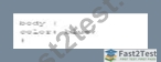
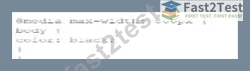
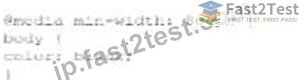
Which code segment changes the font color when the viewport is 800 pixels wide or wider?
- A.
- B.
- C.

- D.

正解:C
解説:
To change the font color when the viewport is 800 pixels wide or wider, a media query with min-width:
800px is used. This ensures that the styles inside the media query are applied only when the viewport width is at least 800 pixels.
* CSS Media Queries:
* Syntax for Media Query:
@media screen and (min-width: 800px) {
body {
color: black;
}
}
* Explanation: The min-width: 800px condition ensures that the styles are applied when the viewport is 800 pixels or wider.
* Example Analysis:
* Option A:
@media screen and (min-width: 800px) {
body {
color: black;
}
}
* Correct. This applies the color: black; style to the body when the viewport is 800 pixels or wider.
* Option B:
@media min-width: 800px {
body {
color: black;
}
}
* Incorrect. Missing screen and which is required for a proper media query targeting screens.
* Option C:
@media screen and (max-width: 800px) {
body {
color: black;
}
}
* Incorrect. This applies the style when the viewport is 800 pixels or narrower.
* Option D:
@media max-width: 800px {
body {
color: black;
}
}
* Incorrect. This applies the style when the viewport is 800 pixels or narrower.
* References:
* MDN Web Docs - Using media queries
* W3Schools - CSS Media Queries
The correct use of media queries ensures that the specified styles are applied only under the desired conditions, providing a responsive design.
質問 # 27
What is the purpose of cascading style sheets (CSSs)?
- A. Providing functionality that was previously provided by plug-ins
- B. Changing the content of a web page dynamically
- C. Structuring and describing web page content
- D. Setting rules to define how page content looks when rendered
正解:D
解説:
Cascading Style Sheets (CSS) are used to control the presentation of web pages, including aspects such as layout, colors, fonts, and other visual styles. They are a cornerstone technology of the World Wide Web, along with HTML and JavaScript. Here's a detailed breakdown:
* Purpose of CSS: CSS is designed to enable the separation of document content (written in HTML or a similar markup language) from document presentation, including elements such as the layout, colors, and fonts. This separation can improve content accessibility, provide more flexibility and control in the specification of presentation characteristics, enable multiple web pages to share formatting, and reduce complexity and repetition in the structural content.
* Setting Visual Rules: CSS allows developers to define rules that specify how different elements of a web page should be displayed. For example, CSS rules can change text color, font size, spacing between elements, and even the overall layout of the web page. These rules are applied by the browser to render the web page according to the defined styles.
* Cascading Nature: The term "cascading" in CSS refers to the process of combining multiple style sheets and resolving conflicts between different CSS rules. This allows developers to use different sources of style information, which can be combined in a hierarchical manner. For instance, a browser style sheet, an external style sheet, and inline styles can all contribute to the final rendering of a web page.
* Benefits of CSS:
* Consistency: By using CSS, developers can ensure a consistent look and feel across multiple web pages.
* Maintainability: CSS makes it easier to update the visual presentation of a web page without altering the HTML structure. This is particularly useful for maintaining large websites.
* Reusability: CSS rules can be reused across multiple pages, reducing redundancy and making it easier to implement changes globally.
* Examples of CSS:
css
Copy code
body {
background-color: lightblue;
}
h1 {
color: navy;
margin-left: 20px;
}
In this example, the body element is given a light blue background color, and the h1 element is styled with a navy color and a left margin of 20 pixels.
References:
* MDN Web Docs on CSS
* W3C CSS Specifications
質問 # 28
Which attribute displays help text in an input field without specifying an actual value for the input?
- A. name
- B. Placeholder
- C. For
- D. Default
正解:B
解説:
The placeholder attribute in an <input> element displays help text in the input field without specifying an actual value for the input. This text disappears when the user starts typing.
* Placeholder Attribute: This attribute provides a hint to the user about what type of information is expected in the field.
* Usage Example:
<input type="text" placeholder="Enter your name">
The input field will show "Enter your name" as help text.
References:
* MDN Web Docs on placeholder
* W3C HTML Specification on Input Placeholder
質問 # 29
Given the following CSS code:
Which type of selector is used?
- A. Element
- B. Group
- C. Class
- D. ID
正解:D
解説:
The given CSS code uses the #name selector, which is an ID selector. The ID selector is used to style an element with a specific id attribute.
* ID Selector: In CSS, the ID selector is used to style the element with the specific id. The syntax for the ID selector is #id, where id is the id attribute value of the HTML element.
* Usage Example:
#name {
text-align: left;
}
This CSS rule will apply the text-align: left; style to the element with id="name".
* ID Selector Characteristics:
* An ID must be unique within a document, meaning it can be used only once per page.
* ID selectors are more specific than class selectors and element selectors.
* Example in HTML:
<div id="name">This is a div with ID "name".</div>
References:
* MDN Web Docs on CSS Selectors
* W3C CSS Specification on Selectors
質問 # 30
Given the following code:
Which type of user input does the developer request by specifying the pattern attribute?
- A. price
- B. Latitude/longitude
- C. Country code
- D. Date
正解:B
解説:
The pattern attribute in the <input> element is used to specify a regular expression that the input's value must match for it to be considered valid. The given pattern -?\d{1,3}\.\d+ matches strings that represent decimal numbers with an optional negative sign, typically used for latitude and longitude values.
* Pattern Explanation:
* -? allows for an optional negative sign.
* \d{1,3} matches one to three digits.
* \. matches a literal dot.
* \d+ matches one or more digits.
* Usage Example:
<input type="text" pattern="-?\d{1,3}\.\d+" placeholder="Enter latitude or longitude"> This pattern ensures the input matches the format of latitude/longitude values.
References:
* MDN Web Docs on <input> pattern attribute
* Regular Expressions Documentation
質問 # 31
Which characters are used to enclose multiple statement in a function?
- A. Parentheses
- B. Semicotons
- C. Curly braces
- D. Spaces
正解:C
解説:
In JavaScript, curly braces {} are used to enclose multiple statements in a function, defining the block of code to be executed.
* Curly Braces: Curly braces {} are used to group multiple statements into a single block. This is necessary for defining the body of a function, loops, conditional statements, and other control structures.
* Usage Example:
function greet(name) {
let greeting = "Hello, " + name;
console.log(greeting);
}
In this example, the curly braces enclose the statements that form the body of the greet function.
References:
* MDN Web Docs on Functions
* ECMAScript Language Specification
質問 # 32
Given the following code:
Var a = ''true'';
What is the data type of d?
- A. String
- B. Boolean
- C. Object
- D. Undefined
正解:A
解説:
The data type of the variable a is determined by the value assigned to it. In JavaScript, if a value is enclosed in double or single quotes, it is treated as a string.
* Variable Assignment:
* Given the code:
var a = "true";
* The value "true" is enclosed in double quotes, making it a string.
* Explanation:
* Option A: Boolean is incorrect because the value "true" is a string, not a boolean.
* Option B: String is correct because the value is enclosed in double quotes.
* Option C: Object is incorrect because the value is a primitive string.
* Option D: Undefined is incorrect because the variable a is assigned a value.
* References:
* MDN Web Docs - JavaScript Data Types
* W3Schools - JavaScript Data Types
質問 # 33
What should a developer correct before revalidating after a code validator reports multiple errors in code?
- A. The first reported error
- B. The last reported error
- C. Only CSS errors
- D. Only JavaScript errors
正解:A
解説:
When using a code validator to check your HTML, CSS, or JavaScript code, it's essential to address errors in a systematic manner. The correct approach is to correct the first reported error before revalidating. This method is recommended because often, the first error can cause a cascade of subsequent errors or warnings.
By fixing the first error, you may automatically resolve other errors that were reported later.
* Reasoning:
* Cascading Errors: The first error in the code might lead to multiple subsequent errors. Fixing it can sometimes resolve those cascading errors, reducing the overall number of errors in the next validation.
* Logical Flow: Addressing errors in the order they appear maintains a logical flow and makes debugging more manageable.
* Steps to Follow:
* Step 1: Run the code through the validator.
* Step 2: Identify the first reported error.
* Step 3: Correct the first error.
* Step 4: Revalidate the code to check if the error count has reduced or if new errors appear.
* Step 5: Repeat the process until all errors are resolved.
* References:
* W3C Markup Validation Service
* MDN Web Docs - Debugging HTML
* W3C CSS Validation Service
質問 # 34
Which 3D transform affects the distance between the z-plane and the user?
- A.

- B.

- C.

- D.

正解:A
解説:
The perspective(n) method in CSS is used to affect the distance between the z-plane and the user, effectively changing the perspective depth of a 3D transformed element.
* perspective(n) Method: The perspective function defines how far the element is from the user. It affects the appearance of the 3D transformed element, giving it a sense of depth.
* Usage Example:
container {
perspective: 1000px;
}
In this example, the perspective is set to 1000 pixels, which defines the distance between the z-plane and the user.
* Properties:
* n: This represents the perspective distance. The lower the value, the more pronounced the perspective effect.
References:
* MDN Web Docs on perspective
* W3C CSS Transforms Module Level 1
質問 # 35
Which element relies on the type attribute to specify acceptable values during form entry?
- A. <Button>
- B. <input>
- C. <Select>
- D. <Option>
正解:B
解説:
The <input> element relies on the type attribute to specify acceptable values during form entry. Different input types include text, email, number, password, etc.
* Input Types: The type attribute determines the kind of input control and the acceptable values for that control.
* Usage Example:
<input type="email" placeholder="Enter your email">
<input type="number" min="1" max="10">
These input elements specify acceptable values for email and number inputs respectively.
References:
* MDN Web Docs on <input>
* W3C HTML Specification on Input Types
質問 # 36
A web page has a section that contains an <article> element. The element is always 10 pixels to the right of its position.
Which type of layout positioning should the <article> element use?
- A. Absolute
- B. Relative
- C. Fixed
- D. Static
正解:B
解説:
Relative positioning in CSS positions an element relative to its normal position. Using position: relative; allows you to adjust the element's position with the top, right, bottom, or left properties.
* CSS Relative Positioning:
* Syntax:
article {
position: relative;
left: 10px;
}
* Description: Moves the element 10 pixels to the right from its normal position.
* Example:
* Given HTML:
<article>Content</article>
* Given CSS:
article {
position: relative;
left: 10px;
}
* Explanation: The <article> element will be positioned 10 pixels to the right of where it would normally appear.
* References:
* MDN Web Docs - position
* W3C CSS Positioned Layout Module Level 3
質問 # 37
Which HTML5 attribute specifies where to send the form data for processing a form is submitted?
- A. Method
- B. Target
- C. Enctype
- D. Action
正解:D
解説:
The action attribute in the <form> element specifies the URL where the form data should be sent for processing when the form is submitted.
* Action Attribute: This attribute defines the endpoint that will handle the submitted form data.
* Usage Example:
<form action="/submit-form" method="post">
<input type="text" name="username">
<input type="submit" value="Submit">
</form>
Here, the form data is sent to the /submit-form URL when submitted.
References:
* MDN Web Docs on <form> action attribute
* W3C HTML Specification on Forms
質問 # 38
Which code segment creates a slider field that accepts a numeric value ranging from 1 through 10?
- A.

- B.

- C.

- D.

正解:A
解説:
To create a slider field that accepts a numeric value ranging from 1 through 10, the input element with type=" range" should be used. The min and max attributes define the range of acceptable values.
* HTML Input Type range:
* Purpose: The range type is used for input fields that should contain a value from a specified range.
* Attributes:
* type="range": Specifies that the input field should be a slider.
* min="1": Sets the minimum acceptable value.
* max="10": Sets the maximum acceptable value.
* Example:
* Given the HTML:
<input type="range" name="sat-level" min="1" max="10">
* Options Analysis:
* Option A:
<input type="number" name="sat-level" max="10">
* This creates a numeric input field, not a slider.
* Option B:
<input type="range" name="sat-level" min="1" max="10">
* This is the correct option that creates a slider field with the specified range.
* Option C:
<input type="number" name="sat-level" min="1" max="10">
* This creates a numeric input field, not a slider.
* Option D:
<input type="range" name="sat-level" max="10">
* This creates a slider but lacks the min attribute, so it doesn't fully meet the requirement.
* References:
* MDN Web Docs - <input type="range">
* W3Schools - HTML Input Range
By using the correct attributes, the slider field will allow users to select a value between 1 and 10.
質問 # 39
Which layout design is easiest to manage on a variety of devices?
- A. Table
- B. Flow
- C. Grid
- D. Border
正解:C
解説:
A grid layout is easiest to manage across a variety of devices due to its flexibility and ability to create responsive designs that adapt to different screen sizes.
* Grid Layout:
* Responsive Design: Grid layouts can be easily adjusted using media queries to provide a consistent user experience across devices.
* CSS Grid Example:
container {
display: grid;
grid-template-columns: repeat(auto-fill, minmax(200px, 1fr));
}
* Other Options:
* A. Flow: Often used for text, not layout.
* B. Table: Outdated and not responsive.
* D. Border: Not commonly used for complex layouts.
* References:
* MDN Web Docs - CSS Grid Layout
* W3Schools - CSS Grid Layout
質問 # 40
Given the following markup:
Where does the image align in relation to the text?
- A. The lop of the image aligns the bottom of Hello world.
- B. The bottom of the Image aligns to the bottom of Hello World
- C. The top of The image aligns to the top of Hello World
- D. The bottom of the image aligns to the top of Held world.
正解:B
解説:
The CSS property vertical-align: baseline aligns the baseline of the element with the baseline of its parent. For inline elements like images, the baseline alignment means that the bottom of the image aligns with the bottom of the text.
* CSS vertical-align Property:
* Baseline Alignment: Aligns the baseline of the element with the baseline of its parent.
* Example:
<p>Hello World<img src="sample.jpg" style="vertical-align:baseline"></p>
* Analysis:
* The <img> element with vertical-align: baseline will align its bottom with the bottom of the surrounding text "Hello World".
* References:
* MDN Web Docs - vertical-align
* W3C CSS Inline Layout Module Level 3
質問 # 41
......
究極のガイドはWeb-Development-Applications最新時間限定今すぐダウンロード!:https://jp.fast2test.com/Web-Development-Applications-premium-file.html
2025年最新のな厳密検証された合格できるWeb-Development-Applications試験にはリアル問題と解答:https://drive.google.com/open?id=1WduoDCg8fwsCj4DzLwhqqTNXnShaajqf