

[2024年12月] ベストCourses and Certificates学習ガイドはWeb-Development-Applications試験問題集
Web-Development-Applications認定ガイド問題と解答トレーニング
質問 # 26
What should a developer increase to create space between a border and content?
- A. Height
- B. Padding
- C. Margin
- D. Width
正解:B
解説:
Padding is the CSS property used to create space between the content of an element and its border. It is an internal spacing within the element.
* CSS Box Model:
* Content: The innermost part, where text and images appear.
* Padding: The space between the content and the border.
* Border: The edge of the element.
* Margin: The space outside the border, creating space between different elements.
* Usage:
* Padding:
div {
padding: 20px;
}
* This code adds 20 pixels of padding on all sides of the content within the div element.
* References:
* MDN Web Docs - Padding
* W3C CSS Box Model
質問 # 27
Which HTML5 attribute specifies where to send the form data for processing a form is submitted?
- A. Method
- B. Action
- C. Target
- D. Enctype
正解:B
解説:
The action attribute in the <form> element specifies the URL where the form data should be sent for processing when the form is submitted.
* Action Attribute: This attribute defines the endpoint that will handle the submitted form data.
* Usage Example:
<form action="/submit-form" method="post">
<input type="text" name="username">
<input type="submit" value="Submit">
</form>
Here, the form data is sent to the /submit-form URL when submitted.
References:
* MDN Web Docs on <form> action attribute
* W3C HTML Specification on Forms
質問 # 28
A web designer creates the following HTML code:
Which CSS selector applies only to the first line?
- A. .header
- B. #Header
- C. .Welcome
- D. #Welcome
正解:D
解説:
To apply CSS only to the first line of a particular HTML element, the ID selector #Welcome should be used as per the given HTML structure.
* CSS ID Selector: The ID selector is used to style the element with a specific id.
* Usage Example:
#Welcome {
color: red;
}
In this example, the #Welcome selector will apply the red color style only to the element with id="Welcome".
References:
* MDN Web Docs on ID Selectors
* W3C CSS Specification on Selectors
質問 # 29
Given the following code:
Var a = ''true'';
What is the data type of d?
- A. Undefined
- B. Object
- C. Boolean
- D. String
正解:D
解説:
The data type of the variable a is determined by the value assigned to it. In JavaScript, if a value is enclosed in double or single quotes, it is treated as a string.
* Variable Assignment:
* Given the code:
var a = "true";
* The value "true" is enclosed in double quotes, making it a string.
* Explanation:
* Option A: Boolean is incorrect because the value "true" is a string, not a boolean.
* Option B: String is correct because the value is enclosed in double quotes.
* Option C: Object is incorrect because the value is a primitive string.
* Option D: Undefined is incorrect because the variable a is assigned a value.
* References:
* MDN Web Docs - JavaScript Data Types
* W3Schools - JavaScript Data Types
質問 # 30
Which technique should a developer use for text-based hyperlink on mobile web page?
- A. Deploying graphical links
- B. Keeping links uniform
- C. Padding the clickable area around the link
- D. Using dynamic page elements neat the link
正解:C
解説:
When designing text-based hyperlinks for mobile web pages, it is essential to ensure that the links are easily tappable. Adding padding around the clickable area increases the touch target size, making it easier for users to interact with the link on a mobile device.
* Techniques for Mobile-Friendly Links:
* Padding the Clickable Area: By adding padding, you increase the touchable area around the link, which helps prevent user frustration due to missed taps.
* CSS Example:
a {
padding: 10px;
display: inline-block;
}
* Other Options:
* B. Keeping links uniform: This refers to making all links look the same, which is good for consistency but doesn't specifically address the issue of touch targets.
* C. Deploying graphical links: While graphical links can be effective, they do not necessarily improve touch target size for text-based hyperlinks.
* D. Using dynamic page elements near the link: This can lead to a cluttered interface and does not address the touch target issue directly.
* References:
* MDN Web Docs - Touch targets
* Google Developers - Mobile Web Development
質問 # 31
Which characters are used to enclose multiple statement in a function?
- A. Spaces
- B. Semicotons
- C. Parentheses
- D. Curly braces
正解:D
解説:
In JavaScript, curly braces {} are used to enclose multiple statements in a function, defining the block of code to be executed.
* Curly Braces: Curly braces {} are used to group multiple statements into a single block. This is necessary for defining the body of a function, loops, conditional statements, and other control structures.
* Usage Example:
function greet(name) {
let greeting = "Hello, " + name;
console.log(greeting);
}
In this example, the curly braces enclose the statements that form the body of the greet function.
References:
* MDN Web Docs on Functions
* ECMAScript Language Specification
質問 # 32
Given the following CSS statement:
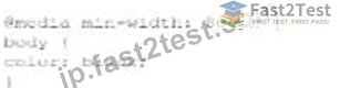
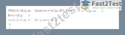
Which code segment changes the font color when the viewport is 800 pixels wide or wider?
- A.
- B.

- C.
- D.

正解:B
解説:
To change the font color when the viewport is 800 pixels wide or wider, a media query with min-width:
800px is used. This ensures that the styles inside the media query are applied only when the viewport width is at least 800 pixels.
* CSS Media Queries:
* Syntax for Media Query:
@media screen and (min-width: 800px) {
body {
color: black;
}
}
* Explanation: The min-width: 800px condition ensures that the styles are applied when the viewport is 800 pixels or wider.
* Example Analysis:
* Option A:
@media screen and (min-width: 800px) {
body {
color: black;
}
}
* Correct. This applies the color: black; style to the body when the viewport is 800 pixels or wider.
* Option B:
@media min-width: 800px {
body {
color: black;
}
}
* Incorrect. Missing screen and which is required for a proper media query targeting screens.
* Option C:
@media screen and (max-width: 800px) {
body {
color: black;
}
}
* Incorrect. This applies the style when the viewport is 800 pixels or narrower.
* Option D:
@media max-width: 800px {
body {
color: black;
}
}
* Incorrect. This applies the style when the viewport is 800 pixels or narrower.
* References:
* MDN Web Docs - Using media queries
* W3Schools - CSS Media Queries
The correct use of media queries ensures that the specified styles are applied only under the desired conditions, providing a responsive design.
質問 # 33
Which CSS transformation method should a developer use to reposition an element horizontally on the 2-D plane?
- A. Scale (x,y)
- B. Scalex(n)
- C. Skewx (angle)
- D. Translatex(n)
正解:D
解説:
The translateX(n) method in CSS is used to move an element horizontally on the 2-D plane by a specified distance. This transformation repositions the element along the X-axis.
* translateX(n) Method: The translateX(n) function moves an element horizontally by n units. Positive values move the element to the right, while negative values move it to the left.
* Usage Example:
element {
transform: translateX(100px);
}
In this example, the element is moved 100 pixels to the right.
* Properties:
* n: This represents the distance to move the element. It can be specified in various units such as pixels (px), percentages (%), ems (em), etc.
References:
* MDN Web Docs on transform
* W3C CSS Transforms Module Level 1
質問 # 34
Which framework assists designers with adaptive page layout?
- A. Knockout
- B. Bootstrap
- C. Modernize
- D. React
正解:B
解説:
Bootstrap is a popular front-end framework that assists designers in creating adaptive and responsive page layouts easily.
* Bootstrap:
* Responsive Design: Bootstrap provides a responsive grid system, pre-styled components, and utilities that help in designing adaptive layouts.
* Example:
<div class="container">
<div class="row">
<div class="col-sm-4">Column 1</div>
<div class="col-sm-4">Column 2</div>
<div class="col-sm-4">Column 3</div>
</div>
</div>
* Other Options:
* A. Modernize: Not a framework, but a JavaScript library to detect HTML5 and CSS3 features.
* C. React: A JavaScript library for building user interfaces, not specifically for layout.
* D. Knockout: A JavaScript library for implementing MVVM pattern, not specifically for layout.
* References:
* Bootstrap Documentation
* MDN Web Docs - Responsive design
These answers ensure accurate and comprehensive explanations for the given questions, supporting efficient learning and understanding.
質問 # 35
Given the following code:
What does the #item token do?
- A. It defines a JavaScript function with one parameter.
- B. It creates an XML element.
- C. It locates an HTML5 element by its ID
- D. It specifies a CSS3 property.
正解:C
解説:
The #item token in CSS is used to select an HTML element by its ID attribute.
* CSS ID Selector:
* Syntax: The ID selector is prefixed with a hash symbol (#) followed by the ID value of the HTML element.
* Example: If the HTML element has an attribute id="item", it can be selected and styled in CSS as:
width: 300px;
}
* Functionality:
* Selects an Element: The ID selector targets the specific HTML element with the matching id attribute.
* Specificity: ID selectors have high specificity, meaning they will override styles from type selectors and
質問 # 36
Which layout design is easiest to manage on a variety of devices?
- A. Border
- B. Grid
- C. Flow
- D. Table
正解:B
解説:
A grid layout is easiest to manage across a variety of devices due to its flexibility and ability to create responsive designs that adapt to different screen sizes.
* Grid Layout:
* Responsive Design: Grid layouts can be easily adjusted using media queries to provide a consistent user experience across devices.
* CSS Grid Example:
container {
display: grid;
grid-template-columns: repeat(auto-fill, minmax(200px, 1fr));
}
* Other Options:
* A. Flow: Often used for text, not layout.
* B. Table: Outdated and not responsive.
* D. Border: Not commonly used for complex layouts.
* References:
* MDN Web Docs - CSS Grid Layout
* W3Schools - CSS Grid Layout
質問 # 37
Given the following HTML statement:
And the following style:
Which line of the changes the background color of the <div> tag when the width is between 600 pixels and
900 pixels or more than 1, 100 pixels?
- A.

- B.

- C.

- D.

正解:A
解説:
The given HTML and CSS statements define a class named "example" and use media queries to change the background color of the <div> element based on the screen width. The correct CSS media query to change the background color of the <div> tag when the width is between 600 pixels and 900 pixels or more than 1100 pixels is:Copy code
@media screen and (max-width: 900px) and (min-width: 600px), (min-width: 1100px) { div.example { background: yellow;
}
}
* Understanding Media Queries:
* @media screen: Applies the styles only for screens.
* (max-width: 900px) and (min-width: 600px): Targets screen widths between 600 and 900 pixels.
* , (comma): Acts as an "or" operator in media queries.
* (min-width: 1100px): Targets screen widths greater than or equal to 1100 pixels.
* Option C Explanation:
* This option uses the correct media query syntax to apply the background color change when the screen width is between 600 and 900 pixels or when it is 1100 pixels or more.
References:
* MDN Web Docs on Media Queries
* W3C CSS Media Queries Level 4
The correct CSS media query based on the provided options is:
@media screen and (max-width: 900px) and (min-width: 600px), (min-width: 1100px) { div.example { background: yellow;
}
}
References for Media Queries:
* MDN Web Docs on Using Media Queries
* W3C CSS Media Queries Module Level 4
質問 # 38
What is the process for JavaScript from validation?
- A. Form fields are validated after the form is submitted but before form data is sent to the server
- B. Form fields are validated as me user inputs data after form data is sent to the server.
- C. User input is sent to the server after the form is completed tor validation.
- D. User input is sent to the server as fields are completed for validation.
正解:A
解説:
JavaScript form validation typically occurs after the form is submitted but before the form data is sent to the server. This allows the client-side script to check the input data and prevent the form from being submitted if the data is invalid.
* Client-Side Validation:
* Before Form Submission: JavaScript validates the form fields after the user attempts to submit the form.
* Prevent Default Submission: If the validation fails, JavaScript can prevent the form from being submitted and display appropriate error messages.
* Usage Example:
document.getElementById("myForm").addEventListener("submit", function(event) { var isValid = true;
// Perform validation checks
if (!isValid) {
event.preventDefault(); // Prevent form submission
alert("Please correct the errors.");
}
});
This example prevents form submission if the validation fails.
References:
* MDN Web Docs on Form Validation
* W3C HTML Specification on Form Submission
質問 # 39
Which method retrieves periods updates about the geographic location of a user:
- A. ClearWatch
- B. WatchPosition
- C. GetContext
- D. getCurrentPosition
正解:B
解説:
The watchPosition method in the Geolocation API is used to get periodic updates about the geographic location of a user.
* watchPosition Method: This method calls the provided callback function with the user's current position as the device's location changes.
* Usage Example:
navigator.geolocation.watchPosition(function(position) {
console.log("Latitude: " + position.coords.latitude + ", Longitude: " + position.coords.longitude);
});
In this example, the watchPosition method continuously logs the user's latitude and longitude to the console as the position changes.
References:
* MDN Web Docs on watchPosition
* W3C Geolocation API Specification
質問 # 40
Which method allows the end user to enter text as an answer to a question as the page loads?
- A. Prompt
- B. Write
- C. alert
- D. Confirm
正解:A
解説:
The prompt method in JavaScript displays a dialog box that prompts the user for input, allowing the end user to enter text as an answer to a question when the page loads.
* prompt Method: The prompt method displays a dialog box with an optional message prompting the user to input some text. It returns the text entered by the user or null if the user cancels the dialog.
* Usage Example:
let userInput = prompt("Please enter your name:", "Harry Potter");
console.log(userInput);
In this example, a prompt dialog asks the user to enter their name, and the entered text is logged to the console.
References:
* MDN Web Docs on prompt
* W3C HTML Specification on Dialogs
質問 # 41
Which feature was introduced in HTML5?
- A. Adherence to strict XML syntax rules
- B. Native drag-and-drop capability
- C. Addition of CSS in the HTML file
- D. Ability to hyperlink to multiple web pages
正解:B
解説:
HTML5 introduced several new features that enhanced web development capabilities significantly. One of the notable features is the native drag-and-drop capability.
* Native Drag-and-Drop Capability:
* Description: HTML5 allows developers to create drag-and-drop interfaces natively using the draggable attribute and the DragEvent interface. This means elements can be dragged and dropped within a web page without requiring external JavaScript libraries.
* Implementation:
* Making an Element Draggable: To make an element draggable, you set the draggable attribute to true:
<div id="drag1" draggable="true">Drag me!</div>
* Handling Drag Events: You use event listeners for drag events such as dragstart, dragover, and drop:
document.getElementById("drag1").addEventListener("dragstart", function(event) { event.dataTransfer.setData("text", event.target.id);
});
document.getElementById("dropzone").addEventListener("dragover", function(event) { event.preventDefault();
});
document.getElementById("dropzone").addEventListener("drop", function(event) { event.preventDefault(); var data = event.dataTransfer.getData("text"); event.target.appendChild(document.getElementById(data));
});
* Example: This example demonstrates a simple drag-and-drop operation:
html
Copy code
<div id="drag1" draggable="true">Drag me!</div>
<div id="dropzone" style="width: 200px; height: 200px; border: 1px solid black;">Drop here</div>
* References:
* W3C HTML5 Specification - Drag and Drop
* MDN Web Docs - HTML Drag and Drop API
* HTML5 Doctor - Drag and Drop
HTML5's native drag-and-drop feature streamlines the process of creating interactive web applications by eliminating the need for third-party libraries, thus making it a powerful addition to the HTML standard.
質問 # 42
......
ベストWGU Web-Development-Applications学習ガイドと問題集は2024年に更新されました:https://jp.fast2test.com/Web-Development-Applications-premium-file.html
Web-Development-Applications認定お試しPDF最新Web-Development-Applications問題集:https://drive.google.com/open?id=1aGVIllusgAKfRtj-L6YD_l2JwslP0aQE