

TDA-C01試験問題集を提供していますTableau問題
TDA-C01認定ガイドPDFはリアル試験問題で100%カバー率
TDA-C01 資格認定は、データ解析における卓越性の基準として、世界中の雇用主によって認められています。これは、Tableau の製品を使用してデータを分析し、実行可能な洞察を作成する知識とスキルを持つことを示しています。認定を受けた専門家は、非認定の専門家よりも高い給与を期待でき、より多くの就職機会があります。また、この認定は、Tableau Certified Associate や Tableau Certified Professional といった高度な Tableau 認定への道を提供します。
質問 # 51
You want to ensure that when you click a bar on a dashboard, a tooltip appears that contains a link named "Click here to know more!" as shown in the following exhibit.

正解:
解説:
質問 # 52
You have a table that contains four columns named Order Date, Country, Sales, and Profit.
You need to add a column that shows the day of the week for each row. For example, orders placed on August 31, 2022, will show a day of Wednesday.
How should you complete the formula? (Use the dropdowns in the Answer Area to select the correct options to complete the formula.)
正解:
解説:
Reference:
Tableau Help: DATENAME Function
Tableau Help: Date Functions
To add a column that shows the day of the week for each row, you should complete the formula as follows:
DATENAME
(
'weekday'
, [Order Date])
The DATENAME function in Tableau returns the name of a specified part of a date or datetime value, such as the year, month, or day. It takes two arguments: the date part and the date. In this question, you want to return the name of the weekday, such as Monday, Tuesday, or Wednesday, for each order date. Therefore, you need to use 'weekday' as the date part and [Order Date] as the date. The formula will return a string value that represents the name of the weekday for each order date.
Tableau Help: DATENAME Function
Tableau Help: Date Functions
質問 # 53
You have a dataset that contains daily sales by business segment from 2017 to the present You want to use monthly historical trends to predict sales by segment in the future Which three actions should you perform m order?
(Place the three correct options in order Use the arrows to move Options lo Answer Area I In Answer Area arrows to re order the options.)
正解:
解説:
1 - Aggregate the date to month and year.
2 - Create a calculated field that uses the MODEL_QUANTILE function.
3 - Add the date to the Columns sfelf. Add the segment and the sales to the Rows shelf.
質問 # 54
Open the link to Book1 found on the desktop. Open Disciplines worksheet.
Filter the table to show the Top 10 NOC based on the number of medals won.
- A. check the steps below in explanation
正解:A
解説:
To filter the table to show the Top 10 NOC based on the number of medals won, you need to do the following steps:
Open the link to Book1 found on the desktop. This will open the Tableau workbook that contains the Disciplines worksheet.
Click on the Disciplines tab at the bottom of the workbook to open the worksheet. You will see a table that shows the NOC, discipline, and medals for each country.
Drag Medals from the Measures pane to the Filters shelf. This will open a dialog box that allows you to filter by different criteria.
Select Top from the dialog box. This will show you options to filter by the top or bottom values of a field.
Enter 10 in the text box next to By field. This will filter by the top 10 values of Medals.
Select NOC from the drop-down list next to By field. This will filter by the top 10 values of NOC based on Medals.
Click OK to apply the filter. You will see that the table now shows only 10 rows, one for each NOC with the highest number of medals.
質問 # 55
You publish a dashboard tut uses an attract. The extract refreshes every Monday at 10:00.
You need to ensure that the extract also refreshes on the last day of the month at 18:00.
What should you do?
- A. From Tableau Desktop, open the Publish Workbook dialog box and configure the schedule.
- B. From Tableau Server select the workbook select Refresh Extracts and then add a new extract refresh
- C. From Tableau Server. select Schedules find the schedule of the extract, and change the frequency to the Last day of the month
- D. From Tableau Server. select Schedules and change the priority of the existing schedule
正解:C
質問 # 56
You have the following map.
You need the map to appear as shown in the following visualization.
What should you do?
- A. Drag Location to Size on the Marks card
- B. Change the mark type to Map
- C. Change the mark type to Density
- D. Change the opacity to 75%
- E. Drag Population to Size on the Marks card
正解:C
解説:
The question presents a scenario where a geographic map visualization in Tableau needs to be transformed from a series of discrete circles representing data points to a density map visualization. The density map shows concentrations of data points with a gradient of color, where denser areas are indicated by a darker color.
Here's the explanation for each option:
A). Change the mark type to Density: This is the correct answer because changing the mark type to 'Density' in Tableau creates a density map, which displays the concentration of data points with a color gradient. This is exactly what is needed to achieve the visual effect shown in the second image, where regions with a higher concentration of data points are represented by darker shades.
B). Drag Location to Size on the Marks card: This option would adjust the size of the marks based on the number of locations, which is not relevant to creating a density map. It would result in varying sizes of circles, not a continuous gradient.
C). Change the mark type to Map: The visualization is already using a map. This option would not change the visualization to the desired density map.
D). Drag Population to Size on the Marks card: This would change the size of the circles based on the population values, making some circles larger and others smaller. This is not how a density map is created, which uses color intensity rather than size to show concentration.
E). Change the opacity to 75%: Changing the opacity would affect the transparency of the marks on the map but would not transform the visualization into a density map.
To achieve the visualization shown in the second image, the mark type must be changed to 'Density,' which will produce a heat map-like effect where the color intensity represents the concentration of data points.
Therefore, the correct answer is A. Change the mark type to Density.
To create a density map from a scatter plot of data points, you would change the mark type to Density. This mark type allows you to visualize the concentration of data points in an area, which can be useful for identifying clusters or patterns in geospatial data.
質問 # 57
You publish a dashboard tut uses an attract. The extract refreshes every Monday at 10:00.
You need to ensure that the extract also refreshes on the last day of the month at 18:00.
What should you do?
- A. From Tableau Desktop, open the Publish Workbook dialog box and configure the schedule.
- B. From Tableau Server select the workbook select Refresh Extracts and then add a new extract refresh
- C. From Tableau Server. select Schedules find the schedule of the extract, and change the frequency to the Last day of the month
- D. From Tableau Server. select Schedules and change the priority of the existing schedule
正解:B
解説:
To refresh an extract on Tableau Server, you need to select the workbook, select Refresh Extracts, and then add a new extract refresh. You can specify the frequency and time of the refresh, as well as any custom options. You can have multiple extract refreshes for the same workbook with different schedules. Reference: https://help.tableau.com/current/server/en-us/refresh_extracts.htm https://help.tableau.com/current/server/en-us/refresh_extracts_add.htm
質問 # 58
You have a Tableau Prep flow that joins a dataset named Global Indicators to a dataset named Price Indices.
In which step can you transform rows of monthly data into rows of yearly data''
正解:
解説:
Explanation:
A screenshot of a computer Description automatically generated
質問 # 59
You want to add a draft watermark to a dashboard as shown in the following exhibit.
Which type of object should you use?
- A. Web page
- B. Image
- C. Horizontal
- D. Sheet
正解:B
解説:
To add a draft watermark to a dashboard, you should use a sheet as a type of object. A sheet is a worksheet that contains a chart or a table that you can add to your dashboard. You can create a sheet that shows the word "Draft" as a text mark and format it with transparency, size, and color. Then you can drag the sheet to your dashboard and position it behind your other sheets as a floating element. You can also adjust the opacity and layering of the sheet to make it look like a watermark. Reference: https://help.tableau.com/current/pro/desktop/en-us/dashboards.htm https://help.tableau.com/current/pro/desktop/en-us/dashboards_create_layouts.htm https://help.tableau.com/current/pro/desktop/en-us/dashboards_create_watermarks.htm
質問 # 60
You have a data source that contains the following columns.
You want to sort customers based on the most expensive orders.
How should you complete the formula? (Use the dropdowns in the Answer Area to select the correct options to complete the formula.)
正解:
解説:
Explanation:
A screenshot of a computer Description automatically generated
質問 # 61
You have a dataset that contains sates data. The following is a sample of the data.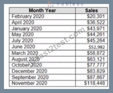
You need to return a value of true if a month has sales greater than $50 000. otherwise the formula must return a value of false.
Which two formulas achieve the goal Choose two
- A. IIF(SUM< [Sales] )>50000, TRUE, FALSE)
- B. MAX< [Sales], 50000)
- C. SUM{[Sales]) IN (50000)
- D. [Sales] > 50000
正解:A、D
解説:
The two formulas that will return a value of true if a month has sales greater than $50,000, otherwise the formula must return a value of false, are:
B). IIF(SUM([Sales]) > 50000, TRUE, FALSE) D. [Sales] > 50000
The IIF function is a logical function that returns one value if a condition is true, and another value if the condition is false. In this case, the condition is SUM([Sales]) > 50000, which means that the sum of sales for a month is greater than $50,000. The function will return TRUE if the condition is true, and FALSE if the condition is false.
The comparison operator > is a logical operator that returns TRUE if the left operand is greater than the right operand, and FALSE otherwise. In this case, the operands are [Sales] and 50000, which means that the sales for a month are greater than $50,000. The operator will return TRUE if the sales are greater than $50,000, and FALSE otherwise.
The other options are not correct for this scenario. The IN function is a logical function that returns TRUE if a value is in a set of values, and FALSE otherwise. In this case, the value is SUM([Sales]), which is not in the set of values (50000). The function will always return FALSE. The MAX function is an aggregation function that returns the maximum value in a field or expression. In this case, the field or expression is [Sales], 50000, which is not valid syntax. The function will return an error. References:
https://help.tableau.com/current/pro/desktop/en-us/functions_functions_logical.htm#IIF
https://help.tableau.com/current/pro/desktop/en-us/operators.htm
https://help.tableau.com/current/pro/desktop/en-us/functions_functions_aggregate.htm#MAX
質問 # 62
You create the following story that contains two story point.
You want to change the story point format to show the current story point number out of the total number of story points.
Which Layout option should you use?
- A. Dots
- B. Caption boxes
- C. Arrows only
- D. Numbers
正解:D
解説:
To change the story point format to show the current story point number out of the total number of story points, you should use the Numbers option in the Layout tab. This option will display the story points as numbers in a horizontal or vertical sequence, such as 1/2, 2/2. You can also choose to show or hide the next and previous arrows for navigation. The Numbers option will help you indicate the progress and order of your story points more clearly than the other options. References:
Creating a Story - Tableau
New in 9.0: Formatting the Story Points Navigator - Tableau
Tableau Certified Data Analyst Study Guide
質問 # 63
You have a dashboard that is configured for desktop browsers.
You want to customize a layout for mobile users.
Which option should you select first? (Click the appropriate Option in the Answer Area.)
正解:
解説:
Explanation:
To customize a layout for mobile users, you should select the Device Preview option first. This option will allow you to see how your dashboard will look on different types of devices, such as phones, tablets, or desktops. You can also choose different models and orientations to preview different screen sizes and resolutions. From the Device Preview mode, you can add, edit, or delete device layouts for each device type.
You can also adjust the size, position, and formatting of the dashboard elements for each device layout. References:
Create Dashboard Layouts for Different Device Types - Tableau
Tableau Certified Data Analyst Study Guide
質問 # 64
You want to connect a Tableau workbook to a dataset in a Microsoft Excel spreadsheet.
What should you do from Tableau Desktop?
- A. From the Data menu select New Data Source
- B. From the File menu select Import Workbook
- C. From the Data menu select Replace Data Source
- D. From the File menu select New
正解:D
質問 # 65
Open the link to Book1 found on the desktop. Open the sales dashboard.
Add the Sales by State sheet in a Show/Hide button to the right side of the dashboard.
- A. Send us your feedback on it.
- B. Send us your
正解:A
質問 # 66
You company has two divisions located in the United States and Germany Bach division has a separate database. The following is a sample of the sales data for the division in the United States.
The following is a sample of the sales data for me division in Germany.
You have population data in a file named Populatio.csv. the following is a sample of the data.
You plan to create a visualization that ml show tie sales per capita for each salesperson Each salesperson must be identified by identified by their full name.
You need to prepare the data to support the planned visualization. The data source must support being published .
Which four actions should you perform in order?
(Place the four correct options n order Use the arrows to move Options to Answer Area arrows to re-order the options.
Use Answer Area arrows to re-order the options)
正解:
解説:
1 - Open Tableau Prep
2 - Create a new column to concatenate the name for the Germany division
3 - Union the sales data of both divisions
4 - Join the sales data and the population data by using Country as the join field
質問 # 67
......
Tableau TDA-C01試験は、データ接続、データ準備、データ分析、および可視化など、広範なトピックをカバーしています。この試験は、Tableau DesktopおよびTableau Prep Builderの理解をテストするように設計されています。試験には、多肢選択問題と多肢選択式の問題が含まれており、認定の信頼性が維持されるように監督試験が行われます。
合格させるTDA-C01試験にはリアル問題解答:https://jp.fast2test.com/TDA-C01-premium-file.html
合格できるTDA-C01レビューガイド、信頼され続けるTDA-C01テストエンジン:https://drive.google.com/open?id=17hh7ZSH0g7ZeatO2QP7O403yh-Buq4lc