

[2024年03月18日] 最速準備で試験合格!TDA-C01問題の事前予備
TDA-C01のPDF問題集リアル2024最近更新された問題
Tableau TDA-C01 認定は、グローバルに認知されており、個人に求職市場での競争力を与えます。この認定は、データ分析や Tableau のスキルと知識を証明します。この認定は、潜在的な雇用主やクライアントに自分の専門知識を示す素晴らしい方法です。
Tableau TDA-C01(Tableau Certified Data Analyst)試験は、データを扱うプロフェッショナルが、データ分析にTableauを使用するスキルを証明するための認定試験です。Tableauは、データの可視化とビジネスインテリジェンスツールとして広く使用され、より効果的かつ効率的な方法でユーザーがデータを接続、可視化、共有することができます。TDA-C01試験は、データの準備、可視化、ダッシュボード、ストーリーテリングなど、データ分析にTableauを使用する候補者の知識とスキルをテストします。
TDA-C01試験を受験するには、データ分析のコンセプトや技術の基本知識、およびTableau製品の使用経験が必要です。試験は36問の複数選択問題から構成され、受験者は120分以内に解答する必要があります。試験は、データの接続、データの準備、データ分析と可視化、ダッシュボードの作成など、さまざまなトピックをカバーしています。
質問 # 25
You have a dataset that contains daily sales by business segment from 2017 to the present You want to use monthly historical trends to predict sales by segment in the future Which three actions should you perform m order?
(Place the three correct options in order Use the arrows to move Options lo Answer Area I In Answer Area arrows to re order the options.)
正解:
解説:
1 - Aggregate the date to month and year
2 - Create a calculated field that uses the MODEL_QUANTILE function.
3 - Add the date to the Columns shelf Add the segment and the sales to the Rows shelf
質問 # 26
You have the following dataset that contain null values in the Profits field.
You want the data to appear as shown in the following table.
Which two formulas achieve the goal? Choose two.
- A. IF [Profits] != null then [Profits] END
- B. ISNULL ([Profits])
- C. IFNULL [(profits] ,0)
- D. ZN ([Profits])
正解:C、D
解説:
Both the ZN and IFNULL functions in Tableau can be used to replace NULL values with zeros. The ZN function converts NULL to zero directly, while the IFNULL function allows you to specify that NULL should be replaced with zero. Both will result in showing zero for any NULL values in the Profits field.
References: https://help.tableau.com/current/pro/desktop/en-us/functions_functions_logical.htm#IFNULL
https://help.tableau.com/current/pro/desktop/en-us/functions_functions_logical.htm#IF
https://help.tableau.com/current/pro/desktop/en-us/functions_functions_logical.htm#ZN
https://help.tableau.com/current/pro/desktop/en-us/functions_functions_logical.htm#ISNULL
質問 # 27
You have the following Map.
You need the map to appear as shown in the following visualization.
What should you do?
- A. Drag Location to Size on the Marks card.
- B. Change the opacity to 75%.
- C. Change the mark type to Map.
- D. Drag Population to Size on the Marks card.
- E. Change the mark type to Density.
正解:E
解説:
To create a map visualization that shows the concentration of data points in different locations, you need to change the mark type to Density. This will create a heatmap that uses color and size to indicate the density of the data points. You can also adjust the intensity and transparency of the density marks to suit your needs. Reference: The information is based on the following sources:
Create Heatmaps that Show Trends or Density in Tableau
Build a Simple Map - Tableau
質問 # 28
You create the following story that contains two story point.
You want to change the story point format to show the current story point number out of the total number of story points.
Which Layout option should you use?
- A. Dots
- B. Caption boxes
- C. Arrows only
- D. Numbers
正解:D
解説:
To change the story point format to show the current story point number out of the total number of story points, you should use the Numbers option in the Layout tab. This option will display the story points as numbers in a horizontal or vertical sequence, such as 1/2, 2/2. You can also choose to show or hide the next and previous arrows for navigation. The Numbers option will help you indicate the progress and order of your story points more clearly than the other options. References:
Creating a Story - Tableau
New in 9.0: Formatting the Story Points Navigator - Tableau
Tableau Certified Data Analyst Study Guide
質問 # 29
Open the link to Book1 found on the desktop. Open the Movie Durations worksheet.
Replace the existing data source with the Netflix_2019 data source.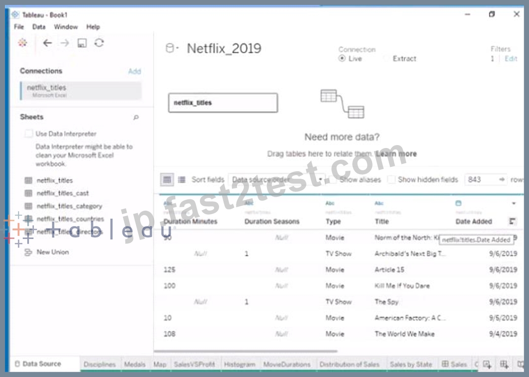
正解:
解説:
Send us your feedback on it
質問 # 30
Open the link to Book1 found on the desktop. Open the Line worksheet.
Modify the chart to show only main and max values of both measures in each region.
正解:
解説:
check the steps below in explanation.
Explanation:
To modify the chart to show only min and max values of both measures in each region, you need to do the following steps:
Open the link to Book1 found on the desktop. This will open the Tableau workbook that contains the Line worksheet.
Click on the Line tab at the bottom of the workbook to open the worksheet. You will see a line chart that shows the sales and profit for each month by region.
Drag Month from the Columns shelf to Filters shelf. This will open a dialog box that allows you to filter by different criteria.
Select Range of Dates from the dialog box. This will show you options to filter by a range of dates or values.
Select Minimum and Maximum from the drop-down list next to Month. This will filter by the minimum and maximum values of Month for each region. You can also enter specific values or use the sliders to adjust the range.
Click OK to apply the filter. You will see that the line chart now shows only min and max values of both measures in each region.
References: https://help.tableau.com/current/pro/desktop/en-us/filtering.htm
https://help.tableau.com/current/pro/desktop/en-us/filtering_range.htm
質問 # 31
Open the link to Book1 found on the desktop. Use the Superstore data source.
Split the Customer Name field into two fields named First Name and Last Name.
- A. Send us your
- B. Send us your feedback on it.
正解:B
質問 # 32
Open the link to Book1 found on the desktop. Open the CategoryPercentage worksheet.
Modify the bar chart show the percentage of sales for each Subcategory within every Category. The total percentage for every Category must be 100%.
- A. check the steps below in explanation
正解:A
解説:
To modify the bar chart to show the percentage of sales for each Subcategory within every Category, you need to do the following steps:
Open the link to Book1 found on the desktop. This will open the Tableau workbook that contains the CategoryPercentage worksheet.
Click on the CategoryPercentage tab at the bottom of the workbook to open the worksheet. You will see a bar chart that shows the total sales for each Subcategory across all Categories.
Right-click on Sales on the Columns shelf and select Add Table Calculation from the menu. This will open a dialog box that allows you to apply a calculation to your measure.
Select Percent of Total from the Calculation Type drop-down list. This will calculate the percentage of sales for each Subcategory out of the total sales for all Subcategories.
Select Category from the Compute Using drop-down list. This will calculate the percentage of sales for each Subcategory within every Category, instead of across all Categories. The total percentage for every Category will be 100%.
Click OK to apply the table calculation. You will see that the bar chart now shows the percentage of sales for each Subcategory within every Category.
質問 # 33
Open the link to Book1 found on the desktop. Open the CategoryPercentage worksheet.
Modify the bar chart show the percentage of sales for each Subcategory within every Category. The total percentage for every Category must be 100%.
- A. Send us your
- B. Send us your feedback on it.
正解:B
質問 # 34
You have a data set that contains three columns named Sales, Profit, and Quantity.
You need to build the following scatter plot.

正解:
解説:
Explanation:
To build the scatter plot shown in the image, you need to place the Profit measure on the Rows shelf and the Sales measure on the Columns shelf. This will create a Cartesian chart with Profit as the y-axis and Sales as the x-axis. Then, you need to change the mark type to Circle on the Marks card. This will display the data points as circles that vary in size according to the Quantity measure. You can also add color or shape encoding to the marks to show additional dimensions or measures in the view. References:
Build a Scatter Plot
Understanding and Using Scatter Plots
Scatter plot in Tableau
質問 # 35
You have a Tableau workbook that contain three worksheets named Sheet1 Sheet2 and Sheet3.
You create several filters.
From the Data Source page you plan to add data source fillers
When type of filter will appear in the Edit Data Source Filters dialog box?
- A. A dimension filter on all the sheets
- B. A table calculation filter used on Sheet
- C. A context filler on a dimension m Sheet3
- D. A top N condition filer on a dimension in Sheet 1 and Sheet2
正解:A
解説:
A data source filter is a filter that applies to all the worksheets that use the same data source. It filters the data before any other filters or calculations are applied. You can add a data source filter from the Data Source page by clicking on the Add button next to Filters.
The type of filter that will appear in the Edit Data Source Filters dialog box is a dimension filter on all the sheets. This means that you can choose a dimension from your data source and filter it by values, range, condition, or top/bottom. The filter will affect all the worksheets that use that dimension.
The other types of filters are not data source filters and will not appear in the Edit Data Source Filters dialog box. A table calculation filter is a filter that applies to a table calculation, such as percent of total or running total. A top N condition filter is a filter that shows only the top or bottom N values of a measure or dimension based on a condition. A context filter is a filter that creates a subset of data that other filters can use.
質問 # 36
You have a Tableau Prep flow that joins a dataset named Global Indicators to a dataset named Price Indices.
In which step can you transform rows of monthly data into rows of yearly data''
正解:
解説:
Explanation:
A screenshot of a computer Description automatically generated
質問 # 37
You are subscribed to several views.
You need to unsubscribe from the views.
What should you use?
- A. The Data Source page of Tableau Desktop
- B. The My Content area of Tableau web pages
- C. The Shared with Me page
- D. The Notifications area of Tableau Prep
正解:B
解説:
To unsubscribe from the views, you should use the My Content area of Tableau web pages. This area allows you to manage your subscriptions, as well as your workbooks, views, and data sources. You can select the views you want to unsubscribe from, click Actions, and then click Unsubscribe. You can also change the subscription options, such as the schedule, the format, or the message. Reference:
Create a Subscription to a View or Workbook - Tableau
Tableau Certified Data Analyst Study Guide
質問 # 38
You company has two divisions located in the United States and Germany Bach division has a separate database. The following is a sample of the sales data for the division in the United States.
The following is a sample of the sales data for me division in Germany.
You have population data in a file named Populatio.csv. the following is a sample of the data.
You plan to create a visualization that ml show tie sales per capita for each salesperson Each salesperson must be identified by identified by their full name.
You need to prepare the data to support the planned visualization. The data source must support being published .
Which four actions should you perform in order?
(Place the four correct options n order Use the arrows to move Options to Answer Area arrows to re-order the options.
Use Answer Area arrows to re-order the options)
正解:
解説:
1 - Open Tableau Desktop
2 - Create a new column to concatenate the name for the Germany division.
3 - Union the sales data of both divisions.
4 - Join the sales data and the population data by using City as the join field
質問 # 39
You want to add a draft watermark to a dashboard as shown in the following exhibit.
Which type of object should you use?
- A. Image
- B. Sheet
- C. Horizontal
- D. Web page
正解:A
解説:
References: https://help.tableau.com/current/pro/desktop/en-us/dashboards.htm
https://help.tableau.com/current/pro/desktop/en-us/dashboards_create_layouts.htm
https://help.tableau.com/current/pro/desktop/en-us/dashboards_create_watermarks.htm To add a draft watermark to a Tableau dashboard, you would use an image object. You can overlay this image across your dashboard, possibly with some transparency, to achieve the watermark effect without interfering with the readability of the dashboard content.
質問 # 40
You have the Mowing dashboard.
Which two elements are floating? Choose two.
- A. The little
- B. The color legend
- C. The Rate of Obesity chart
- D. The map
- E. The state filter
正解:B、C
解説:
To identify which elements are floating on a dashboard, you can look for a gray border around them when you select them. Alternatively, you can open the Layout pane and see which elements have a pin icon next to them. The pin icon indicates that the element is floating and can be moved freely on the dashboard. Based on these criteria, the state filter and the color legend are floating elements on the dashboard. Reference: https://help.tableau.com/current/pro/desktop/en-us/dashboards_organize_floating_layoutcontainers.htm https://help.tableau.com/current/pro/desktop/en-us/dashboards_create_layouts.htm
質問 # 41
You have the following dashboard that contains two sheets.
You want to minimize the whitespace between the sheets.
What should you configure?
- A. The padding
- B. The position
- C. The border
- D. The size
- E. The background
正解:A
解説:
To minimize the whitespace between the sheets, you should configure the padding of the sheets and the dashboard. Padding is the amount of space between the edge of a sheet or dashboard and its content. You can adjust the padding by using the Layout tab in the Format pane. You can reduce the padding for each sheet by selecting the sheet and changing the values for the inner and outer padding. You can also reduce the padding for the dashboard by selecting the dashboard and changing the values for the outer padding. Reducing the padding will make the sheets and the dashboard more compact and eliminate unnecessary whitespace. Reference:
Format Dashboards - Tableau
Tableau Certified Data Analyst Study Guide
質問 # 42
You have a data source that contains data tor every city in the Unites States. The following is a sample of the data.
You need to use the City dimension to create a dynamic filter that snows the cities that have a population greater than one million Which type of filter should you use?
- A. Top filter
- B. General filter
- C. Wildcard filter
- D. Condition filter
正解:D
解説:
To use the City dimension to create a dynamic filter that shows the cities that have a population greater than one million, you should use a condition filter. A condition filter is a type of filter that shows only the values that meet a specified condition based on a measure or a calculation. You can create a condition filter by dragging a dimension to the Filters shelf and selecting Condition from the dialog box. Then you can enter a formula or choose an option that defines your condition.
In this case, you want to create a condition filter based on Population, which is a measure. You can drag City to the Filters shelf and select Condition from the dialog box. Then you can choose By field from the tab and select Population > Sum > Greater than > 1000000 from the drop-down lists. This will create a condition filter that shows only the cities that have a sum of population greater than one million.
The other options are not correct for this scenario. A general filter is not a specific type of filter, but a term that refers to any type of filter in Tableau. A wildcard filter is a type of filter that shows only the values that match a specified pattern or string, such as "New*" or "*ton". A top filter is a type of filter that shows only the top or bottom N values of a measure or dimension based on a ranking or an aggregation. Reference: https://help.tableau.com/current/pro/desktop/en-us/filtering.htm https://help.tableau.com/current/pro/desktop/en-us/filtering_condition.htm https://help.tableau.com/current/pro/desktop/en-us/filtering_wildcard.htm https://help.tableau.com/current/pro/desktop/en-us/filtering_topn.htm
質問 # 43
You are developing a data source in Tableau Prep.
You have two tables named Orders and Employees.
The Orders table was created in 2019 and contains the following columns.
The Employees table contains all the employee information for the various sales teams in the sales department and contains the following columns
You want to prepare the data so that you can analyze sales trends over time for every sales team.
Which three actions should you perform in order? (Place the three correct options in order. Use the arrows to move Options to Answer Area. Use Answer Area arrows to re-order the options.)
正解:
解説:
Explanation:
There are different ways to prepare the data in Tableau Prep, but one possible answer is:
Answer area:
Join the tables.
Aggregate the data by Sales Team.
Add the following filter to the Employees table: Sale Team - Team Alpha.
To analyze sales trends over time for every sales team, you need to combine the data from the Orders and Employees tables. You can do this by joining the tables on the Rep ID column, which is a common identifier for both tables. This will create a single table with all the columns from both tables. Next, you need to aggregate the data by Sales Team, which is the level of analysis you want. You can do this by grouping the data by the Sales Team column and applying an aggregation function (such as sum, average, count, etc.) to the other columns that you want to measure (such as Total Amount, Rep Tenure, etc.). This will create a summary table with one row for each sales team and the aggregated values for the other columns. Finally, you need to filter the data to focus on a specific sales team, such as Team Alpha. You can do this by adding a filter to the Employees table and selecting only the rows where Sales Team equals Team Alpha. This will remove the rows for other sales teams and keep only the data for Team Alpha.
References:
[Tableau Certified Data Analyst Exam Prep Guide], page 9, section "Preparing Data"
[Tableau Help: Join Your Data]
[Tableau Help: Aggregate Your Data]
[Tableau Help: Filter Your Data]
質問 # 44
You have the following visualization.
The Last() calculation is set to compute using Table (across)
Which value will appear in the crosstab for the Consumer segment of the year 2018 if you change compute to use Oder Dale?
- A. 0
- B. 1
- C. 2
- D. 3
正解:B
解説:
The value that will appear in the crosstab for the Consumer segment of the year 2018 if you change compute to use Order Date is 0. The Last() calculation is a table calculation that returns the number of rows from the current row to the last row in the partition. The partition is determined by how you compute the calculation. In this case, you change compute to use Order Date, which means that the calculation will be performed for each value of Order Date.
The crosstab shows that there are two values of Order Date for the Consumer segment of the year 2018: Q1 and Q4. The Last() calculation will return 0 for Q4, because it is the last row in the partition. It will return 1 for Q1, because it is one row away from the last row in the partition.
The other options are not correct for this scenario. The Last() calculation will not return 2, 3, or 4 for any value of Order Date, because there are only two values in each partition.
質問 # 45
......
TDA-C01問題集と練習テスト(100試験問題):https://jp.fast2test.com/TDA-C01-premium-file.html
リリースTableau TDA-C01更新された問題PDF:https://drive.google.com/open?id=17hh7ZSH0g7ZeatO2QP7O403yh-Buq4lc