

[2024年07月] 問題集簡単概要TDS-C01日本語試験問題Fast2test
TDS-C01日本語トレーニング認証最新版をゲットTableau Desktop Specialist
質問 # 36
Excel、テキスト ファイル データ、JSON ファイル、.pdf ファイル データを操作する場合、_________________ を使用してフォルダー間でファイルを結合し、ワークブック間でワークシートを結合できます。検索は、選択した接続に限定されます。
- A. 正規表現検索
- B. パターン検索
- C. ユニオン検索
- D. ワイルドカード検索
正解:D
解説:
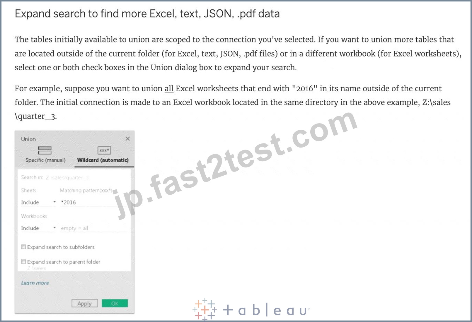
You can use Wildcard Search to set up search criteria to automatically include tables in your union. Use the wildcard character, which is an asterisk (*), to match a sequence or pattern of characters in the Excel workbook and worksheet names, Google Sheets workbook and worksheet names, text file names, JSON file names, .pdf file names, and database table names.
When working with Excel, text file data, JSON file, .pdf file data, you can also use this method to union files across folders, and worksheets across workbooks. Search is scoped to the selected connection. The connection and the tables available in a connection are shown on the left pane of the Data source page.
質問 # 37
次のうち、Tableau 2020.1 で導入された新機能でないものはどれですか?
- A. バッファ計算
- B. 動的パラメータ
- C. Viz アニメーション
- D. コントロールの設定
正解:D
解説:
Your Tableau Desktop Specialist exam will be based on the 2020.1 version.
Set controls are a new feature introduced in the 2020.2 version, and hence is the correct answer - it is not a part of 2020.1 For the 2020.1 version the new features were:
1) Viz animations:
Viz animations help you see and understand your changing data. It's easy to track the logical steps behind data's evolution and tell powerful data stories. Sorting, filtering, adding fields, and other actions will now smoothly animate your visualizations. Choose whether to turn Viz Animations on or off, and decide how you'd best like to apply animations to your new workbooks.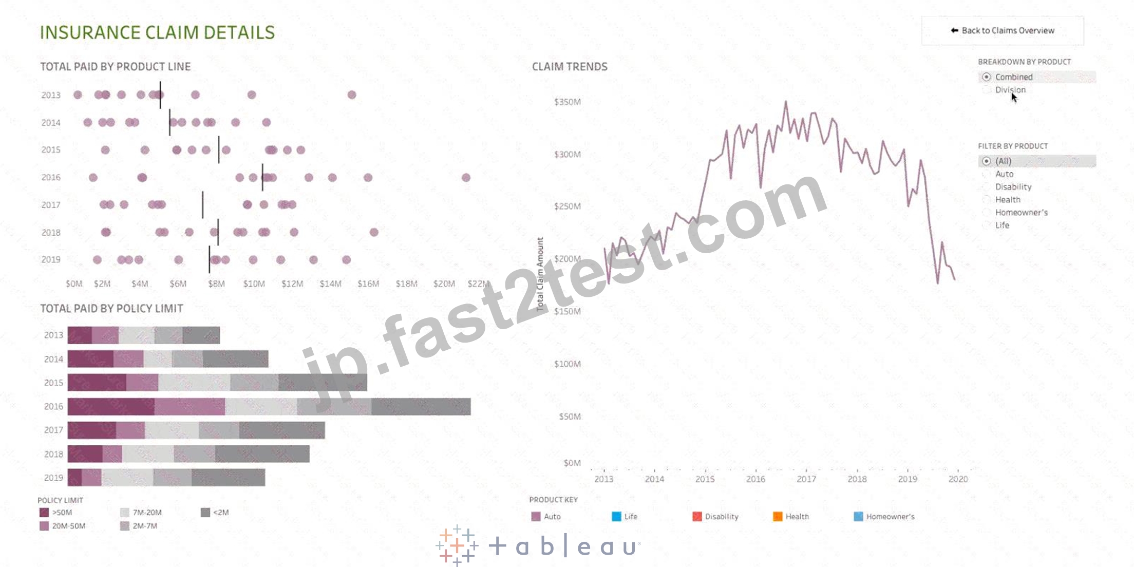
2) Dynamic Parameters:
Say goodbye to republishing workbooks with parameters every time the underlying data changes. Set your parameter once, and Tableau will automatically update the parameter's list of values every time someone opens the workbook.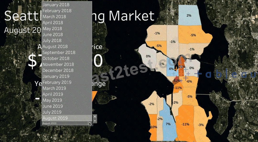
3) Buffer Calculations: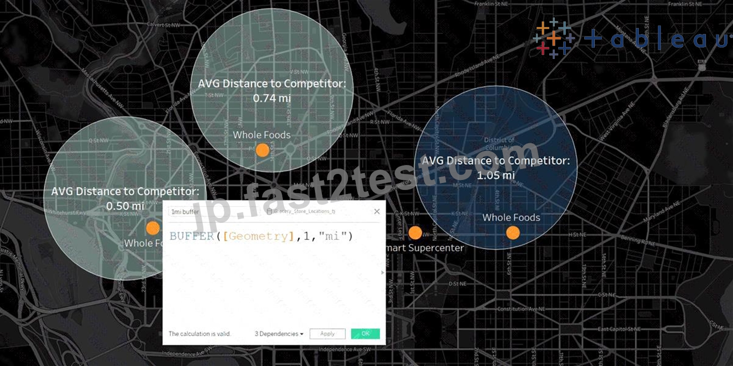
Buffer calculations allow you to visualize the distance around point locations. Give Tableau three parameters-location, distance, and a unit of measure-and a buffer, or boundary is instantly created.
Answering complex spatial questions becomes easier than ever before-visualize what properties are within
200 meters of a proposed transit site, or how many competitors' stores are within 1 mile of their store, and more.
質問 # 38
正誤問題: LEFT JOIN または INNER JOIN は、結合基準が満たされるたびに行を作成するため、行が重複する可能性があります。これを回避する 1 つの方法は、代わりにデータ ブレンディングを使用することです。
- A. 偽
- B. 真
正解:B
解説:
Joins combine tables by adding more columns of data across similar row structures. This can cause data loss or duplication if tables are at different levels of detail, and joined data sources must be fixed before analysis can begin.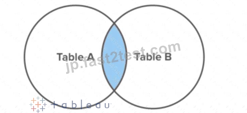
Inner join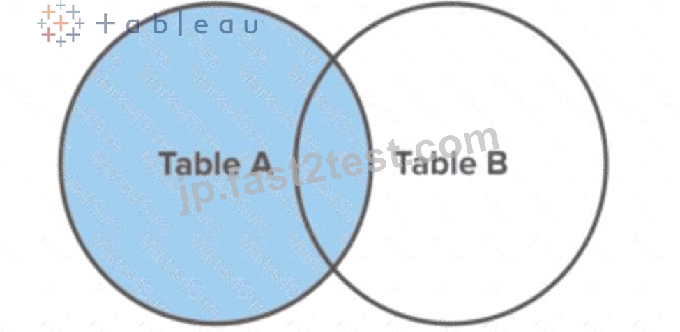
Left Join
Blends, unlike relationships or joins, never truly combine the data. Instead, blends query each data source independently, the results are aggregated to the appropriate level, then the results are presented visually together in the view.
質問 # 39
新しいデータ ソースに接続すると、以前に元のデータ ソースを参照していたすべてのワークシートが新しいデータ ソースを参照するようになります。新しいデータ ソースのフィールド名が元のワークブックと同じでない場合、フィールドには感嘆符が付けられます。
。この問題の解決に役立つ機能はどれですか?
- A. 参照を置換
- B. エイリアス
- C. メタデータを修正
- D. 名前の変更
正解:A
解説:
Replace Reference:
For example, say you have a workbook connected to a data source that contains a Customer Name field. Then you edit the data source to point to a new data source that has all the same data but instead of Customer Name, the field name has been changed to Name. The Customer Name field remains in the Data pane but is marked as invalid. To make the field valid, you can replace the references, which means you can map the invalid field to a valid field in the new data source (for example, Customer Name corresponds to Name).
Read more at : https://help.tableau.com/current/pro/desktop/en-us/howto_connect.htm
質問 # 40
データセットを使用して、LATAM のみを含むように市場でフィルター処理されたすべての国を示すマップをプロットします。LATAM 市場で出荷遅延 (注文日から出荷日までの合計日数) が最も長い国は?
- A. メキシコ
- B. アルゼンチン
- C. ペルー
- D. ブラジル
正解:A
解説:
VERY IMPORTANT QUESTION FOR THE EXAM, PAY ATTENTION
1) To find the number of days between order date and shipping date, we will make use of a calculated field: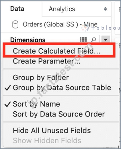
In the data pane, click on the dropdown arrow, and choose create calculated field.
Let's name this calculated field "ShippingDelay" (you can name it anything you want :) )
2) Use the DATEDIFF() function, and pass it the arguments as follows: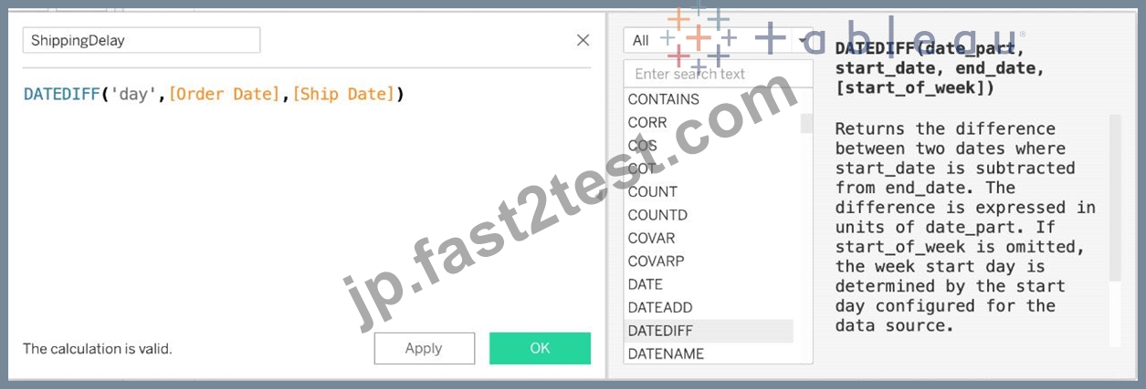
'day' depicts that we want to calculate the number of DAYS between the two dates. The first argument is 'start_date' which is the ORDER_DATE (day the order was placed), the second argument is 'end_date', which is the SHIP_DATE (date the order was shipped). So by subtracting as follows: SHIP_DATE - ORDER_DATE, we can find the delay in shipping.
Click OK.
3) You should now have a new measure as follows: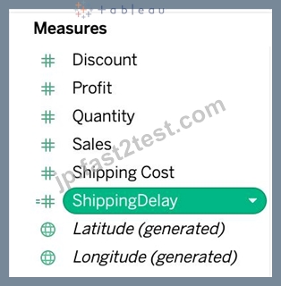
4) Phew! The hard part is done! Now let's filter by Market to include only LATAM: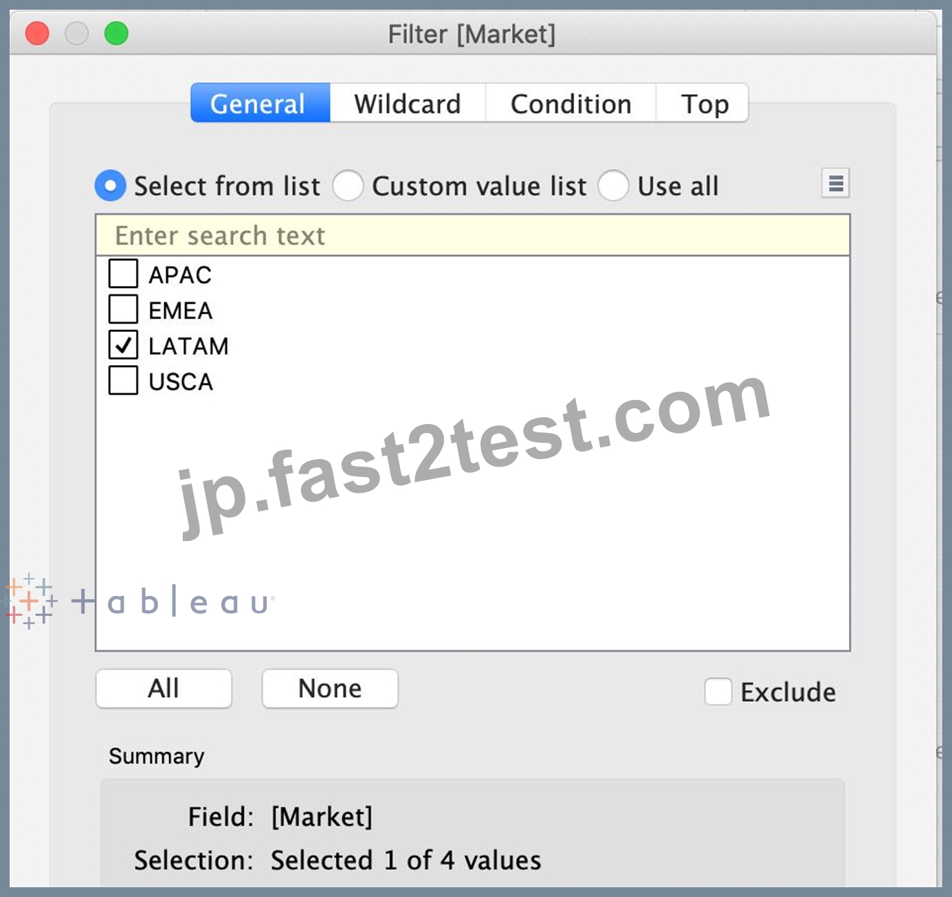
5) Drag Country to the view, and the new calculated field 'ShippingDelay' to SIZE on the Marks Shelf as follows:
*You can also click on Show Text Labels to be sure that you're choosing the Largest value*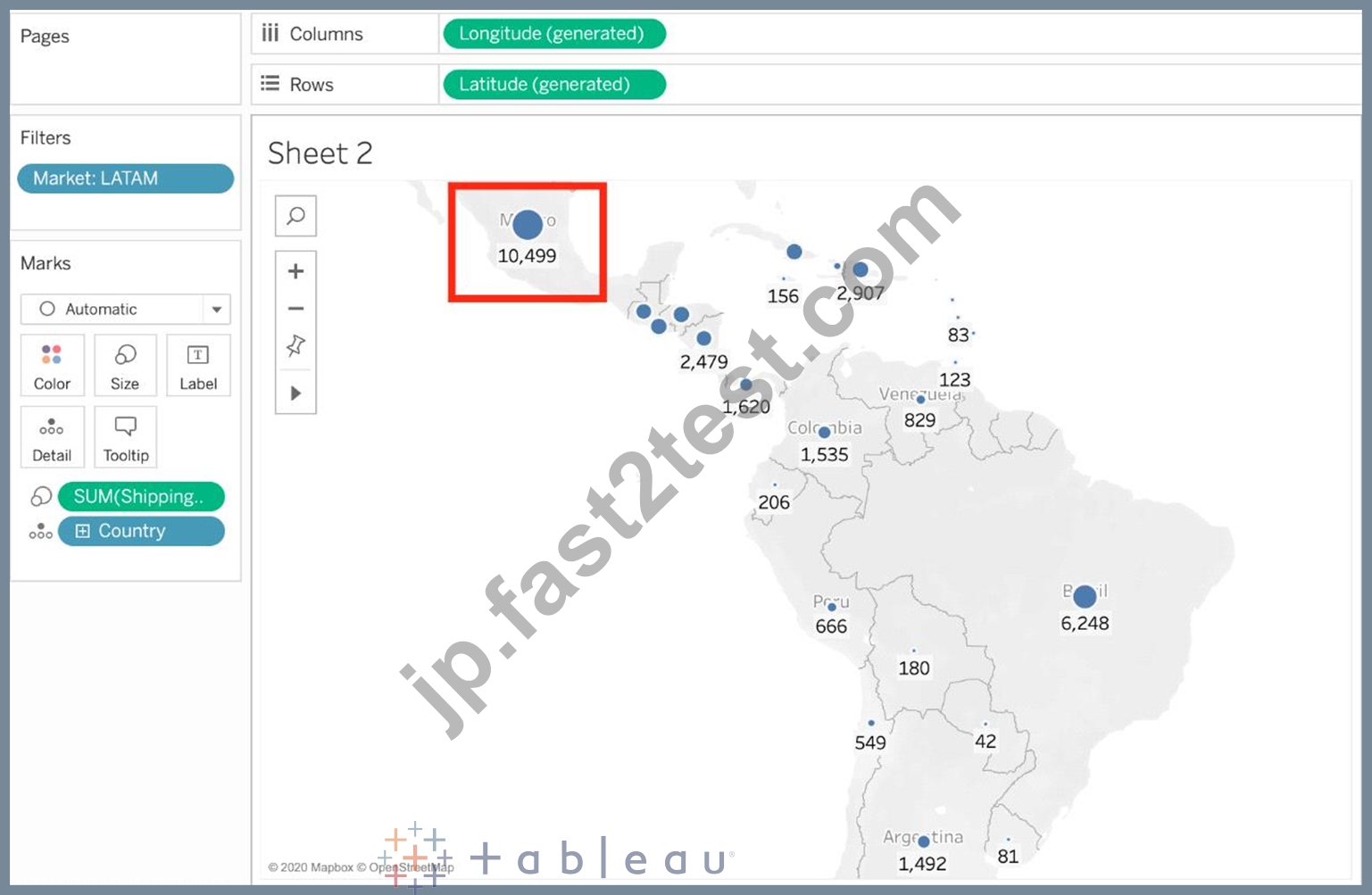
Clearly, Mexico has the highest Shipping Delay!
質問 # 41
次のうち、Tableau でセットを作成する有効な方法はどれですか?
- A. [データ] ペインでメジャーを右クリックし、[作成] > [セット] を選択します。
- B. Tableau メイン メニューで、[ワークシート] を選択し、[作成] > [設定] を選択します。
- C. [データ] ペインでディメンションを右クリックし、[作成] > [設定] を選択します。
- D. Tableau メイン メニューで [ダッシュボード] を選択し、[作成] > [設定] を選択します。
正解:C
解説:
There are two types of sets: dynamic sets and fixed sets. The members of a dynamic set change when the underlying data changes. Dynamic sets can only be based on a single dimension.
To create a dynamic set:
1) In the Data pane, right-click a dimension and select Create > Set.
2) In the Create Set dialog box, configure your set. You can configure your set using the following tabs:
General: Use the General tab to select one or more values that will be considered when computing the set.
You can alternatively select the Use all option to always consider all members even when new members are added or removed.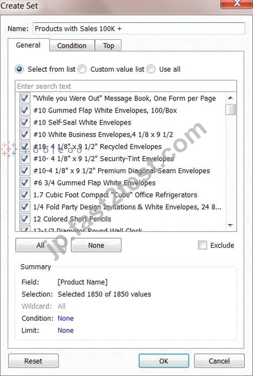
None of the other options exist, and therefore are incorrect answers.
質問 # 42
Union 内のフィールド名が一致しない場合は、次のようになります。
- A. Tableau がフィールド名の不一致を自動的に修正するため、正しい値を持つフィールド名がユニオン内に 1 つだけ存在します。
- B. 両方のフィールド名が共用体に存在しますが、いくつかの null 値が含まれています
- C. エラーが発生し、両方のフィールドが結果の和集合から削除されます。
- D. ユニオン内に null 値を持つフィールド名が 1 つだけ存在します。
正解:B
解説:
By default, both field names are present in the Union, but contain several null values!
When field names in the union do not match, fields in the union contain null values. You can merge the non-matching fields into a single field using the merge option to remove the null values. When you use the merge option, the original fields are replaced by a new field that displays the first non-null value for each row in the non-matching fields.
You can also create your own calculation or, if possible, modify the underlying data to combine the non-matching fields.
For example, suppose you have the following customer purchase information stored in three tables, separated by month. The table names are "May2016," "June2016," and "July2016." Table Description automatically generated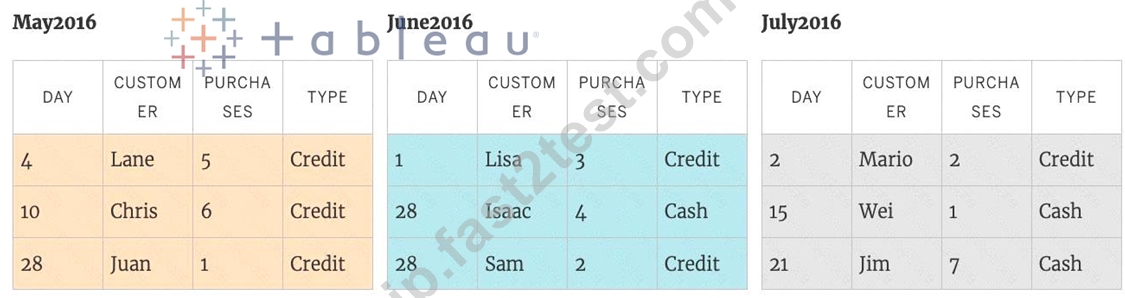
A union of these tables creates the following single table that contains all rows from all tables.
Table Description automatically generated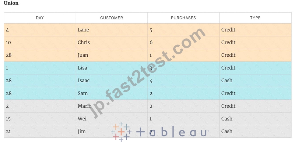
Now suppose a fourth table, "August2016", is added to the underlying data. Instead of the standard
"Customer" field name, it contains an abbreviated version called "Cust." Table Description automatically generated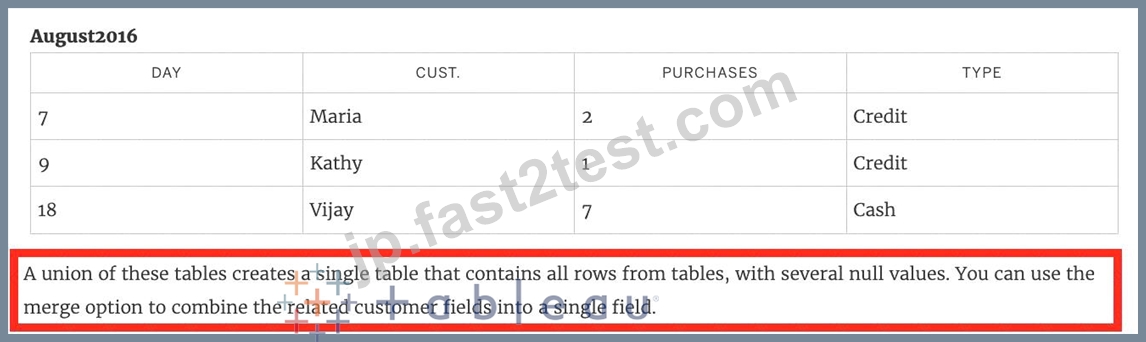
Table Description automatically generated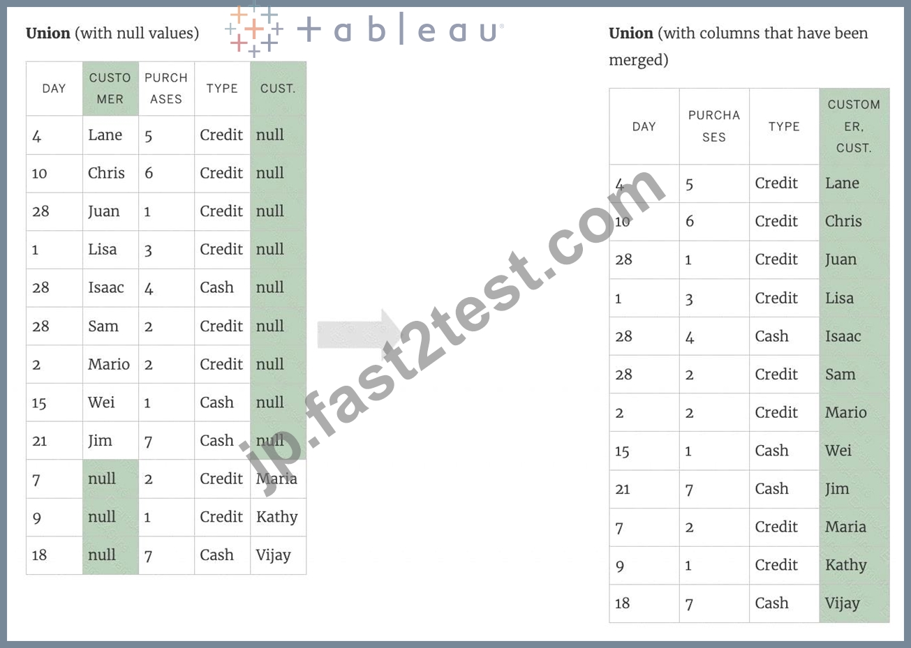
質問 # 43
次のうち、Tableau でツールヒントのコンテンツを太字にする有効な方法はどれですか?
- A. 右クリックして [書式] をクリックし、既定のワークシートの書式設定で [ツールヒント] を選択して太字にします。
- B. メニュー バーの [ワークシート] をクリックし、続いて [ツールヒント] をクリックして、太字のオプションを選択します。
- C. [分析]、[ツールヒント オプション] をクリックし、太字を選択します。
- D. [マーク] カードの [ツールヒント] をクリックし、[太字] を選択します。
正解:A、B、D
解説:
Lot of students have been seeing this question in the exam lately, and wanted me to include this question so here it is. Follow along -
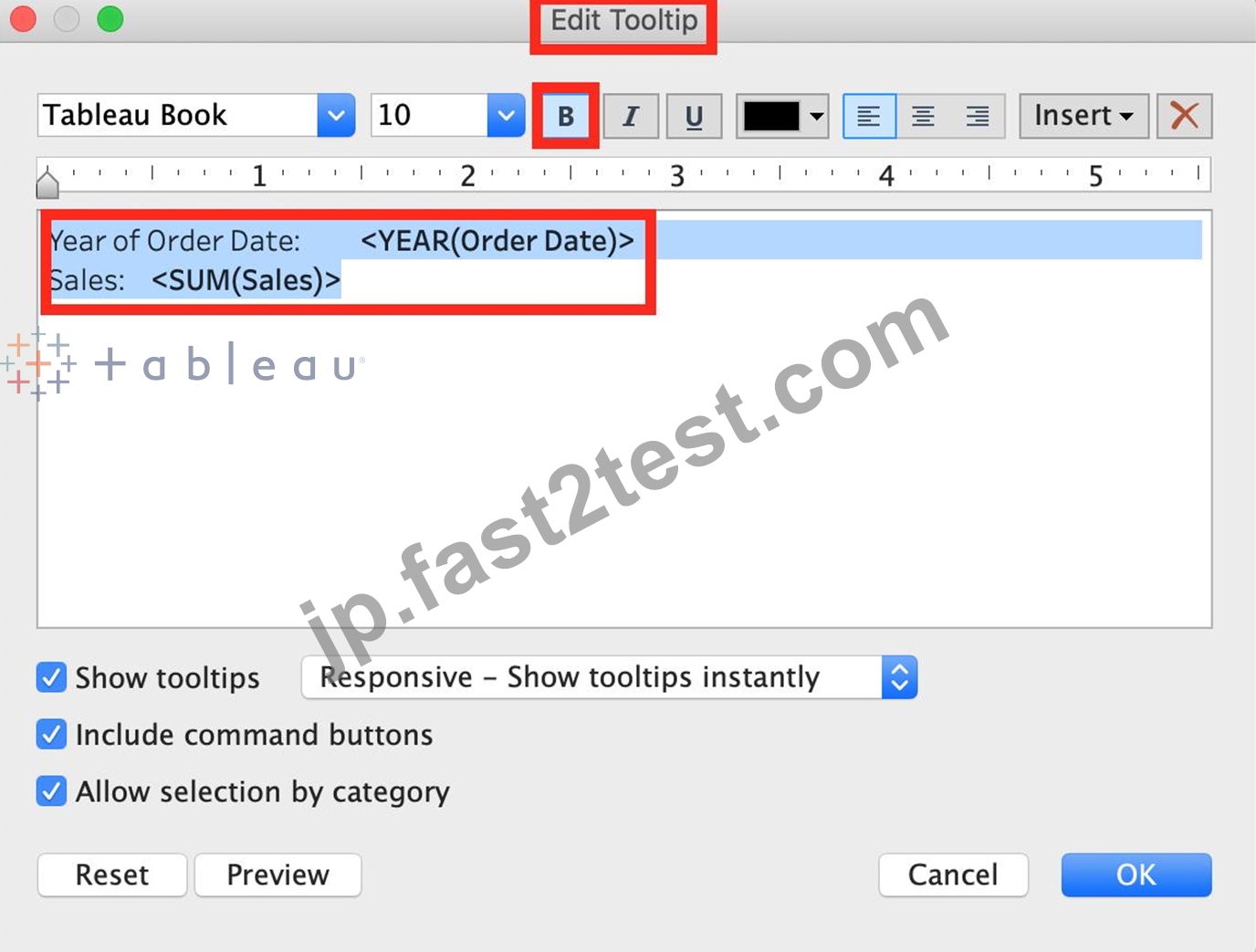
1) Click on Worksheet in the Menu bar, followed by Tooltip and select the bold option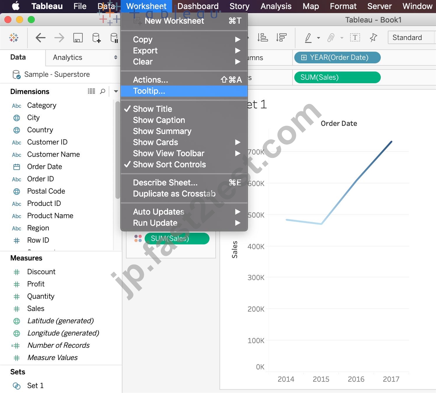
2) Click on Tooltip in the Marks card, and select bold.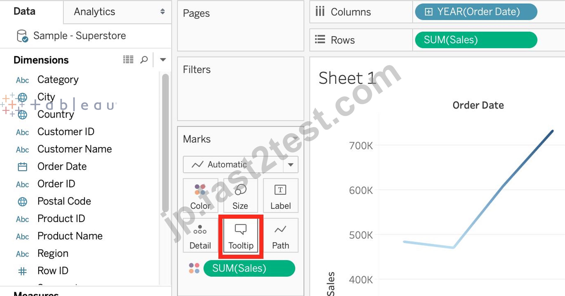
3) Right click, click format and then under the default worksheet formatting, choose Tooltip and make it bold.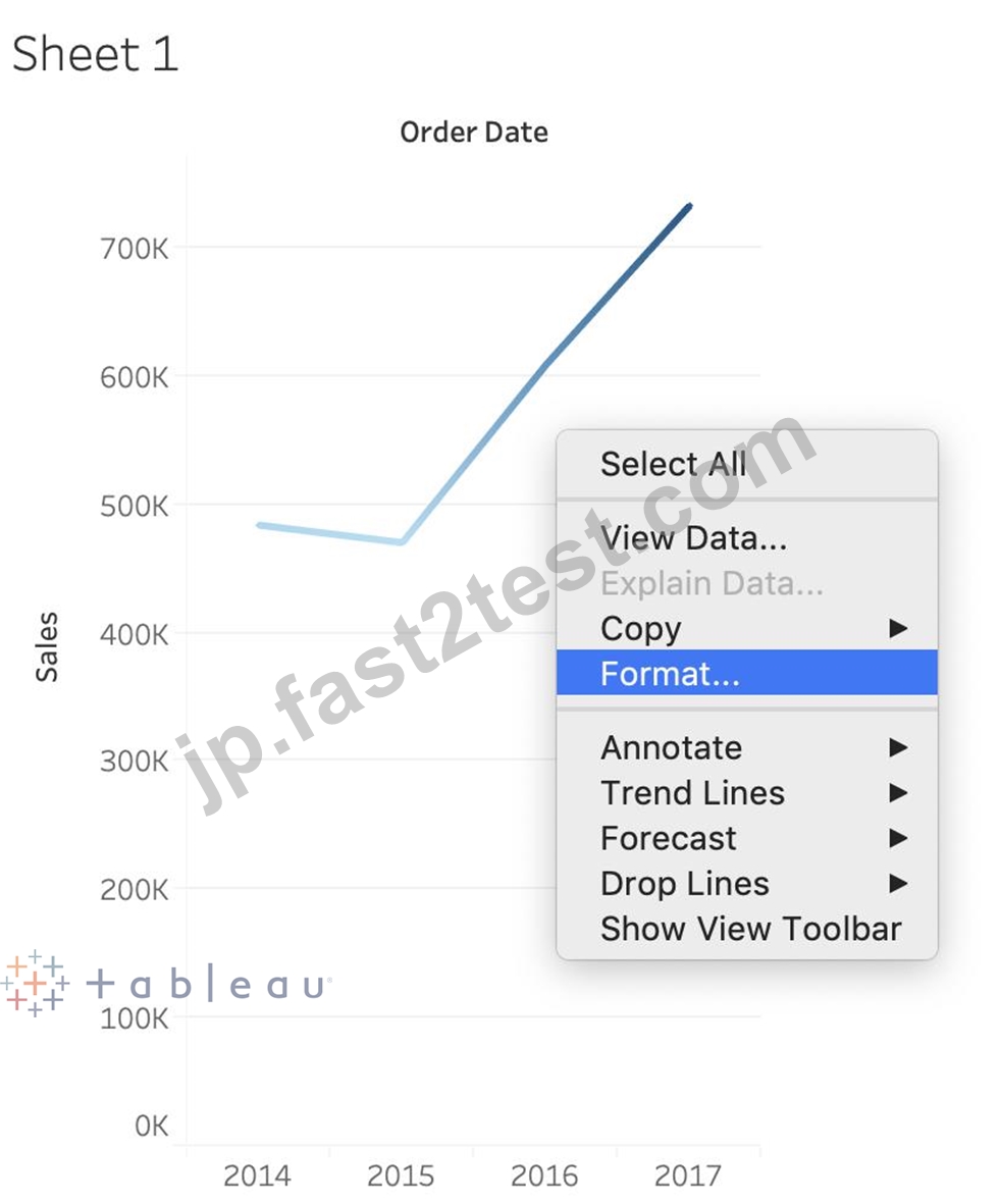
There exists no option to Bold the tooltip contents by clicking Analysis. Hence, it is an incorrect choice.
質問 # 44
メタデータの管理オプションを使用すると、______________ が列の元の名前であるのに対し、______________ は Tableau で作成したカスタム名である列のカスタム名を作成できます。
- A. ローカル名、実際の名前
- B. 列名、実際の名前
- C. ローカル フィールド、グローバル フィールド
- D. リモート フィールド名、フィールド名
正解:D
解説:
Using the Sample superstore as a reference, click on the manage metadata icon as follows: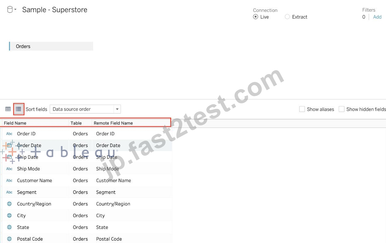
We can rename a particular column name to make it easier to remember and use in Tableau. Let's change Order ID to oID as shown: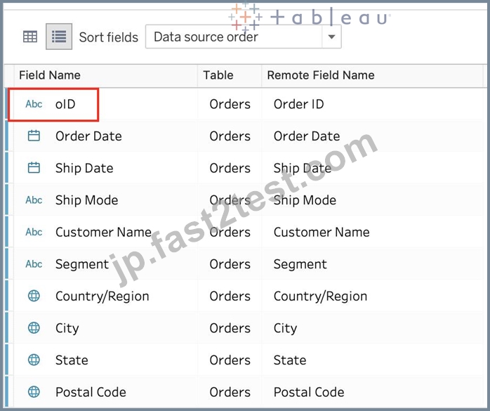
Now, we'll see oID when using this data source in Tableau. This WILL NOT affect the original data source. The remote field name let's us see what the name of the column is in the ORIGINAL Data source.
質問 # 45
.tds ファイルに保存されるのは次のうちどれですか? 3 を選択します。
- A. データ抽出
- B. ビジュアライゼーション
- C. メタデータの編集
- D. データ接続情報
- E. 計算フィールド
正解:C、D、E
解説:
If you've created a data connection that you might want to use with other workbooks or share with colleagues, you can export (save) the data source to a file. You might want to do this also if you've added joined tables, default properties, or custom fields-such as groups, sets, calculated fields, and binned fields-to the Data pane.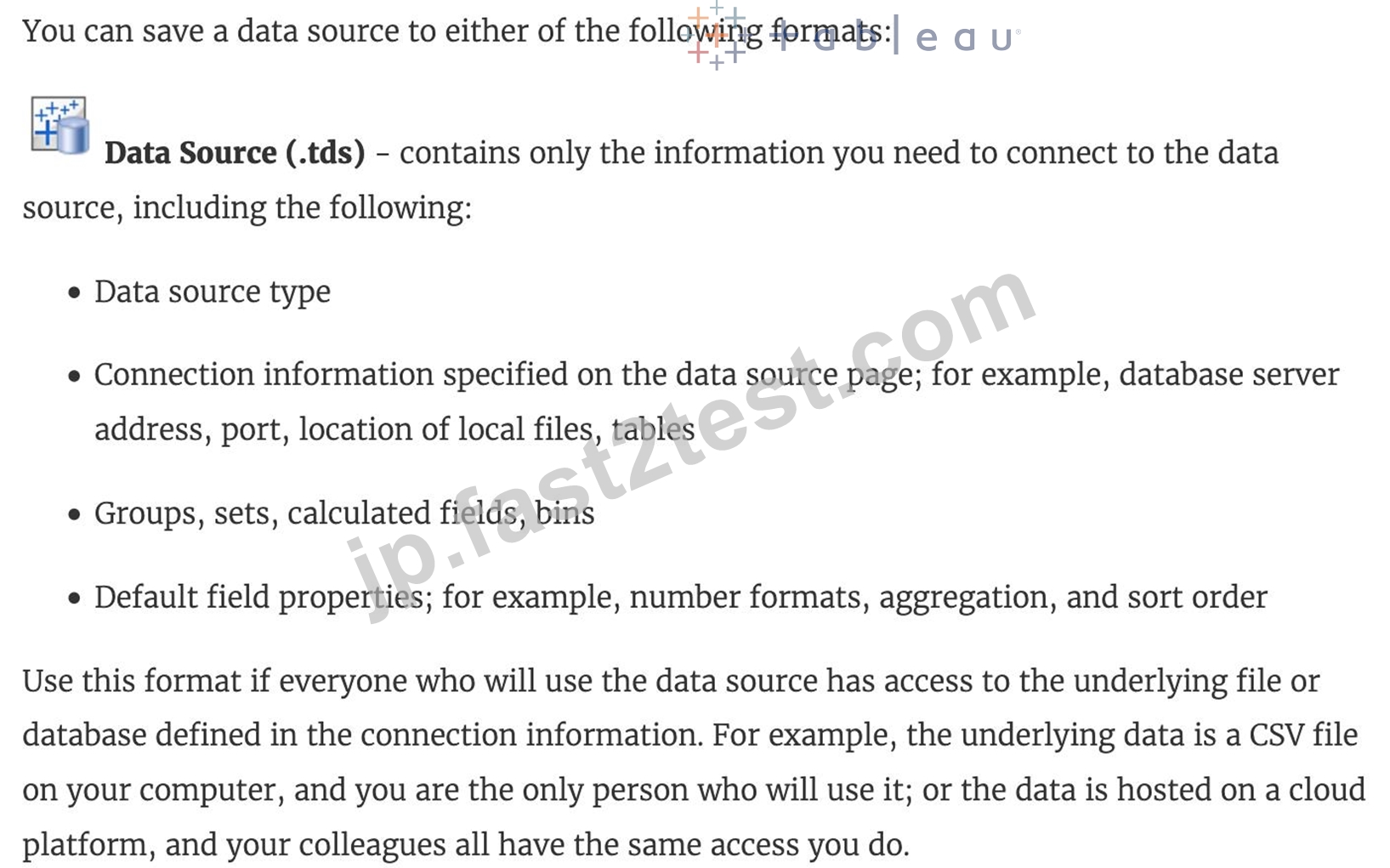
Visualisations and Data extracts are NOT saved in a .tds file!
質問 # 46
正誤問題: コンテキスト フィルターはデータ ソース フィルターの後に実行される
- A. 偽
- B. 真
正解:B
解説:
THIS IS A VERY IMPORTANT QUESTION
To answer this question, you need to understand Tableau's Order of Operations. See below and remember this always: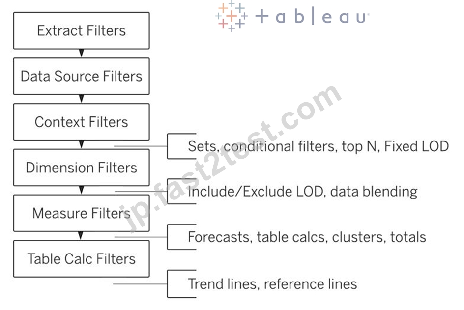
質問 # 47
次のビジュアライゼーションを作成します。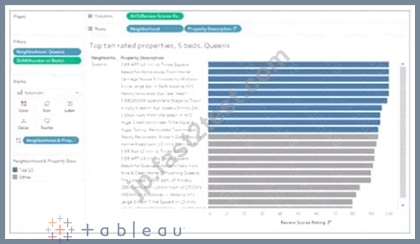
青で示された 10 個のマークを視覚的にグループ化するための最初のステップは何ですか?
- A. ビュー内で目的の 10 個のマークを選択します。
- B. [データ] ペインの [プロパティの説明] フィールドでグループを作成します。
- C. [プロパティの説明] で目的のテキスト ラベルを 10 個選択します。
- D. [データ] ペインの [近傍] フィールドにセットを作成します。
正解:A
解説:
To visually group marks in Tableau, you typically start by selecting the marks directly in the view. Once the desired marks are selected, you can then create a group from them. This will visually group the selected marks, as indicated by the blue color in the example provided.
質問 # 48
______________ は、テーブルに値 (行) を追加する方法です。両方のテーブルに同じ列がある場合、この方法を使用できます。その結果、同じ列を持つ仮想テーブルが作成されますが、データの行が追加されて垂直方向に拡張されます。
- A. 参加中
- B. 合体
- C. 結合
- D. ブレンディング
正解:B
解説:
Unioning is the correct answer!
From the official documentation: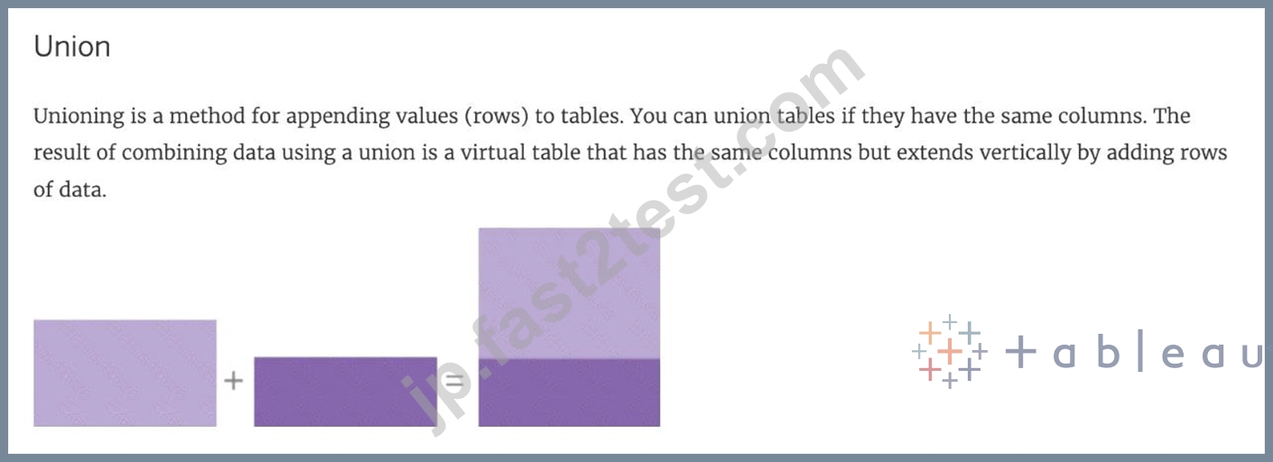
For example, suppose you have the following customer purchase information stored in three tables, separated by month. The table names are "May2016" , "June2016" and "July2016."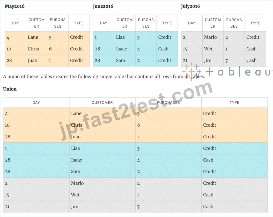
質問 # 49
Tableau のストーリー ポイントとは何ですか?
- A. ダッシュボードのコレクション
- B. ワークシートとダッシュボードの両方のコレクション
- C. ワークシートの集まり
- D. 単一のワークシートまたはダッシュボード
正解:D
解説:
In Tableau, a story is a sequence of visualizations that work together to convey information. You can create stories to tell a data narrative, provide context, demonstrate how decisions relate to outcomes, or to simply make a compelling case.
A story is a sheet, so the methods you use to create, name, and manage worksheets and dashboards also apply to stories (for more details, see Workbooks and Sheets). At the same time, a story is also a collection of sheets, arranged in a sequence. Each individual sheet (worksheet or dashboard) in a story is called a story point.
When you share a story -for example, by publishing a workbook to Tableau Public, Tableau Server, or Tableau Online-users can interact with the story to reveal new findings or ask new questions of the data.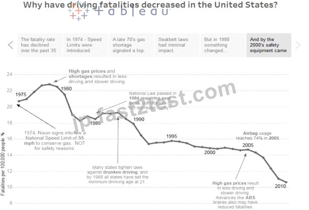
質問 # 50
次のうち、データをグループ化する有効な方法はどれですか?
- A. 分析ペインから
- B. ビューでのラベルの使用
- C. ビューでマークを使用する
- D. 次元の棚から
正解:B、C、D
解説:
**IMPORTANT QUESTION AND EXPLANATION, PLEASE READ**
3 ways to group data -
1) Marks
2) Labels
3) Dimensions shelf.
*IMPORTANT*
If we Group the data by selecting the marks, then they remain separate marks in the view and then have the same colour. Also, a new group is created in the Dimensions shelf. Example - Using the sample superstore dataset, first plot a bar chart showing sales for each sub-category: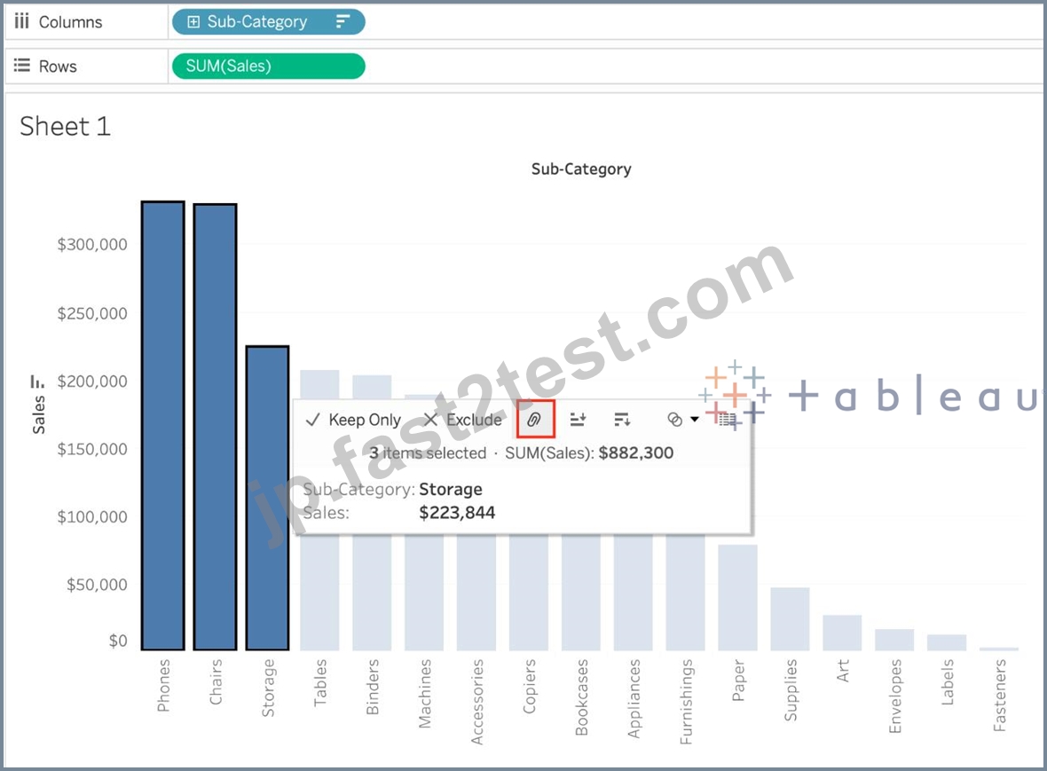
Here, if we Select Phones, Chairs and Storage by selecting the MARKS (Bars), and then group them: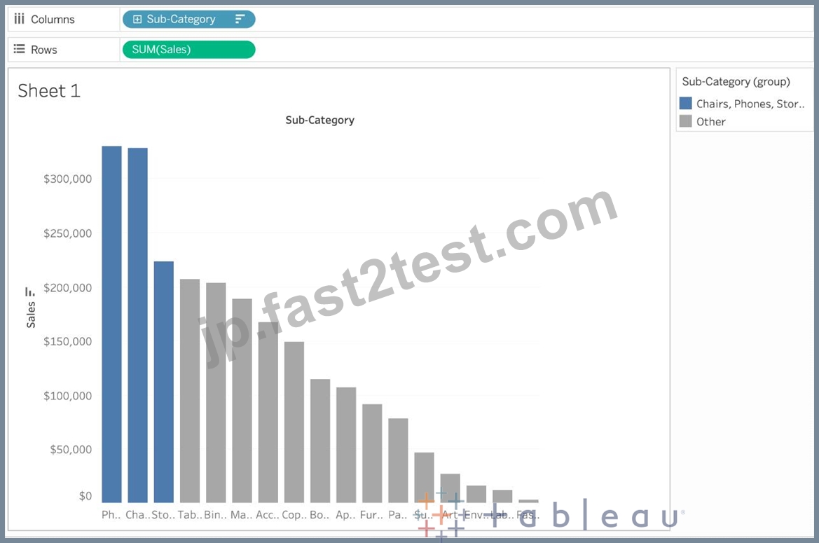
They remain seperate marks (BARS) but are grouped by the same colour.
Now, if we didn't do this, and rather grouped by selecting their Labels (Names):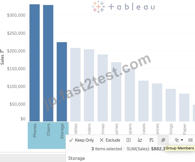
Then they no longer remain separate Marks (bars) but are rather consolidated into a single Bar: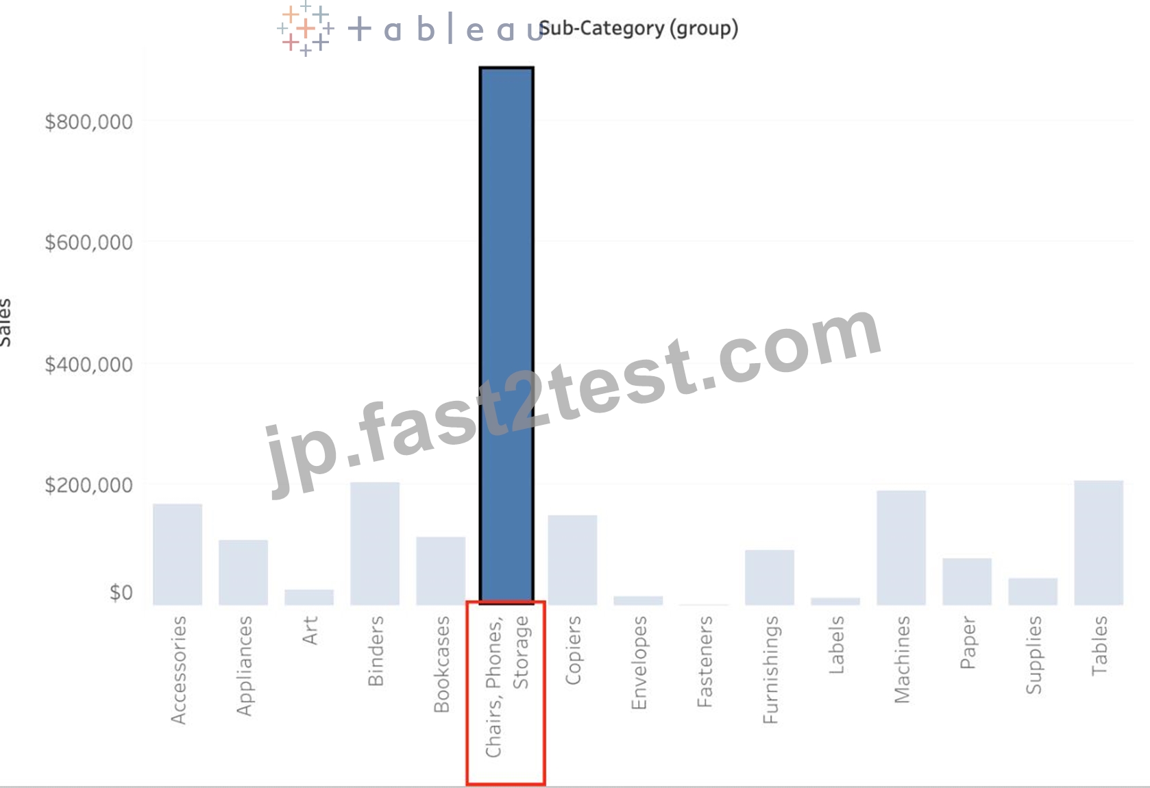
Finally, we can group directly from the Dimensions shelf as follows: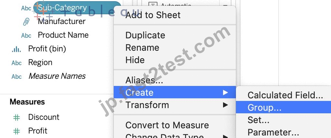
Now choose Phones, Chairs and Storage and Click Group: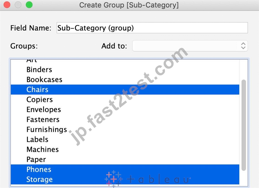
You will now automatically have a new Dimension as follows:
質問 # 51
https://drive.google.com/file/d/12AYHfiPWkwBmvH0zbumOURgUX6Az00Rw/view?usp=sharing からデータセットをダウンロードします。時系列テーブルを使用して、経時的な売上を示す折れ線グラフを作成します。売上が最も低かった年と月は?
- A. 2017 年 9 月
- B. 2017 年 12 月
- C. 2018 年 3 月
- D. 2018 年 1 月
正解:D
解説:
Follow the steps to get the correct answer : January 2018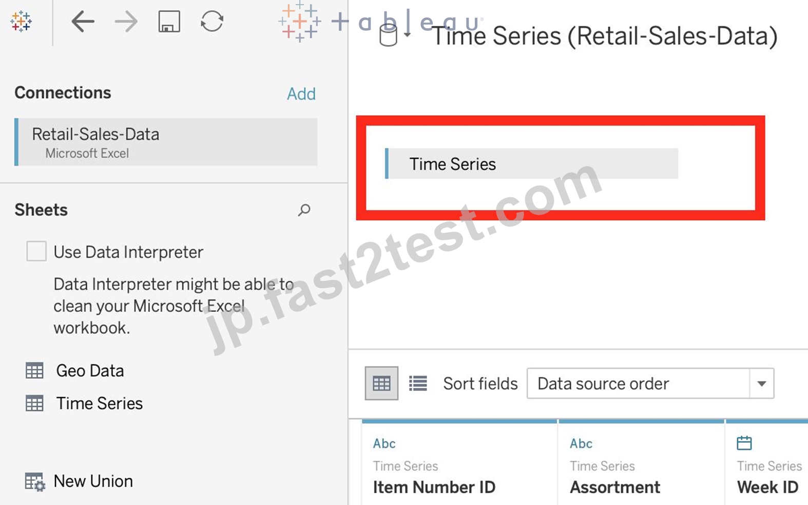
We are talking about dates, so use the Time series sheet as follows: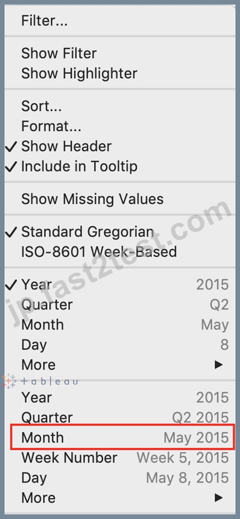
Next, the following should be your view and clearly, January 2018 is the lowest point: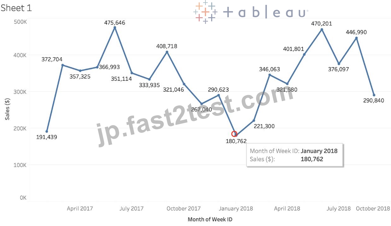
Read more about dates: https://interworks.com/blog/rcurtis/2017/01/30/tableau-deep-dive-dates-introduction-dates/
質問 # 52
箱ひげ図の箱は何を表していますか?
- A. データ ポイントの中央半分の中央値
- B. データの最大値
- C. 四分位範囲
- D. データの最小値
正解:C
解説:
In a box and whisker plot:
1) The ends of the box are the upper and lower quartiles, so the box spans the interquartile range
2) The median is marked by a vertical line inside the box
3) The whiskers are the two lines outside the box that extend to the highest and lowest observations.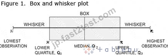
質問 # 53
CoffeeChain テーブルを使用して、州ごとの総経費を示すクロス集計を作成し、列の総計をビューに追加します。次に、ニューヨーク州、カリフォルニア州、ワシントン州をグループ化します。このグループは総売上の何パーセントに貢献していますか?
- A. 25.79%
- B. 27.73%
- C. 29.49%
- D. 23.39%
正解:B
解説:
We need to use the concept of Groups for this question. Follow along:
1) First, Drag State to the Rows shelf, and Total Expenses to the Text Mark on the Marks Shelf: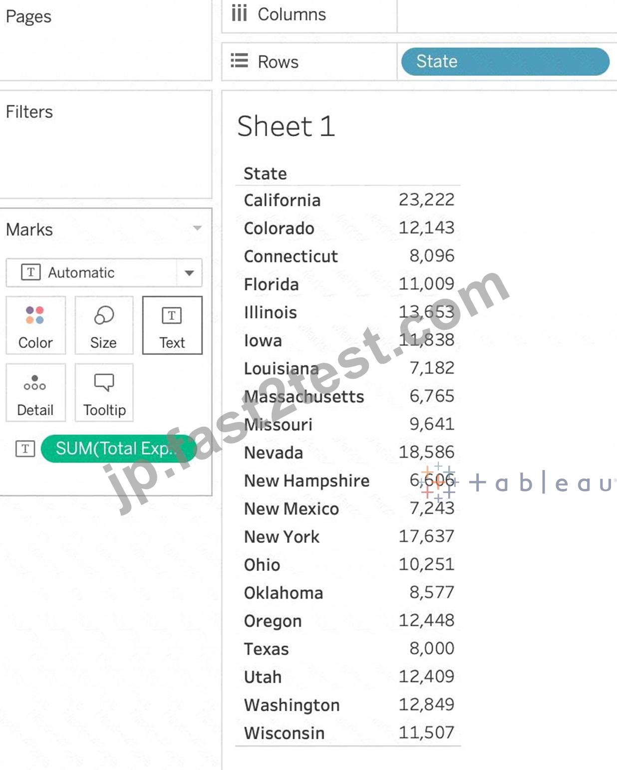
2) Now, remove the SUM aggregation from Total Expenses, and add a quick table calculation -> Percent of total: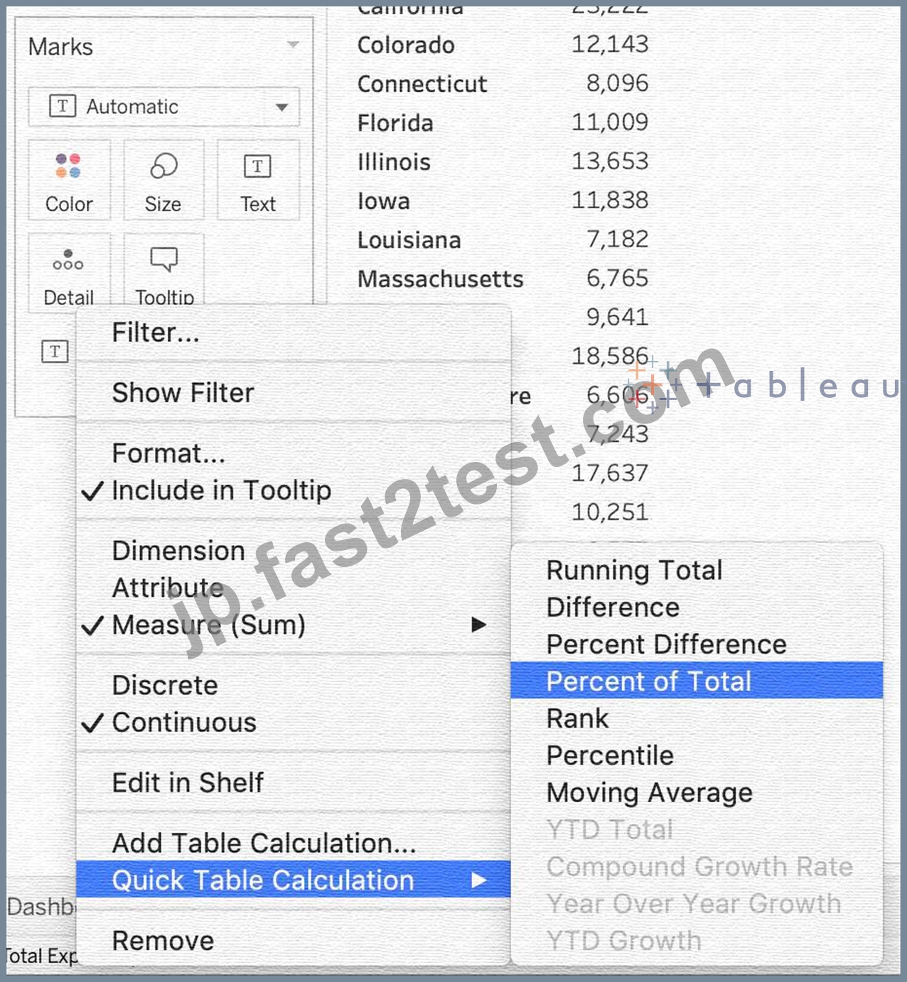
3) Next, Select the States of New York, California and Washington -> And then click the paperclip icon:
We can see the answer already : 23.386% in the view above (even before grouping!)
4) Finally, we get the following view and our answer: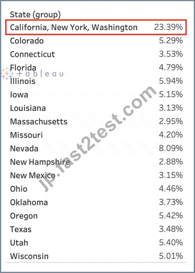
質問 # 54
________________ はヘッダーのみ作成できます。________________ はヘッダーと軸の両方を作成します。
- A. グループ、セット
- B. 日付、文字列
- C. 寸法、寸法
- D. メジャー、ディメンション
正解:C
解説:
Using the Sample superstore as a reference:
1) Let's plot a bar chart showing SUM(Quantity) for each Segment:
2) Right click on the x-axis (Segment):
Notice we don't have an option to edit the axis, only header. This is because only continous values form the AXIS.
3) Similarly, right click on the y-axis (Quantity):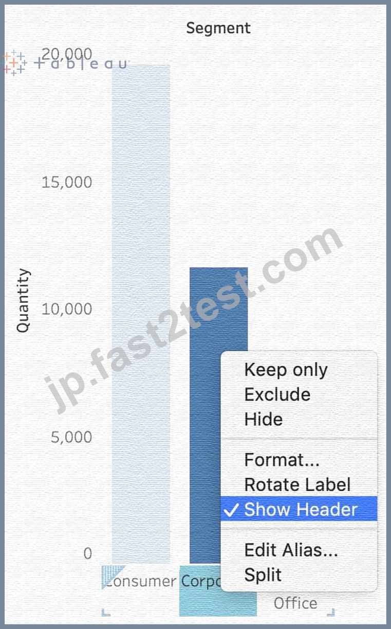
Now we have the option to edit BOTH the axis and the header.
質問 # 55
次の関数は何を返しますか?
LEFT("タブロー", 3)
- A. オー
- B. ブルー
- C. エラー
- D. タブ
正解:D
解説:
The following is the official documentation for the String function LEFT: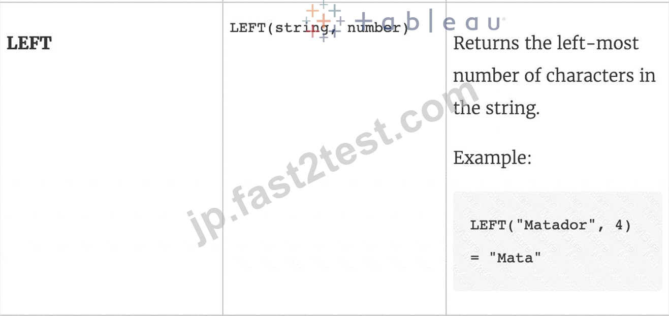
質問 # 56
CoffeeChain テーブルを使用して、2012 年の初めから 2013 年末までの毎月の利益のパーセント差の変化を確認するグラフを作成します。
- A. 0
- B. 1
- C. 2
- D. 3
正解:A
解説:
Follow along to reach the correct answer:
1) First, drag Date to the Column shelf and Profit to the Rows shelf. We need to see the 2 consecutive months over this two year period (2012-2013) so this tells us we need to work with continuous dates:
Click on Date in the Column shelf and convert it to continuous month :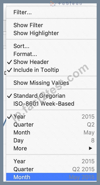
2) Now, click on the Profit pill in the Rows shelf, go to quick table calculation and choose Percent difference: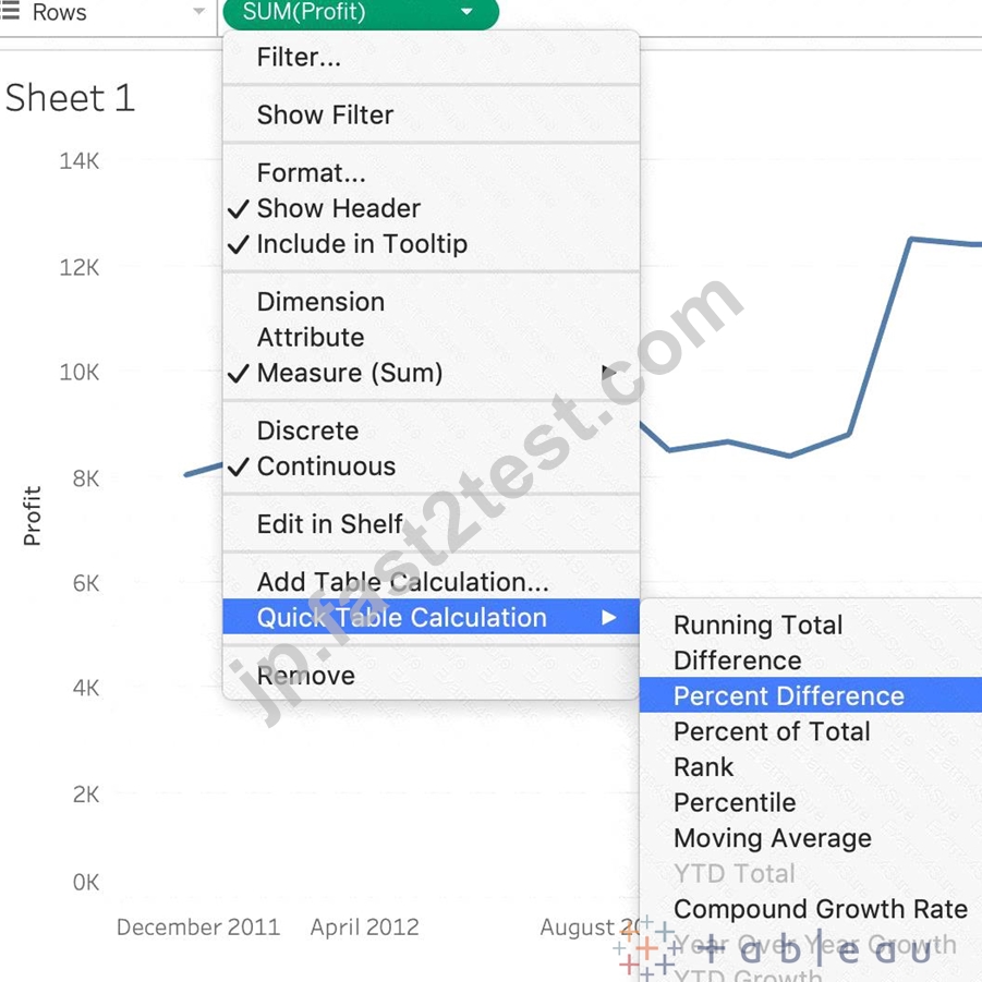
3) Finally, click on the Show mark Labels icon:
4) We finally have our view, and clearly, 10 Months have a NEGATIVE percent difference: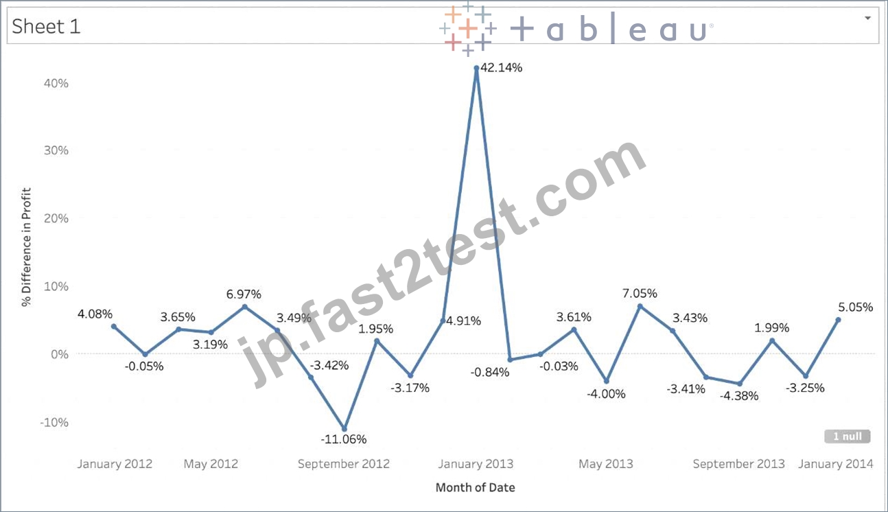
質問 # 57
アニメーションは Tableau で既定で有効になっていますか?
- A. はい
- B. いいえ
正解:B
解説:
No, by default, animations are not enabled in Tableau.
We can animate visualizations to better highlight changing patterns in your data, reveal spikes and outliers, and see how data points cluster and separate.
Animations visually transition between filter, sort, and zoom settings, different pages, and changes to filter, parameter, and set actions. As visualizations animate in response to these changes, viewers can more clearly see how data differs, helping them make better informed decisions.
When you author animations, you can choose between two different styles: simultaneous or sequential. Here are examples of each type.
1) Simultaneous animations
The default simultaneous animations are faster and work well when showing value changes in simpler charts and dashboards.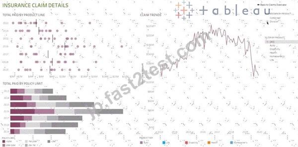
2) Sequential animations
Sequential animations take more time but make complex changes clearer by presenting them step-by-step.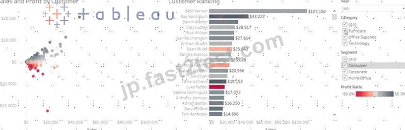
To Animate visualizations in a workbook:
1) Choose Format > Animations.
2) If you want to animate every sheet, under Workbook Default, click On. Then do the following:
For Duration, choose a preset, or specify a custom duration of up to 10 seconds.
For Style, choose Simultaneous to play all animations at once or Sequential to fade out marks, move and sort them, and then fade them in.
3) To override workbook defaults for a particular sheet, change the settings under Selected Sheet.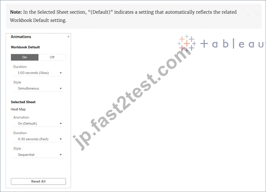
質問 # 58
.tds ファイルに保存されるのは次のうちどれですか? 3 を選択します。
- A. データ抽出
- B. ビジュアライゼーション
- C. メタデータの編集
- D. データ接続情報
- E. 計算フィールド
正解:C、D、E
解説:
If you've created a data connection that you might want to use with other workbooks or share with colleagues, you can export (save) the data source to a file. You might want to do this also if you've added joined tables, default properties, or custom fields-such as groups, sets, calculated fields, and binned fields-to the Data pane.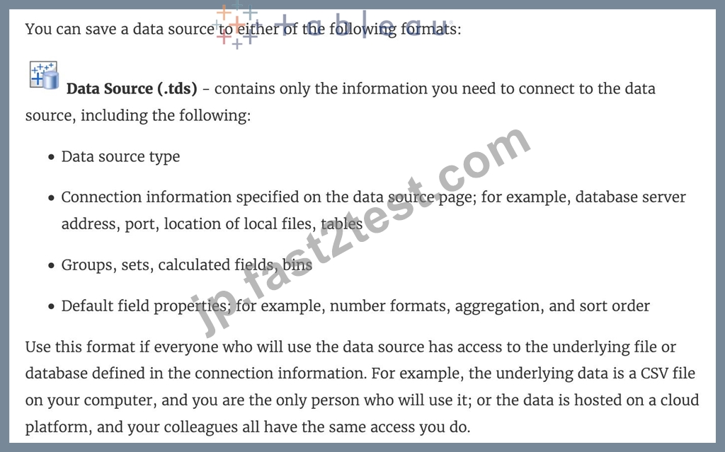
Visualisations and Data extracts are NOT saved in a .tds file!
質問 # 59
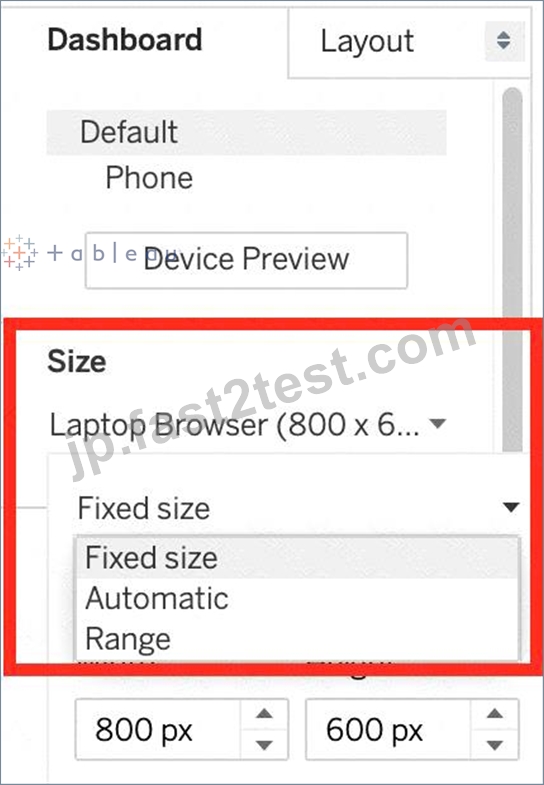
有効なダッシュボード サイズ オプションは次のうちどれですか?
- A. 範囲
- B. スケーリング
- C. 自動
- D. 固定サイズ
正解:A、C、D
解説:
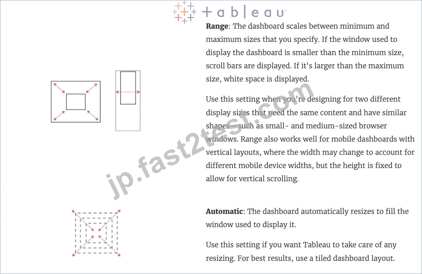
Scaled is NOT a valid size options when creating Dashboards in Tableau!
After you create a dashboard, you might need to resize and reorganize it to work better for your users.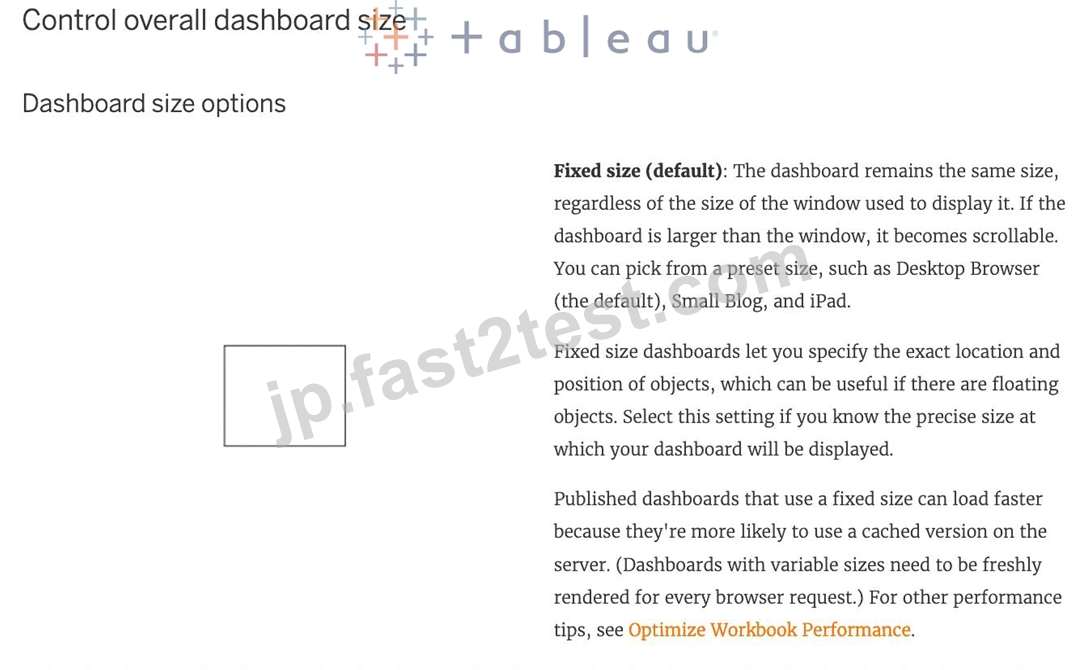
質問 # 60
次のうち、Tableau で使用できるタイプのクイック フィルターでないものはどれですか?
- A. ワイルドカード マッチ
- B. 単一値 (スライダー)
- C. 複数の値 (ドロップダウン)
- D. 正規表現一致
正解:D
解説:
Upon clicking on a filter, we see the following options: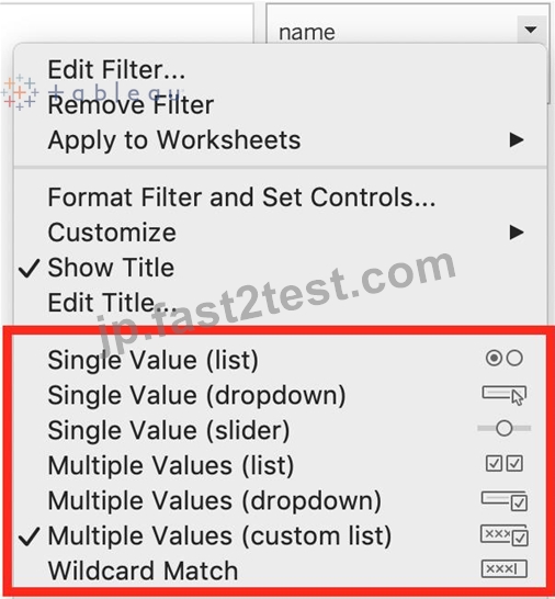
Clearly, Regex Match is not one of these options!
質問 # 61
......
認証トレーニングTDS-C01日本語試験問題集テストエンジン:https://jp.fast2test.com/TDS-C01-JPN-premium-file.html