

更新されたのは2023年03月試験エンジンはDesktop-Specialist無料お試しサンプルが365日更新されます
試験合格保証Desktop-Specialist試験には正確な問題解答付き!
Tableau Desktop-Specialist 認定試験の出題範囲:
| トピック | 出題範囲 |
|---|---|
| トピック 1 |
|
| トピック 2 |
|
| トピック 3 |
|
| トピック 4 |
|
| トピック 5 |
|
| トピック 6 |
|
| トピック 7 |
|
質問 61
Using the Time Series Table, create a Line chart showing the Monthly Year over Year Growth for the Sales, broken down by Assortment. For the Electronics assortment, which Month had the most NEGATIVE value of Year over Year Growth?
- A. July
- B. June
- C. October
- D. September
正解: C
解説:
Explanation
Follow along:
1) Drag Assortment and Year ID (choose Discrete Month) to Columns shelf, and Sales to the Columns Shelf.
For sales, click on the pill -> choose Quick Table calculation -> Year over Year growth.
The view should now look like:
質問 62
When using a Blend, what is the color of tick-mark on the primary and secondary data sources respectively?
- A. Blue, Orange
- B. Blue, Red
- C. Orange, Blue
- D. Red, Blue
正解: A
解説:
Explanation
When using a Blend, the primary data source appears with a BLUE tick-mark and the secondary data source appears with a ORANGE tick-mark.
See below: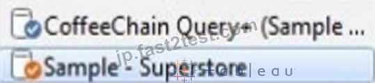
質問 63
Larger image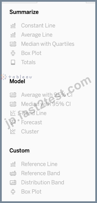
What is this entire view referred to as in Tableau?
- A. Distribution Pane
- B. Summary Pane
- C. Analytics Pane
- D. Data pane
正解: C
解説:
Explanation
Distribution Pane
Explanation
This is the Analytics pane! Read more from the official documentation below: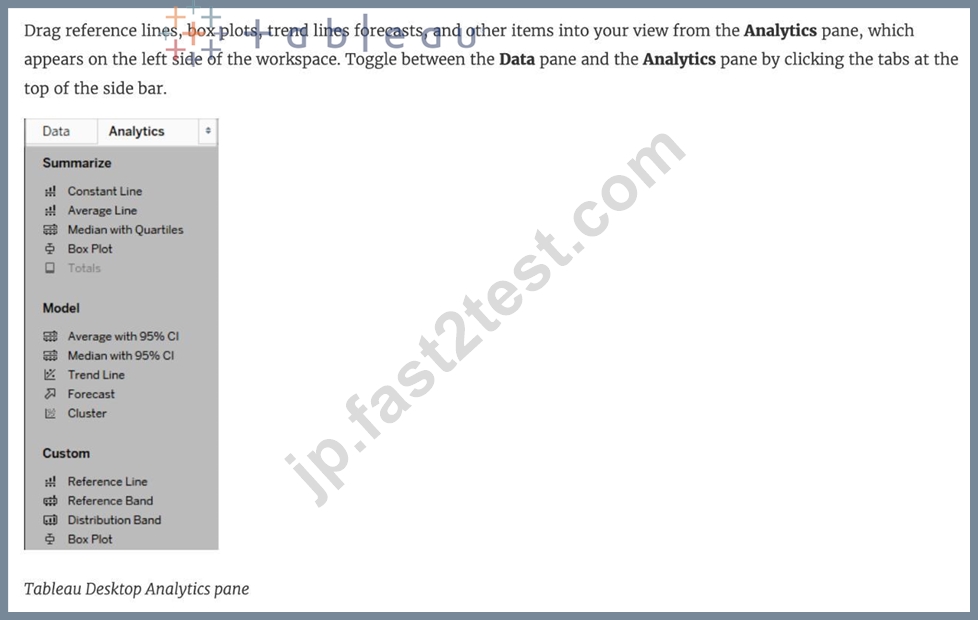
質問 64
Is it possible to use measures in the same view multiple times (e.g. SUM of the measure and AVG of the measure)?
- A. Yes
- B. No
正解: A
解説:
Explanation
Yes, it is very much possible to use measures in the same view multiple times. For example, refer to the image below: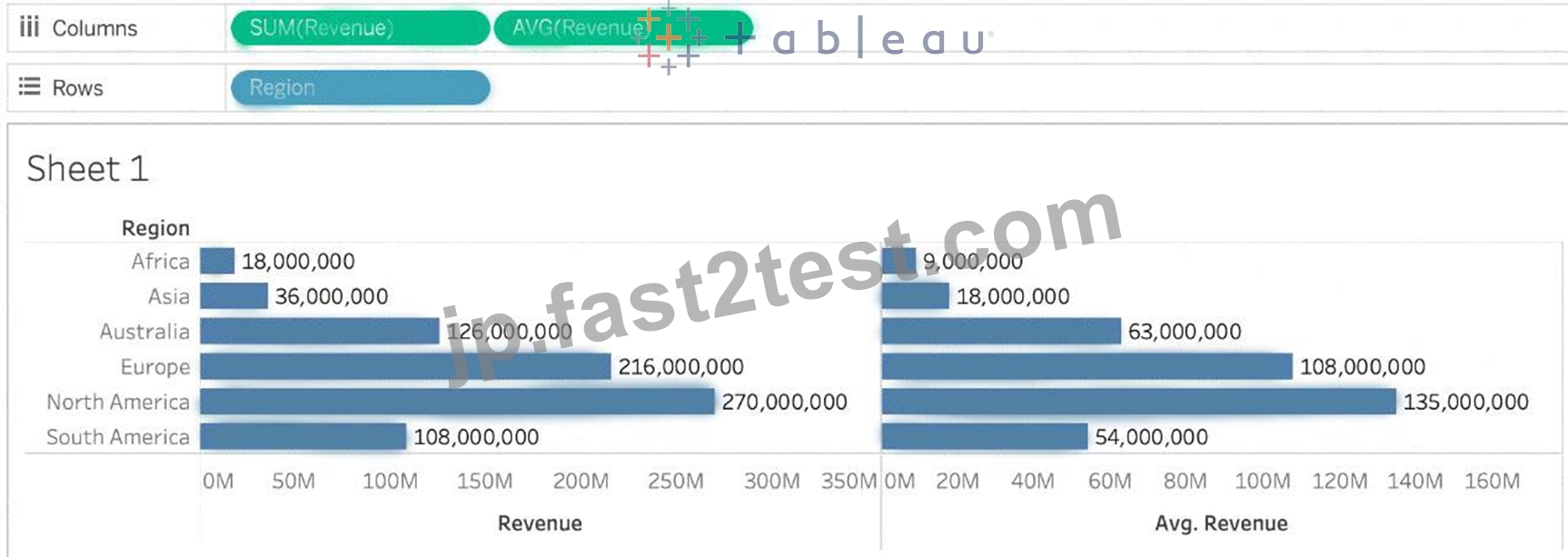
We are using BOTH the Sum of the revenue and the of the revenue in the same view!
質問 65
Download the Dataset from:
https://drive.google.com/file/d/12AYHfiPWkwBmvH0zbumOURgUX6Az00Rw/view?usp=sharing Using the Time Series Table, create a line chart to show Sales over time. Which Month and Year witnessed the lowest Sales?
- A. March 2018
- B. January 2018
- C. December 2017
- D. September 2017
正解: B
解説:
Explanation
Follow the steps to get the correct answer : January 2018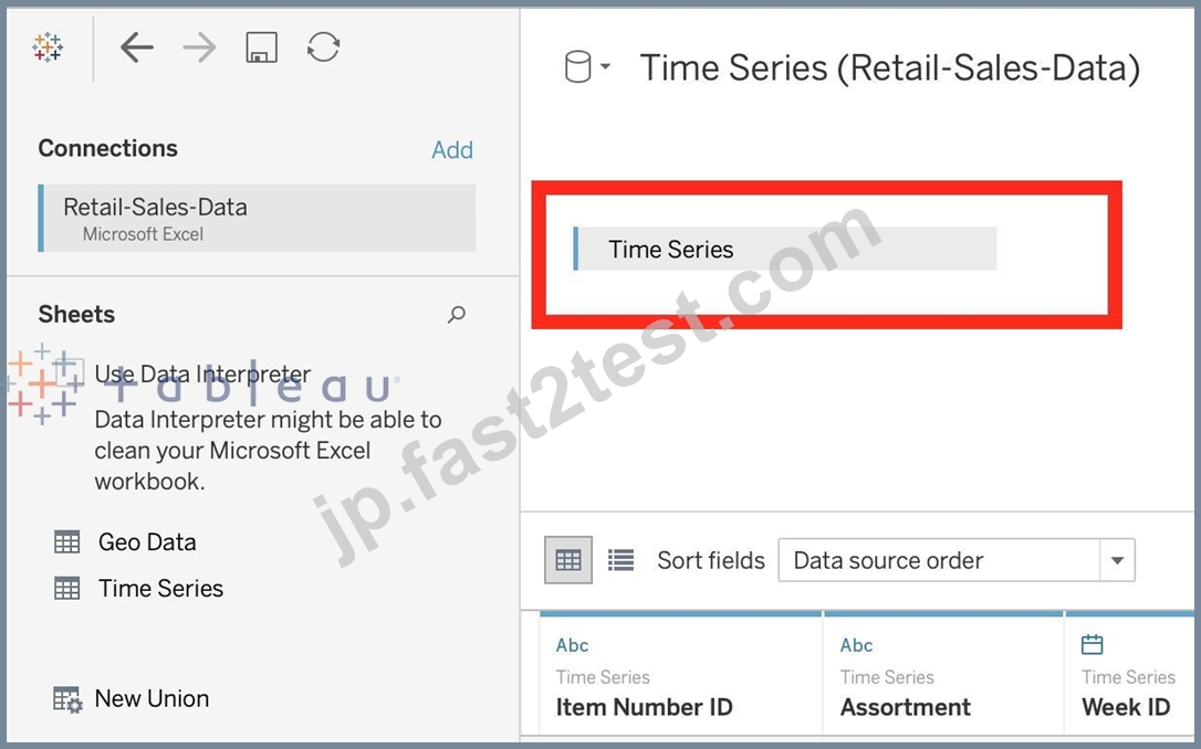
* We are talking about dates, so use the Time series sheet as follows:
* Next, the following should be your view and clearly, January 2018 is the lowest point: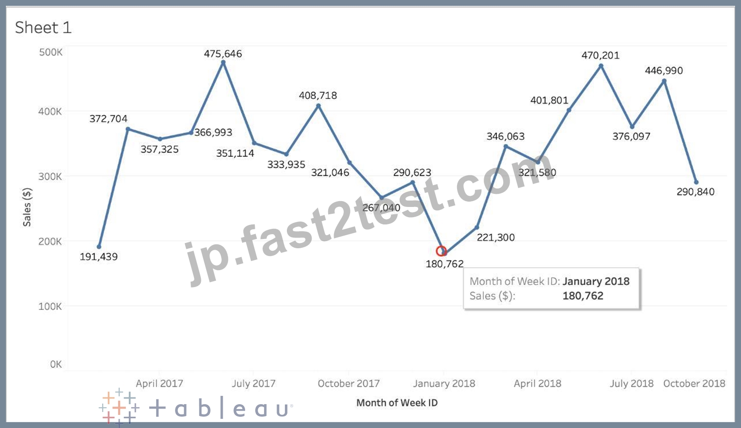
Read more about dates:
https://interworks.com/blog/rcurtis/2017/01/30/tableau-deep-dive-dates-introduction-dates/
質問 66
The row and column shelves contain ___________________
- A. Filters
- B. Pills
- C. Parameters
- D. Grand Totals
正解: B
解説:
Explanation
We can drag fields from the Data pane to create the structure for your visualizations.
The Columns shelf creates the columns of a table, while the Rows shelf creates the rows of a table. You can place any number of fields on these shelves.
These FIELDS are also referred to as PILLS. See below: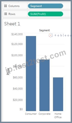
質問 67
You can use the __________________ in Tableau to clean / organise your data.
- A. Data manager
- B. Data interpreter
- C. Data cleaner
- D. Data organiser
正解: B
解説:
Explanation
When you track data in Excel spreadsheets, you create them with the human interface in mind. To make your spreadsheets easy to read, you might include things like titles, stacked headers, notes, maybe empty rows and columns to add white space, and you probably have multiple tabs of data too.
When you want to analyze this data in Tableau, these aesthetically pleasing attributes make it very difficult for Tableau to interpret your data. That's where Data Interpreter can help.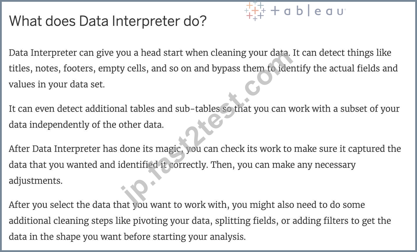
質問 68
Dragging a ______________ to colour creates distinct colours for each item whereas dragging a
______________ to colour creates a gradient
- A. Continuous Value, Discrete Value
- B. Longitude, Latitude
- C. Discrete value, Continuous Value
- D. Geographic Value, Discrete Value
正解: C
解説:
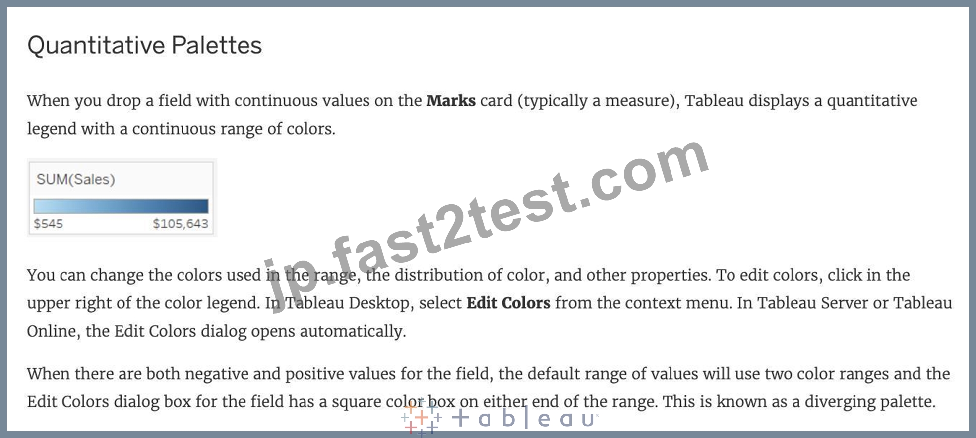
Explanation
Remember that dragging a discrete value to colour creates distinct colours for each item whereas dragging a continuous value to colour creates a gradient. ( Same for Map ) From the official documentation: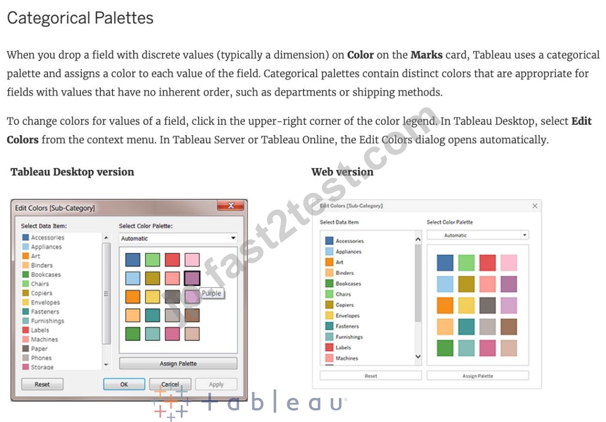
質問 69
In Tree maps, the size begins with the largest rectangle on the ________________ and the smallest rectangle on the ________________.
- A. top left, bottom right
- B. top left bottom left
- C. top right, bottom right
- D. top right, bottom left
正解: D
解説:
Explanation
Tree maps size begins from maximum in top left to smallest in bottom right.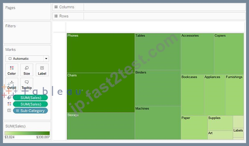
See below to learn how to create a TreeMap and add colours to it:
質問 70
When creating a dashboard for multiple devices, which of the following Device options are available in the Device Preview section?
- A. Phone, Tablet, Laptop, Desktop
- B. Default, Phone, Tablet, Desktop
- C. Monitor, Default, Phone, Tablet
- D. Phone, Monitor, Laptop, Default
正解: D
解説:
Explanation
The following options are available in the Device preview section when creating a Dashboard: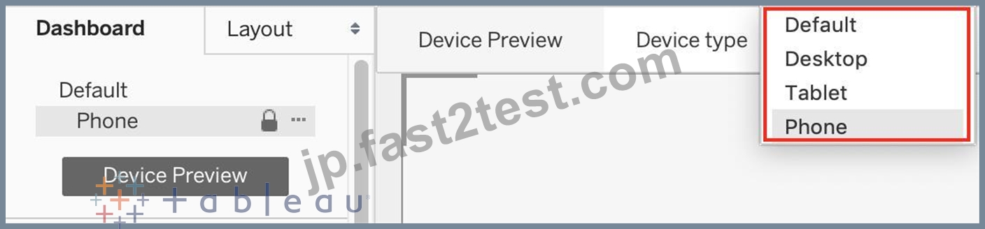
質問 71
Which of the following are the options to export the data used to build the view / visualisations?
- A. MS Access Database
- B. CSV file
- C. PDF File
- D. JSON format
正解: A
解説:
Explanation
You can export the data in a Tableau data source, including all or part of the records from your original data.
Alternatively, you can export only the portion of data used to generate the view.
Since the question mentions the data used to build the view, we'll focus on that :
*Export data in the view to Microsoft Access or .csv*
Export the data that is used to generate the view as an Access database (Windows only) or .csv file (Mac only).
1) In Tableau Desktop, select Worksheet > Export > Data.
2) Select a location and type a name for your Access database or .csv file.
3) Click Save.
4) If you're on Windows, the Export Data to Access dialog box displays to give you the option to immediately use the new Access database and continue working in Access without interrupting your work flow.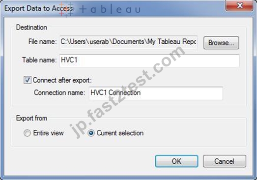
質問 72
______________ refers to the level of detail for a piece of data, wherever you are looking.
- A. Data LOD
- B. Data connectivity
- C. Data granularity
- D. Data Cleanliness
正解: C
解説:
Explanation
Data is generated and analyzed at many different levels of granularity. Granularity is the level of detail of the data. For example, when looking at graduation data, granularity would describe whether a row in the data set represents a single person or the graduating class of a university.
質問 73
By definition, Tableau displays measures over time as a ____________
- A. Stacked Bar
- B. Bar
- C. Line
- D. Packed Bubble
正解: C
解説:
Explanation
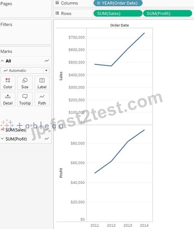
Line charts connect individual data points in a view. They provide a simple way to visualize a sequence of values and are useful when you want to see trends over time, or to forecast future values.
Please refer to the images below: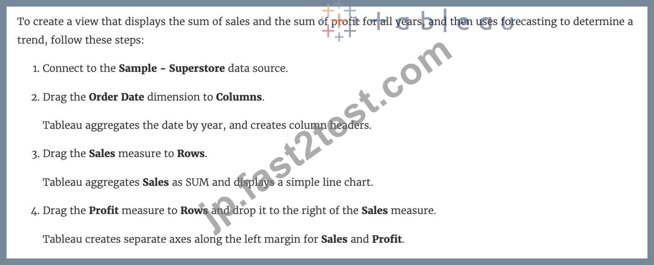
質問 74
What is the one critical difference between normal calculated fields, and the calculated fields created after Data blending?
- A. Fields used in Blends must first be aggregated
- B. No difference, calculated fields cannot be created in Blends
- C. The calculated fields created in Blends cannot use more than 2 fields
- D. The calculated fields created in Blends cannot be edited once created
正解: A
解説:
Explanation
Yes, due to the nature of blends, there are some conditions as follows from the official documentation that must be kept in mind while working with blends: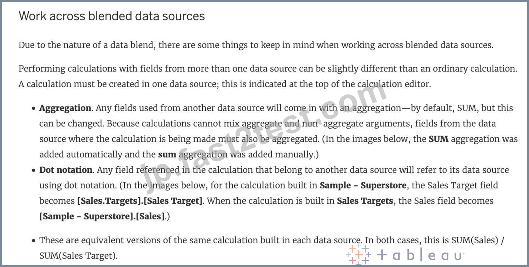
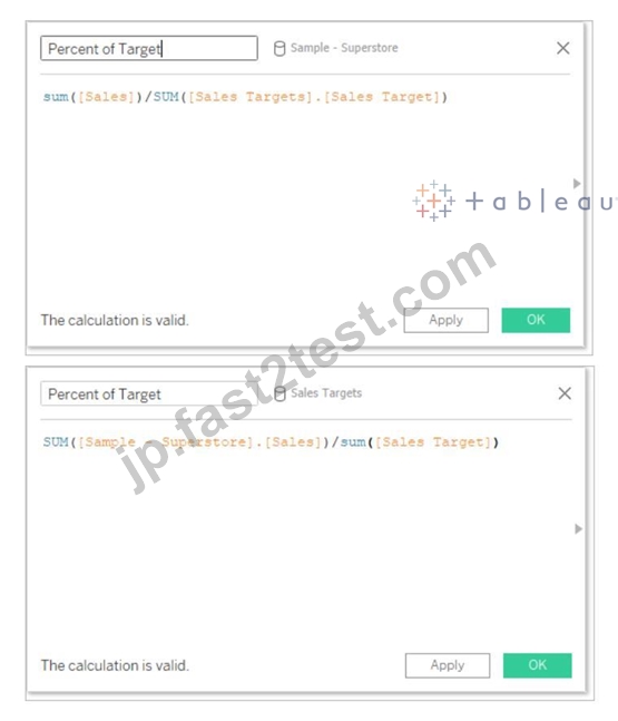
In addition to handling calculations slightly differently, there are some limitations on secondary data sources.
You may not be able to sort by a field from a secondary data source, and action filters may not work as expected with blended data. For more information, see Other data blending issues.
質問 75
For creating variable sized bins we use __________________
- A. Table Calculations
- B. Sets
- C. Calculated Fields
- D. Groups
正解: C
解説:
Explanation
One way to view a measure in Tableau Desktop is to split it into bins. You can think of bins as buckets based on a range of values. For example, say you have a measure that represents age. Instead of aggregating the measure to calculate the average age, you can bin the measure to define age groups: 0-5, 6-10, 11-15, and so on. Then you can count the number of people in each age group.
Create a calculated field for variable bin size
Step 1
Select Analysis > Create Calculated Field.
Step 2
In the Calculated Field dialog box, complete the following steps: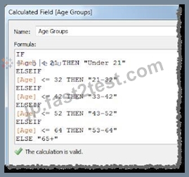
質問 76
The calculation [Ship Date] - [Order Date] will return _______________
- A. Number of days between these dates
- B. Number of unique orders placed between these dates
- C. Number of orders shipped between these dates
- D. Number of orders placed in that duration
正解: A
解説:
Explanation
As the names suggest, if we subtract the order date from the shipping date, we simply get the number of days between these 2 dates.
We can these use this calculated field in our charts, and can use COUNT, SUM, AVG etc with them according to our need.
質問 77
......
試験問題はDesktop-Specialist最新版を提供するのはテストエンジン:https://jp.fast2test.com/Desktop-Specialist-premium-file.html
テストエンジンの練習テストならこれDesktop-Specialist有効で更新された問題集:https://drive.google.com/open?id=175EjaPXOUOTSw5wJRwy-OrOI8OfXHgQy